
1) Descriptive and inferential statistics
Statistics can be used to answer lots of different types of questions, but being able to identify which type of statistics is needed is essential to drawing accurate conclusions. In this exercise, you’ll sharpen your skills by identifying which type is needed to answer each question.
- Identify which questions can be answered with descriptive statistics and which questions can be answered with inferential statistics.

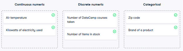
2) Data type classification
In the video, you learned about two main types of data: numeric and categorical. Numeric variables can be classified as either discrete or continuous, and categorical variables can be classified as either nominal or ordinal. These characteristics of a variable determine which ways of summarizing your data will work best.
- Map each variable to its data type by dragging each item and dropping it into the correct data type.
3) Mean and median
In this chapter, you’ll be working with the food_consumption dataset from 2018 Food Carbon Footprint Index by nu3. The food_consumption dataset contains the number of kilograms of food consumed per person per year in each country and food category (consumption), and its carbon footprint (co2_emissions) measured in kilograms of carbon dioxide, or CO2.
In this exercise, you’ll compute measures of center to compare food consumption in the US and Belgium using your pandas and numpy skills.
pandas is imported as pd for you and food_consumption is pre-loaded.
- Import numpy with the alias np.
- Subset food_consumption to get the rows where the country is ‘USA’.
- Calculate the mean of food consumption in the usa_consumption DataFrame, which is already created for you.
- Calculate the median of food consumption in the usa_consumption DataFrame.
# Import numpy with alias np
import numpy as np
# Subset country for USA: usa_consumption
usa_consumption = food_consumption[food_consumption[‘country’] == ‘USA’]
# Calculate mean consumption in USA
print(np.mean(usa_consumption[‘consumption’]))
# Calculate median consumption in USA
print(np.median(usa_consumption[‘consumption’]))
4) Mean vs. median
In the video, you learned that the mean is the sum of all the data points divided by the total number of data points, and the median is the middle value of the dataset where 50% of the data is less than the median, and 50% of the data is greater than the median. In this exercise, you’ll compare these two measures of center.
pandas is loaded as pd, numpy is loaded as np, and food_consumption is available.
- Import matplotlib.pyplot with the alias plt.
- Subset food_consumption to get the rows where food_category is ‘rice’.
- Create a histogram of co2_emission in rice_consumption DataFrame and show the plot.
# Import matplotlib.pyplot with alias plt
import matplotlib.pyplot as plt
# Subset for food_category equals rice
rice_consumption = food_consumption[food_consumption[‘food_category’] == ‘rice’]
# Histogram of co2_emission for rice and show plot
plt.hist(rice_consumption[‘co2_emission’])
plt.show()
Question
Take a look at the histogram you just created of different countries’ CO2 emissions for rice. Which of the following terms best describes the shape of the data?
Possible answers
No skew
Left-skewed
Right-skewed
- Use .agg() to calculate the mean and median of co2_emission for rice.
# Subset for food_category equals rice
rice_consumption = food_consumption[food_consumption[‘food_category’] == ‘rice’]
# Calculate mean and median of co2_emission with .agg()
print(rice_consumption[‘co2_emission’].agg([‘mean’, ‘median’]))
Question
Given the skew of this data, what measure of central tendency best summarizes the kilograms of CO2 emissions per person per year for rice?
Possible answers
Mean
Median
Both mean and median
5) Variance and standard deviation
Variance and standard deviation are two of the most common ways to measure the spread of a variable, and you’ll practice calculating these in this exercise. Spread is important since it can help inform expectations. For example, if a salesperson sells a mean of 20 products a day, but has a standard deviation of 10 products, there will probably be days where they sell 40 products, but also days where they only sell one or two. Information like this is important, especially when making predictions.
pandas has been imported as pd, numpy as np, and matplotlib.pyplot as plt; the food_consumption DataFrame is also available.
- Calculate the variance and standard deviation of co2_emission for each food_category with the .groupby() and .agg() methods; compare the values of variance and standard deviation.
- Create a histogram of co2_emission for the beef in food_category and show the plot.
- Create a histogram of co2_emission for the eggs in food_category and show the plot.
# Print variance and sd of co2_emission for each food_category
print(food_consumption.groupby(‘food_category’)[‘co2_emission’].agg([‘var’, ‘std’]))
# Create histogram of co2_emission for food_category ‘beef’
food_consumption[food_consumption[‘food_category’] == ‘beef’][‘co2_emission’].hist()
plt.show()
# Create histogram of co2_emission for food_category ‘eggs’
plt.figure()
food_consumption[food_consumption[‘food_category’] == ‘eggs’][‘co2_emission’].hist()
plt.show()
6) Quartiles, quantiles, and quintiles
Quantiles are a great way of summarizing numerical data since they can be used to measure center and spread, as well as to get a sense of where a data point stands in relation to the rest of the data set. For example, you might want to give a discount to the 10% most active users on a website.
In this exercise, you’ll calculate quartiles, quintiles, and deciles, which split up a dataset into 4, 5, and 10 pieces, respectively.
Both pandas as pd and numpy as np are loaded and food_consumption is available.
- Calculate the quartiles of the co2_emission column of food_consumption.
# Calculate the quartiles of co2_emission
print(np.quantile(food_consumption[‘co2_emission’], [0, 0.25, 0.5, 0.75, 1]))
- Calculate the six quantiles that split up the data into 5 pieces (quintiles) of the co2_emission column of food_consumption.
# Calculate the quintiles of co2_emission
print(np.quantile(food_consumption[‘co2_emission’], [0, 0.2, 0.4, 0.6, 0.8, 1]))
- Calculate the eleven quantiles of co2_emission that split up the data into ten pieces (deciles).
# Calculate the deciles of co2_emission
print(np.quantile(food_consumption[‘co2_emission’], [0, 0.1, 0.2, 0.3, 0.4, 0.5, 0.6, 0.7, 0.8, 0.9, 1]))
7) Finding outliers using IQR
Outliers can have big effects on statistics like mean, as well as statistics that rely on the mean, such as variance and standard deviation. Interquartile range, or IQR, is another way of measuring spread that’s less influenced by outliers. IQR is also often used to find outliers. If a value is less than or greater than
, it’s considered an outlier. In fact, this is how the lengths of the whiskers in a matplotlib box plot are calculated.
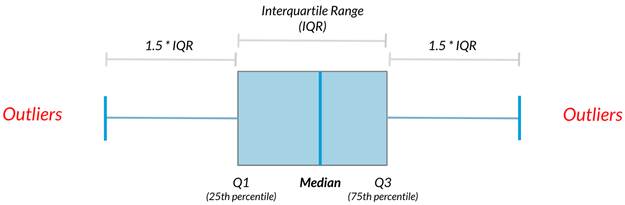
In this exercise, you’ll calculate IQR and use it to find some outliers. pandas as pd and numpy as np are loaded and food_consumption is available.
- Calculate the total co2_emission per country by grouping by country and taking the sum of co2_emission. Store the resulting DataFrame as emissions_by_country.
# Calculate total co2_emission per country: emissions_by_country
emissions_by_country = food_consumption.groupby(‘country’)[‘co2_emission’].sum()
print(emissions_by_country)
- Compute the first and third quartiles of emissions_by_country and store these as q1 and q3.
- Calculate the interquartile range of emissions_by_country and store it as iqr.
# Calculate total co2_emission per country: emissions_by_country
emissions_by_country = food_consumption.groupby(‘country’)[‘co2_emission’].sum()
# Compute the first and third quartiles and IQR of emissions_by_country
q1 = emissions_by_country.quantile(0.25)
q3 = emissions_by_country.quantile(0.75)
iqr = q3 – q1
- Calculate the lower and upper cutoffs for outliers of emissions_by_country, and store these as lower and upper.
# Calculate total co2_emission per country: emissions_by_country
emissions_by_country = food_consumption.groupby(‘country’)[‘co2_emission’].sum()
# Compute the first and third quantiles and IQR of emissions_by_country
q1 = np.quantile(emissions_by_country, 0.25)
q3 = np.quantile(emissions_by_country, 0.75)
iqr = q3 – q1
# Calculate the lower and upper cutoffs for outliers
lower = q1 – 1.5 * iqr
upper = q3 + 1.5 * iqr
- Subset emissions_by_country to get countries with a total emission greater than the upper cutoff or a total emission less than the lower cutoff.
# Calculate total co2_emission per country: emissions_by_country
emissions_by_country = food_consumption.groupby(‘country’)[‘co2_emission’].sum()
# Compute the first and third quantiles and IQR of emissions_by_country
q1 = np.quantile(emissions_by_country, 0.25)
q3 = np.quantile(emissions_by_country, 0.75)
iqr = q3 – q1
# Calculate the lower and upper cutoffs for outliers
lower = q1 – 1.5 * iqr
upper = q3 + 1.5 * iqr
# Subset emissions_by_country to find outliers
outliers = emissions_by_country[(emissions_by_country < lower) | (emissions_by_country > upper)]
print(outliers)
8) With or without replacement?
In the video, you learned about two different ways of taking samples: with replacement and without replacement. Although it isn’t always easy to tell which best fits various situations, it’s important to correctly identify this so that any probabilities you report are accurate. In this exercise, you’ll put your new knowledge to the test and practice figuring this out.
- For each scenario, decide whether it’s sampling with replacement or sampling without replacement.

9) Calculating probabilities
You’re in charge of the sales team, and it’s time for performance reviews, starting with Amir. As part of the review, you want to randomly select a few of the deals that he’s worked on over the past year so that you can look at them more deeply. Before you start selecting deals, you’ll first figure out what the chances are of selecting certain deals.
Recall that the probability of an event can be calculated by
Both pandas as pd and numpy as np are loaded and amir_deals is available.
- Count the number of deals Amir worked on for each product type using .value_counts() and store in counts.
# Count the deals for each product
counts = amir_deals[‘product’].value_counts()
print(counts)
- Calculate the probability of selecting a deal for the different product types by dividing the counts by the total number of deals Amir worked on. Save this as probs.
# Count the deals for each product
counts = amir_deals[‘product’].value_counts()
# Calculate probability of picking a deal with each product
probs = counts / counts.sum()
print(probs)
Question
If you randomly select one of Amir’s deals, what’s the probability that the deal will involve Product C?
Possible answers
15%
80.43%
8.43%
22.5%
124.3%
10) Sampling deals
In the previous exercise, you counted the deals Amir worked on. Now it’s time to randomly pick five deals so that you can reach out to each customer and ask if they were satisfied with the service they received. You’ll try doing this both with and without replacement.
Additionally, you want to make sure this is done randomly and that it can be reproduced in case you get asked how you chose the deals, so you’ll need to set the random seed before sampling from the deals.
Both pandas as pd and numpy as np are loaded and amir_deals is available.
- Set the random seed to 24.
- Take a sample of 5 deals without replacement and store them as sample_without_replacement.
# Set random seed
np.random.seed(24)
# Sample 5 deals without replacement
sample_without_replacement = amir_deals.sample(n=5, replace=False)
print(sample_without_replacement)
- Take a sample of 5 deals with replacement and save as sample_with_replacement.
# Set random seed
np.random.seed(24)
# Sample 5 deals with replacement
sample_with_replacement = amir_deals.sample(n=5, replace=True)
print(sample_with_replacement)
Question
What type of sampling is better to use for this situation?
Possible answers
With replacement
Without replacement
It doesn’t matter
11) Creating a probability distribution
A new restaurant opened a few months ago, and the restaurant’s management wants to optimize its seating space based on the size of the groups that come most often. On one night, there are 10 groups of people waiting to be seated at the restaurant, but instead of being called in the order they arrived, they will be called randomly. In this exercise, you’ll investigate the probability of groups of different sizes getting picked first. Data on each of the ten groups is contained in the restaurant_groups DataFrame.
Remember that expected value can be calculated by multiplying each possible outcome with its corresponding probability and taking the sum. The restaurant_groups data is available. pandas is loaded as pd, numpy is loaded as np, and matplotlib.pyplot is loaded as plt.
- Create a histogram of the group_size column of restaurant_groups, setting bins to [2, 3, 4, 5, 6]. Remember to show the plot.
# Create a histogram of restaurant_groups and show plot
restaurant_groups[‘group_size’].hist(bins=[2, 3, 4, 5, 6])
plt.show()
- Count the number of each group_size in restaurant_groups, then divide by the number of rows in restaurant_groups to calculate the probability of randomly selecting a group of each size. Save as size_dist.
- Reset the index of size_dist.
- Rename the columns of size_dist to group_size and prob.
# Create probability distribution
size_dist = restaurant_groups[‘group_size’].value_counts() / len(restaurant_groups)
# Reset index and rename columns
size_dist = size_dist.reset_index()
size_dist.columns = [‘group_size’, ‘prob’]
print(size_dist)
- Calculate the expected value of the size_dist, which represents the expected group size, by multiplying the group_size by the prob and taking the sum.
# Create probability distribution
size_dist = restaurant_groups[‘group_size’].value_counts() / restaurant_groups.shape[0]
# Reset index and rename columns
size_dist = size_dist.reset_index()
size_dist.columns = [‘group_size’, ‘prob’]
# Calculate expected value
expected_value = np.sum(size_dist[‘group_size’] * size_dist[‘prob’])
print(expected_value)
- Calculate the probability of randomly picking a group of 4 or more people by subsetting for groups of size 4 or more and summing the probabilities of selecting those groups.
# Create probability distribution
size_dist = restaurant_groups[‘group_size’].value_counts() / restaurant_groups.shape[0]
# Reset index and rename columns
size_dist = size_dist.reset_index()
size_dist.columns = [‘group_size’, ‘prob’]
# Expected value
expected_value = np.sum(size_dist[‘group_size’] * size_dist[‘prob’])
# Subset groups of size 4 or more
groups_4_or_more = size_dist[size_dist[‘group_size’] >= 4]
# Sum the probabilities of groups_4_or_more
prob_4_or_more = groups_4_or_more[‘prob’].sum()
print(prob_4_or_more)
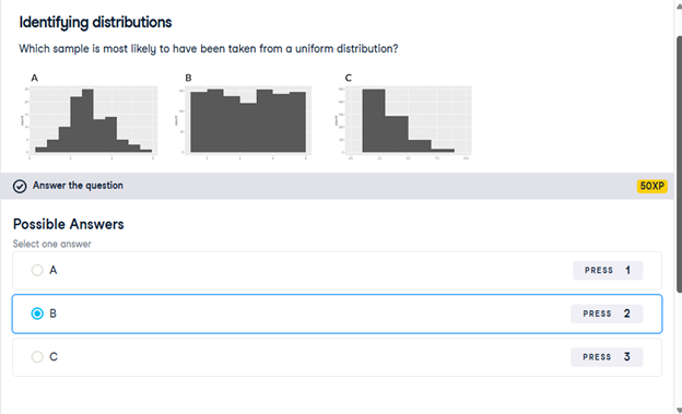
12) Identifying distributions
Which sample is most likely to have been taken from a uniform distribution?
13) Expected value vs. sample mean
The app to the right will take a sample from a discrete uniform distribution, which includes the numbers 1 through 9, and calculate the sample’s mean. You can adjust the size of the sample using the slider. Note that the expected value of this distribution is 5.
A sample is taken, and you win twenty dollars if the sample’s mean is less than 4. There’s a catch: you get to pick the sample’s size.
Which sample size is most likely to win you the twenty dollars?
10
14) Which distribution?
At this point, you’ve learned about the two different variants of the uniform distribution: the discrete uniform distribution, and the continuous uniform distribution. In this exercise, you’ll decide which situations follow which distribution.

- Map each situation to the probability distribution it would best be modeled by.

15) Data back-ups
The sales software used at your company is set to automatically back itself up, but no one knows exactly what time the back-ups happen. It is known, however, that back-ups happen exactly every 30 minutes. Amir comes back from sales meetings at random times to update the data on the client he just met with. He wants to know how long he’ll have to wait for his newly-entered data to get backed up. Use your new knowledge of continuous uniform distributions to model this situation and answer Amir’s questions.
- To model how long Amir will wait for a back-up using a continuous uniform distribution, save his lowest possible wait time as min_time and his longest possible wait time as max_time. Remember that back-ups happen every 30 minutes.
# Min and max wait times for back-up that happens every 30 min
min_time = 0
max_time = 30
- Import uniform from scipy.stats and calculate the probability that Amir has to wait less than 5 minutes, and store in a variable called prob_less_than_5.
# Min and max wait times for back-up that happens every 30 min
min_time = 0
max_time = 30
# Import uniform from scipy.stats
from scipy.stats import uniform
# Calculate probability of waiting less than 5 mins
prob_less_than_5 = uniform.cdf(5, loc=min_time, scale=max_time – min_time)
print(prob_less_than_5)
- Calculate the probability that Amir has to wait more than 5 minutes, and store in a variable called prob_greater_than_5.
# Min and max wait times for back-up that happens every 30 min
min_time = 0
max_time = 30
# Import uniform from scipy.stats
from scipy.stats import uniform
# Calculate probability of waiting more than 5 mins
prob_greater_than_5 = 1 – uniform.cdf(5, loc=min_time, scale=max_time – min_time)
print(prob_greater_than_5)
- Calculate the probability that Amir has to wait between 10 and 20 minutes, and store in a variable called prob_between_10_and_20.
# Min and max wait times for back-up that happens every 30 min
min_time = 0
max_time = 30
# Import uniform from scipy.stats
from scipy.stats import uniform
# Calculate probability of waiting 10-20 mins
prob_between_10_and_20 = uniform.cdf(20, loc=min_time, scale=max_time – min_time) – uniform.cdf(10, loc=min_time, scale=max_time – min_time)
print(prob_between_10_and_20)
16) Simulating wait times
To give Amir a better idea of how long he’ll have to wait, you’ll simulate Amir waiting 1000 times and create a histogram to show him what he should expect. Recall from the last exercise that his minimum wait time is 0 minutes and his maximum wait time is 30 minutes.
As usual, pandas as pd, numpy as np, and matplotlib.pyplot as plt are loaded.
- Set the random seed to 334.
# Set random seed to 334
np.random.seed(334)
- Import uniform from scipy.stats.
# Set random seed to 334
np.random.seed(334)
# Import uniform
from scipy.stats import uniform
- Generate 1000 wait times from the continuous uniform distribution that models Amir’s wait time. Save this as wait_times.
# Set random seed to 334
np.random.seed(334)
# Import uniform
from scipy.stats import uniform
# Generate 1000 wait times between 0 and 30 mins
wait_times = uniform.rvs(loc=0, scale=30, size=1000)
print(wait_times)
- Create a histogram of the simulated wait times and show the plot.
# Set random seed to 334
np.random.seed(334)
# Import uniform
from scipy.stats import uniform
# Generate 1000 wait times between 0 and 30 mins
wait_times = uniform.rvs(0, 30, size=1000)
# Create a histogram of simulated times and show plot
plt.hist(wait_times, bins=30) # optional: bins=30 for better resolution
plt.show()
17) Simulating sales deals
Assume that Amir usually works on 3 deals per week, and overall, he wins 30% of deals he works on. Each deal has a binary outcome: it’s either lost, or won, so you can model his sales deals with a binomial distribution. In this exercise, you’ll help Amir simulate a year’s worth of his deals so he can better understand his performance.
numpy is imported as np.
- Import binom from scipy.stats and set the random seed to 10.
# Import binom from scipy.stats
from scipy.stats import binom
# Set random seed to 10
np.random.seed(10)
- Simulate 1 deal worked on by Amir, who wins 30% of the deals he works on.
# Import binom from scipy.stats
from scipy.stats import binom
# Set random seed to 10
np.random.seed(10)
# Simulate a single deal
print(binom.rvs(1, 0.3, size=1))
- Simulate a typical week of Amir’s deals, or one week of 3 deals.
# Import binom from scipy.stats
from scipy.stats import binom
# Set random seed to 10
np.random.seed(10)
# Simulate 1 week of 3 deals
print(binom.rvs(3, 0.3, size=1))
- Simulate a year’s worth of Amir’s deals, or 52 weeks of 3 deals each, and store in deals.
- Print the mean number of deals he won per week.
# Import binom from scipy.stats
from scipy.stats import binom
# Set random seed to 10
np.random.seed(10)
# Simulate 52 weeks of 3 deals
deals = binom.rvs(n=3, p=0.3, size=52)
# Print mean deals won per week
print(deals.mean())
18) Calculating binomial probabilities
Just as in the last exercise, assume that Amir wins 30% of deals. He wants to get an idea of how likely he is to close a certain number of deals each week. In this exercise, you’ll calculate what the chances are of him closing different numbers of deals using the binomial distribution.
binom is imported from scipy.stats.
- What’s the probability that Amir closes all 3 deals in a week? Save this as prob_3.
# Probability of closing 3 out of 3 deals
prob_3 = binom.pmf(3, n=3, p=0.3)
print(prob_3)
- What’s the probability that Amir closes 1 or fewer deals in a week? Save this as prob_less_than_or_equal_1.
# Probability of closing <= 1 deal out of 3 deals
prob_less_than_or_equal_1 = binom.cdf(1, n=3, p=0.3)
print(prob_less_than_or_equal_1)
- What’s the probability that Amir closes more than 1 deal? Save this as prob_greater_than_1.
# Probability of closing > 1 deal out of 3 deals
prob_greater_than_1 = 1 – binom.cdf(1, n=3, p=0.3)
print(prob_greater_than_1)
19) How many sales will be won?
Now Amir wants to know how many deals he can expect to close each week if his win rate changes. Luckily, you can use your binomial distribution knowledge to help him calculate the expected value in different situations. Recall from the video that the expected value of a binomial distribution can be calculated by .
- Calculate the expected number of sales out of the 3 he works on that Amir will win each week if he maintains his 30% win rate.
- Calculate the expected number of sales out of the 3 he works on that he’ll win if his win rate drops to 25%.
- Calculate the expected number of sales out of the 3 he works on that he’ll win if his win rate rises to 35%.
# Expected number won with 30% win rate
won_30pct = 3 * 0.3
print(won_30pct)
# Expected number won with 25% win rate
won_25pct = 3 * 0.25
print(won_25pct)
# Expected number won with 35% win rate
won_35pct = 3 * 0.35
print(won_35pct)
20) Distribution of Amir’s sales
Since each deal Amir worked on (both won and lost) was different, each was worth a different amount of money. These values are stored in the amount column of amir_deals As part of Amir’s performance review, you want to be able to estimate the probability of him selling different amounts, but before you can do this, you’ll need to determine what kind of distribution the amount variable follows.
Both pandas as pd and matplotlib.pyplot as plt are loaded and amir_deals is available.
- Create a histogram with 10 bins to visualize the distribution of the amount. Show the plot.
# Histogram of amount with 10 bins and show plot
amir_deals[‘amount’].hist(bins=10)
plt.show()
Question
Which probability distribution do the sales amounts most closely follow?
Possible answers
Uniform
Binomial
Normal
None of the above
21) Probabilities from the normal distribution
Since each deal Amir worked on (both won and lost) was different, each was worth a different amount of money. These values are stored in the amount column of amir_deals and follow a normal distribution with a mean of 5000 dollars and a standard deviation of 2000 dollars. As part of his performance metrics, you want to calculate the probability of Amir closing a deal worth various amounts.
norm from scipy.stats is imported as well as pandas as pd. The DataFrame amir_deals is loaded.
- What’s the probability of Amir closing a deal worth less than $7500?
# Probability of deal < 7500
prob_less_7500 = norm.cdf(7500, loc=5000, scale=2000)
print(prob_less_7500)
- What’s the probability of Amir closing a deal worth more than $1000?
# Probability of deal > 1000
prob_over_1000 = 1 – norm.cdf(1000, loc=5000, scale=2000)
print(prob_over_1000)
- What’s the probability of Amir closing a deal worth between $3000 and $7000?
# Probability of deal between 3000 and 7000
prob_3000_to_7000 = norm.cdf(7000, loc=5000, scale=2000) – norm.cdf(3000, loc=5000, scale=2000)
print(prob_3000_to_7000)
- What amount will 25% of Amir’s sales be less than?
# Calculate amount that 25% of deals will be less than
pct_25 = norm.ppf(0.25, loc=5000, scale=2000)
print(pct_25)
22) Simulating sales under new market conditions
The company’s financial analyst is predicting that next quarter, the worth of each sale will increase by 20% and the volatility, or standard deviation, of each sale’s worth will increase by 30%. To see what Amir’s sales might look like next quarter under these new market conditions, you’ll simulate new sales amounts using the normal distribution and store these in the new_sales DataFrame, which has already been created for you.
In addition, norm from scipy.stats, pandas as pd, and matplotlib.pyplot as plt are loaded.
- Currently, Amir’s average sale amount is $5000. Calculate what his new average amount will be if it increases by 20% and store this in new_mean.
- Amir’s current standard deviation is $2000. Calculate what his new standard deviation will be if it increases by 30% and store this in new_sd.
- Create a variable called new_sales, which contains 36 simulated amounts from a normal distribution with a mean of new_mean and a standard deviation of new_sd.
- Plot the distribution of the new_sales amounts using a histogram and show the plot.
# Calculate new average amount
new_mean = 5000 * 1.2
# Calculate new standard deviation
new_sd = 2000 * 1.3
# Simulate 36 new sales
new_sales = norm.rvs(loc=new_mean, scale=new_sd, size=36)
# Create histogram and show
plt.hist(new_sales, bins=10)
plt.show()
23) Which market is better?
The key metric that the company uses to evaluate salespeople is the percent of sales they make over $1000 since the time put into each sale is usually worth a bit more than that, so the higher this metric, the better the salesperson is performing.
Recall that Amir’s current sales amounts have a mean of $5000 and a standard deviation of $2000, and Amir’s predicted amounts in next quarter’s market have a mean of $6000 and a standard deviation of $2600.
norm from scipy.stats is imported.
Based only on the metric of percent of sales over $1000, does Amir perform better in the current market or the predicted market?
Possible answers
Amir performs much better in the current market.
Amir performs much better in next quarter’s predicted market.
Amir performs about equally in both markets.
24) Visualizing sampling distributions
On the right, try creating sampling distributions of different summary statistics from samples of different distributions. Which distribution does the central limit theorem not apply to?
Discrete uniform distribution- Continuous uniform distribution
- Binomial distribution
- All of the above
- None of the above
25) The CLT in action
The central limit theorem states that a sampling distribution of a sample statistic approaches the normal distribution as you take more samples, no matter the original distribution being sampled from.
In this exercise, you’ll focus on the sample mean and see the central limit theorem in action while examining the num_users column of amir_deals more closely, which contains the number of people who intend to use the product Amir is selling.
pandas as pd, numpy as np, and matplotlib.pyplot as plt are loaded and amir_deals is available.
- Create a histogram of the num_users column of amir_deals and show the plot.
# Create a histogram of num_users and show
amir_deals[‘num_users’].hist(bins=10)
plt.show()
- Set the seed to 104.
- Take a sample of size 20 with replacement from the num_users column of amir_deals, and take the mean.
# Set seed to 104
np.random.seed(104)
# Sample 20 num_users with replacement from amir_deals
samp_20 = amir_deals[‘num_users’].sample(n=20, replace=True)
# Take mean of samp_20
print(samp_20.mean())
- Repeat this 100 times using a for loop and store as sample_means. This will take 100 different samples and calculate the mean of each.
# Set seed to 104
np.random.seed(104)
# Sample 20 num_users with replacement from amir_deals and take mean
samp_20 = amir_deals[‘num_users’].sample(20, replace=True)
np.mean(samp_20)
sample_means = []
# Loop 100 times
for i in range(100):
# Take sample of 20 num_users
samp_20 = amir_deals[‘num_users’].sample(20, replace=True)
# Calculate mean of samp_20
samp_20_mean = samp_20.mean()
# Append samp_20_mean to sample_means
sample_means.append(samp_20_mean)
print(sample_means)
- Convert sample_means into a pd.Series, create a histogram of the sample_means, and show the plot.
# Set seed to 104
np.random.seed(104)
sample_means = []
# Loop 100 times
for i in range(100):
# Take sample of 20 num_users
samp_20 = amir_deals[‘num_users’].sample(20, replace=True)
# Calculate mean of samp_20
samp_20_mean = np.mean(samp_20)
# Append samp_20_mean to sample_means
sample_means.append(samp_20_mean)
# Convert to Series and plot histogram
sample_means_series = pd.Series(sample_means)
sample_means_series.hist(bins=10)
# Show plot
plt.show()
26) The mean of means
You want to know what the average number of users (num_users) is per deal, but you want to know this number for the entire company so that you can see if Amir’s deals have more or fewer users than the company’s average deal. The problem is that over the past year, the company has worked on more than ten thousand deals, so it’s not realistic to compile all the data. Instead, you’ll estimate the mean by taking several random samples of deals, since this is much easier than collecting data from everyone in the company.
amir_deals is available and the user data for all the company’s deals is available in all_deals. Both pandas as pd and numpy as np are loaded.
- Set the random seed to 321.
- Take 30 samples (with replacement) of size 20 from all_deals[‘num_users’] and take the mean of each sample. Store the sample means in sample_means.
- Print the mean of sample_means.
- Print the mean of the num_users column of amir_deals.
# Set seed to 321
np.random.seed(321)
sample_means = []
# Loop 30 times to take 30 means
for i in range(30):
# Take sample of size 20 from num_users col of all_deals with replacement
cur_sample = all_deals[‘num_users’].sample(20, replace=True)
# Take mean of cur_sample
cur_mean = cur_sample.mean()
# Append cur_mean to sample_means
sample_means.append(cur_mean)
# Print mean of sample_means
print(np.mean(sample_means))
# Print mean of num_users in amir_deals
print(amir_deals[‘num_users’].mean())
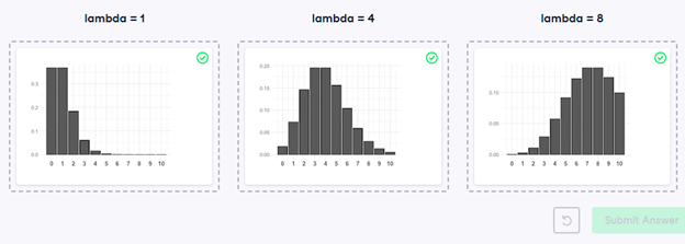
27) Identifying lambda
Now that you’ve learned about the Poisson distribution, you know that its shape is described by a value called lambda. In this exercise, you’ll match histograms to lambda values.
- Match each Poisson distribution to its lambda value.
28) Tracking lead responses
Your company uses sales software to keep track of new sales leads. It organizes them into a queue so that anyone can follow up on one when they have a bit of free time. Since the number of lead responses is a countable outcome over a period of time, this scenario corresponds to a Poisson distribution. On average, Amir responds to 4 leads each day. In this exercise, you’ll calculate probabilities of Amir responding to different numbers of leads.
- Import poisson from scipy.stats and calculate the probability that Amir responds to 5 leads in a day, given that he responds to an average of 4.
# Import poisson from scipy.stats
from scipy.stats import poisson
# Probability of 5 responses
prob_5 = poisson.pmf(5, mu=4)
print(prob_5)
- Amir’s coworker responds to an average of 5.5 leads per day. What is the probability that she answers 5 leads in a day?
# Import poisson from scipy.stats
from scipy.stats import poisson
# Probability of 5 responses
prob_coworker = poisson.pmf(5, mu=5.5)
print(prob_coworker)
- What’s the probability that Amir responds to 2 or fewer leads in a day?
# Import poisson from scipy.stats
from scipy.stats import poisson
# Probability of 2 or fewer responses
prob_2_or_less = poisson.cdf(2, mu=4)
print(prob_2_or_less)
- What’s the probability that Amir responds to more than 10 leads in a day?
# Import poisson from scipy.stats
from scipy.stats import poisson
# Probability of > 10 responses
prob_over_10 = 1 – poisson.cdf(10, mu=4)
print(prob_over_10)
29) Distribution dragging and dropping
By this point, you’ve learned about so many different probability distributions that it can be difficult to remember which is which. In this exercise, you’ll practice distinguishing between distributions and identifying the distribution that best matches different scenarios.
- Match each situation to the distribution that best models it.

30) Modeling time between leads
To further evaluate Amir’s performance, you want to know how much time it takes him to respond to a lead after he opens it. On average, he responds to 1 request every 2.5 hours. In this exercise, you’ll calculate probabilities of different amounts of time passing between Amir receiving a lead and sending a response.
- Import expon from scipy.stats. What’s the probability it takes Amir less than an hour to respond to a lead?
# Import expon from scipy.stats
from scipy.stats import expon
# Print probability response takes < 1 hour
print(expon.cdf(1, scale=2.5))
- What’s the probability it takes Amir more than 4 hours to respond to a lead?
# Import expon from scipy.stats
from scipy.stats import expon
# Print probability response takes > 4 hours
print(1 – expon.cdf(4, scale=2.5))
- What’s the probability it takes Amir 3-4 hours to respond to a lead?
# Import expon from scipy.stats
from scipy.stats import expon
# Print probability response takes 3-4 hours
print(expon.cdf(4, scale=2.5) – expon.cdf(3, scale=2.5))
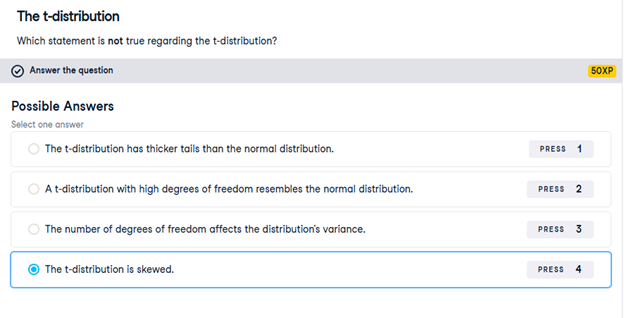
31) The t-distribution
Which statement is not true regarding the t-distribution?
32) Guess the correlation
On the right, use the scatterplot to estimate what the correlation is between the variables x and y. Once you’ve guessed it correctly, use the New Plot button to try out a few more scatterplots. When you’re ready, answer the question below to continue to the next exercise.
Which of the following statements is NOT true about correlation?
If the correlation between x and y has a high magnitude, the data points will be clustered closely around a line.- Correlation can be written as r.
- If x and y are negatively correlated, values of y decrease as values of x increase.
- Correlation cannot be 0.
33) Relationships between variables
In this chapter, you’ll be working with a dataset world_happiness containing results from the 2019 World Happiness Report. The report scores various countries based on how happy people in that country are. It also ranks each country on various societal aspects such as social support, freedom, corruption, and others. The dataset also includes the GDP per capita and life expectancy for each country.
In this exercise, you’ll examine the relationship between a country’s life expectancy (life_exp) and happiness score (happiness_score) both visually and quantitatively. seaborn as sns, matplotlib.pyplot as plt, and pandas as pd are loaded and world_happiness is available.
- Create a scatterplot of happiness_score vs. life_exp (without a trendline) using seaborn.
- Show the plot.
# Create a scatterplot of happiness_score vs. life_exp and show
sns.scatterplot(x=’life_exp’, y=’happiness_score’, data=world_happiness)
# Show plot
plt.show()
- Create a scatterplot of happiness_score vs. life_exp with a linear trendline using seaborn, setting ci to None.
- Show the plot.
# Create scatterplot of happiness_score vs life_exp with trendline
sns.lmplot(x=’life_exp’, y=’happiness_score’, data=world_happiness, ci=None)
# Show plot
plt.show()
Question
Based on the scatterplot, which is most likely the correlation between life_exp and happiness_score?
Possible answers
0.3
-0.3
0.8
-0.8
- Calculate the correlation between life_exp and happiness_score. Save this as cor.
# Create scatterplot of happiness_score vs life_exp with trendline
sns.lmplot(x=’life_exp’, y=’happiness_score’, data=world_happiness, ci=None)
# Show plot
plt.show()
# Correlation between life_exp and happiness_score
cor = world_happiness[‘life_exp’].corr(world_happiness[‘happiness_score’])
print(cor)
34) What can’t correlation measure?
While the correlation coefficient is a convenient way to quantify the strength of a relationship between two variables, it’s far from perfect. In this exercise, you’ll explore one of the caveats of the correlation coefficient by examining the relationship between a country’s GDP per capita (gdp_per_cap) and happiness score.
pandas as pd, matplotlib.pyplot as plt, and seaborn as sns are imported, and world_happiness is loaded.
- Create a seaborn scatterplot (without a trendline) showing the relationship between gdp_per_cap (on the x-axis) and life_exp (on the y-axis).
- Show the plot
# Scatterplot of gdp_per_cap and life_exp
sns.scatterplot(x=’gdp_per_cap’, y=’life_exp’, data=world_happiness)
# Show plot
plt.show()
- Calculate the correlation between gdp_per_cap and life_exp and store as cor.
# Scatterplot of gdp_per_cap and life_exp
sns.scatterplot(x=’gdp_per_cap’, y=’life_exp’, data=world_happiness)
# Show plot
plt.show()
# Correlation between gdp_per_cap and life_exp
cor = world_happiness[‘gdp_per_cap’].corr(world_happiness[‘life_exp’])
print(cor)
Question
The correlation between GDP per capita and life expectancy is 0.7. Why is correlation not the best way to measure the relationship between these two variables?
Possible answers
Correlation measures how one variable affects another.
Correlation only measures linear relationships.
Correlation cannot properly measure relationships between numeric variables.
35) Transforming variables
When variables have skewed distributions, they often require a transformation in order to form a linear relationship with another variable so that correlation can be computed. In this exercise, you’ll perform a transformation yourself.
pandas as pd, numpy as np, matplotlib.pyplot as plt, and seaborn as sns are imported, and world_happiness is loaded.
- Create a scatterplot of happiness_score versus gdp_per_cap and calculate the correlation between them.
# Scatterplot of happiness_score vs. gdp_per_cap
sns.scatterplot(x=’gdp_per_cap’, y=’happiness_score’, data=world_happiness)
plt.show()
# Calculate correlation
cor = world_happiness[‘gdp_per_cap’].corr(world_happiness[‘happiness_score’])
print(cor)
- Add a new column to world_happiness called log_gdp_per_cap that contains the log of gdp_per_cap.
- Create a seaborn scatterplot of happiness_score versus log_gdp_per_cap.
- Calculate the correlation between log_gdp_per_cap and happiness_score.
# Create log_gdp_per_cap column
world_happiness[‘log_gdp_per_cap’] = np.log(world_happiness[‘gdp_per_cap’])
# Scatterplot of happiness_score vs. log_gdp_per_cap
sns.scatterplot(x=’log_gdp_per_cap’, y=’happiness_score’, data=world_happiness)
plt.show()
# Calculate correlation
cor = world_happiness[‘log_gdp_per_cap’].corr(world_happiness[‘happiness_score’])
print(cor)
36) Does sugar improve happiness?
A new column has been added to world_happiness called grams_sugar_per_day, which contains the average amount of sugar eaten per person per day in each country. In this exercise, you’ll examine the effect of a country’s average sugar consumption on its happiness score.
pandas as pd, matplotlib.pyplot as plt, and seaborn as sns are imported, and world_happiness is loaded.
- Create a seaborn scatterplot showing the relationship between grams_sugar_per_day (on the x-axis) and happiness_score (on the y-axis).
- Calculate the correlation between grams_sugar_per_day and happiness_score.
- # Scatterplot of grams_sugar_per_day and happiness_score
- sns.scatterplot(x=’grams_sugar_per_day’, y=’happiness_score’, data=world_happiness)
- plt.show()
- # Correlation between grams_sugar_per_day and happiness_score
- cor = world_happiness[‘grams_sugar_per_day’].corr(world_happiness[‘happiness_score’])
- print(cor)
Question
Based on this data, which statement about sugar consumption and happiness scores is true?
Possible answers
Increased sugar consumption leads to a higher happiness score.
Lower sugar consumption results in a lower happiness score
Increased sugar consumption is associated with a higher happiness score.
Sugar consumption is not related to happiness.
37) Confounders
A study is investigating the relationship between neighborhood residence and lung capacity. Researchers measure the lung capacity of thirty people from neighborhood A, which is located near a highway, and thirty people from neighborhood B, which is not near a highway. Both groups have similar smoking habits and a similar gender breakdown.
Which of the following could be a confounder in this study?

38) Study types
While controlled experiments are ideal, many situations and research questions are not conducive to a controlled experiment. In a controlled experiment, causation can likely be inferred if the control and test groups have similar characteristics and don’t have any systematic difference between them. On the other hand, causation cannot usually be inferred from observational studies, whose results are often misinterpreted as a result.
In this exercise, you’ll practice distinguishing controlled experiments from observational studies.
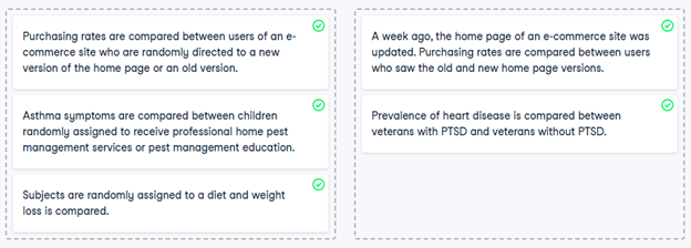
- Determine if each study is a controlled experiment or observational study.
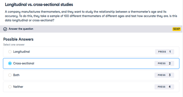
39) Longitudinal vs. cross-sectional studies
A company manufactures thermometers, and they want to study the relationship between a thermometer’s age and its accuracy. To do this, they take a sample of 100 different thermometers of different ages and test how accurate they are. Is this data longitudinal or cross-sectional?
Session 6 – Python Lab 2
1) Which one is the response variable?
Regression lets you predict the values of a response variable from known values of explanatory variables. Which variable you use as the response variable depends on the question you are trying to answer, but in many datasets, there will be an obvious choice for variables that would be interesting to predict. Over the next few exercises, you’ll explore a Taiwan real estate dataset with four variables.
| Variable | Meaning |
| dist_to_mrt_station_m | Distance to nearest MRT metro station, in meters. |
| n_convenience | No. of convenience stores in walking distance. |
| house_age_years | The age of the house, in years, in three groups. |
| price_twd_msq | House price per unit area, in New Taiwan dollars per meter squared. |
Print taiwan_real_estate in the console to view the dataset, and decide which variable would make a good response variable.

2) Visualizing two numeric variables
Before you can run any statistical models, it’s usually a good idea to visualize your dataset. Here, you’ll look at the relationship between house price per area and the number of nearby convenience stores using the Taiwan real estate dataset.
One challenge in this dataset is that the number of convenience stores contains integer data, causing points to overlap. To solve this, you will make the points transparent.
taiwan_real_estate is available as a pandas DataFrame.
- Import the seaborn package, aliased as sns.
- Using taiwan_real_estate, draw a scatter plot of “price_twd_msq” (y-axis) versus “n_convenience” (x-axis).
# Import seaborn with alias sns
import seaborn as sns
# Import matplotlib.pyplot with alias plt
import matplotlib.pyplot as plt
# Draw the scatter plot
sns.scatterplot(x=’n_convenience’, y=’price_twd_msq’, data=taiwan_real_estate, alpha=0.5)
# Show the plot
plt.show()
- Draw a trend line calculated using linear regression. Omit the confidence interval ribbon. Note: The scatter_kws argument, pre-filled in the exercise, makes the data points 50% transparent.
# Import seaborn with alias sns
import seaborn as sns
# Import matplotlib.pyplot with alias plt
import matplotlib.pyplot as plt
# Draw the scatter plot
sns.scatterplot(x=”n_convenience”,
y=”price_twd_msq”,
data=taiwan_real_estate)
# Draw a trend line on the scatter plot of price_twd_msq vs. n_convenience
sns.regplot(x=”n_convenience”,
y=”price_twd_msq”,
data=taiwan_real_estate,
ci=None,
scatter_kws={‘alpha’: 0.5})
# Show the plot
plt.show()
3) Estimate the intercept
Linear regression models always fit a straight line to the data. Straight lines are defined by two properties: their intercept and their slope.
Here, you can see a scatter plot of house price per area versus number of nearby convenience stores, using the Taiwan real estate dataset.
Click the plot, then estimate the intercept of the linear regression trend line.
8.22
4) Estimate the slope
Here is the same scatter plot of house price per area versus number of nearby convenience stores, using the Taiwan real estate dataset.
This time, estimate the slope of the trend line. Click the line once, then double click a different position on the line, and finally, read the slope value.
0.8
5) Linear regression with ols()
While sns.regplot() can display a linear regression trend line, it doesn’t give you access to the intercept and slope as variables, or allow you to work with the model results as variables. That means that sometimes you’ll need to run a linear regression yourself.
Time to run your first model!
taiwan_real_estate is available. TWD is an abbreviation for Taiwan dollars.
In addition, for this exercise and the remainder of the course, the following packages will be imported and aliased if necessary: matplotlib.pyplot as plt, seaborn as sns, and pandas as pd.
- Import the ols() function from the statsmodels.formula.api package.
- Run a linear regression with price_twd_msq as the response variable, n_convenience as the explanatory variable, and taiwan_real_estate as the dataset. Name it mdl_price_vs_conv.
- Fit the model.
- Print the parameters of the fitted model.
# Import the ols function
from statsmodels.formula.api import ols
# Create the model object
mdl_price_vs_conv = ols(‘price_twd_msq ~ n_convenience’, data=taiwan_real_estate)
# Fit the model
mdl_price_vs_conv = mdl_price_vs_conv.fit()
# Print the parameters of the fitted model
print(mdl_price_vs_conv.params)
Question
- The model had an Intercept coefficient of 8.2242. What does this mean?
Possible answers
On average, a house with zero convenience stores nearby had a price of 8.2242 TWD per square meter.
Question
- The model had an Intercept coefficient of 8.2242. What does this mean?
Possible answers
On average, houses had a price of 8.2242 TWD per square meter.
6) Visualizing numeric vs. categorical
If the explanatory variable is categorical, the scatter plot that you used before to visualize the data doesn’t make sense. Instead, a good option is to draw a histogram for each category.
The Taiwan real estate dataset has a categorical variable in the form of the age of each house. The ages have been split into 3 groups: 0 to 15 years, 15 to 30 years, and 30 to 45 years.
taiwan_real_estate is available.
- Using taiwan_real_estate, plot a histogram of price_twd_msq with 10 bins. Split the plot by house_age_years to give 3 panels.
# Histograms of price_twd_msq with 10 bins, split by the age of each house
sns.displot(data=taiwan_real_estate,
x=’price_twd_msq’,
col=’house_age_years’,
bins=10)
# Show the plot
plt.show()
7) Calculating means by category
A good way to explore categorical variables further is to calculate summary statistics for each category. For example, you can calculate the mean and median of your response variable, grouped by a categorical variable. As such, you can compare each category in more detail.
Here, you’ll look at grouped means for the house prices in the Taiwan real estate dataset. This will help you understand the output of a linear regression with a categorical variable.
taiwan_real_estate is available as a pandas DataFrame.
- Group taiwan_real_estate by house_age_years and calculate the mean price (price_twd_msq) for each age group. Assign the result to mean_price_by_age.
- Print the result and inspect the output.
# Calculate the mean of price_twd_msq, grouped by house age
mean_price_by_age = taiwan_real_estate.groupby(‘house_age_years’)[‘price_twd_msq’].mean()
# Print the result
print(mean_price_by_age)
8) Linear regression with a categorical explanatory variable
Great job calculating those grouped means! As mentioned in the last video, the means of each category will also be the coefficients of a linear regression model with one categorical variable. You’ll prove that in this exercise.
To run a linear regression model with categorical explanatory variables, you can use the same code as with numeric explanatory variables. The coefficients returned by the model are different, however. Here you’ll run a linear regression on the Taiwan real estate dataset.
taiwan_real_estate is available and the ols() function is also loaded.
- Run and fit a linear regression with price_twd_msq as the response variable, house_age_years as the explanatory variable, and taiwan_real_estate as the dataset. Assign to mdl_price_vs_age.
- Print its parameters.
# Create the model, fit it
mdl_price_vs_age = ols(‘price_twd_msq ~ house_age_years’, data=taiwan_real_estate).fit()
# Print the parameters of the fitted model
print(mdl_price_vs_age.params)
- Update the model formula so that no intercept is included in the model. Assign to mdl_price_vs_age0.
- Print its parameters.
# Update the model formula to remove the intercept
mdl_price_vs_age0 = ols(“price_twd_msq ~ house_age_years – 1”, data=taiwan_real_estate).fit()
# Print the parameters of the fitted model
print(mdl_price_vs_age0.params)
9) Predicting house prices
Perhaps the most useful feature of statistical models like linear regression is that you can make predictions. That is, you specify values for each of the explanatory variables, feed them to the model, and get a prediction for the corresponding response variable. The code flow is as follows.
explanatory_data = pd.DataFrame({“explanatory_var”: list_of_values})
predictions = model.predict(explanatory_data)
prediction_data = explanatory_data.assign(response_var=predictions)
Here, you’ll make predictions for the house prices in the Taiwan real estate dataset.
taiwan_real_estate is available. The fitted linear regression model of house price versus number of convenience stores is available as mdl_price_vs_conv. For future exercises, when a model is available, it will also be fitted.
- Import the numpy package using the alias np.
- Create a DataFrame of explanatory data, where the number of convenience stores, n_convenience, takes the integer values from zero to ten.
- Print explanatory_data.
# Import numpy with alias np
import numpy as np
# Create the explanatory_data
explanatory_data = pd.DataFrame({‘n_convenience’: np.arange(0, 11)})
# Print it
print(explanatory_data)
- Use the model mdl_price_vs_conv to make predictions from explanatory_data and store it as price_twd_msq.
- Print the predictions.
# Import numpy with alias np
import numpy as np
# Create explanatory_data
explanatory_data = pd.DataFrame({‘n_convenience’: np.arange(0, 11)})
# Use mdl_price_vs_conv to predict with explanatory_data, call it price_twd_msq
price_twd_msq = mdl_price_vs_conv.predict(explanatory_data)
# Print it
print(price_twd_msq)
- Create a DataFrame of predictions named prediction_data. Start with explanatory_data, then add an extra column, price_twd_msq, containing the predictions you created in the previous step.
# Import numpy with alias np
import numpy as np
# Create explanatory_data
explanatory_data = pd.DataFrame({‘n_convenience’: np.arange(0, 11)})
# Use mdl_price_vs_conv to predict with explanatory_data, call it price_twd_msq
price_twd_msq = mdl_price_vs_conv.predict(explanatory_data)
# Create prediction_data
prediction_data = explanatory_data.assign(price_twd_msq=price_twd_msq)
# Print the result
print(prediction_data)
# Print the result
print(prediction_data)
10) Visualizing predictions
The prediction DataFrame you created contains a column of explanatory variable values and a column of response variable values. That means you can plot it on the same scatter plot of response versus explanatory data values.
prediction_data is available. The code for the plot you created using sns.regplot() in Chapter 1 is shown.
- Create a new figure to plot multiple layers.
- Extend the plotting code to add points for the predictions in prediction_data. Color the points red.
- Display the layered plot.
# Create a new figure, fig
fig = plt.figure()
# Original regression plot
sns.regplot(x=”n_convenience”,
y=”price_twd_msq”,
data=taiwan_real_estate,
ci=None)
# Add a scatter plot layer for the predictions, colored red
sns.scatterplot(x=”n_convenience”,
y=”price_twd_msq”,
data=prediction_data,
color=”red”)
# Show the layered plot
plt.show()
11) The limits of prediction
In the last exercise, you made predictions on some sensible, could-happen-in-real-life, situations. That is, the cases when the number of nearby convenience stores were between zero and ten. To test the limits of the model’s ability to predict, try some impossible situations.
Use the console to try predicting house prices from mdl_price_vs_conv when there are -1 convenience stores. Do the same for 2.5 convenience stores. What happens in each case?
mdl_price_vs_conv is available.
- Create some impossible explanatory data. Define a DataFrame impossible with one column, n_convenience, set to -1 in the first row, and 2.5 in the second row.
- # Define a DataFrame impossible
- impossible = pd.DataFrame({‘n_convenience’: [-1, 2.5]})
- # Print to check
- print(impossible)
Question
Try making predictions on your two impossible cases. What happens?
Possible answers
The model successfully gives a prediction about cases that are impossible in real life.
12) Extracting model elements
The model object created by ols() contains many elements. In order to perform further analysis on the model results, you need to extract its useful bits. The model coefficients, the fitted values, and the residuals are perhaps the most important pieces of the linear model object.
mdl_price_vs_conv is available.
- Print the parameters of mdl_price_vs_conv.
# Print the model parameters of mdl_price_vs_conv
print(mdl_price_vs_conv.params)
- Print the fitted values of mdl_price_vs_conv.
# Print the fitted values of mdl_price_vs_conv
print(mdl_price_vs_conv.fittedvalues)
- Print the residuals of mdl_price_vs_conv.
# Print the residuals of mdl_price_vs_conv
print(mdl_price_vs_conv.resid)
- Print a summary of mdl_price_vs_conv.
# Print a summary of mdl_price_vs_conv
print(mdl_price_vs_conv.summary())
13) Manually predicting house prices
You can manually calculate the predictions from the model coefficients. When making predictions in real life, it is better to use .predict(), but doing this manually is helpful to reassure yourself that predictions aren’t magic – they are simply arithmetic.
In fact, for a simple linear regression, the predicted value is just the intercept plus the slope times the explanatory variable.

mdl_price_vs_conv and explanatory_data are available.
- Get the coefficients/parameters of mdl_price_vs_conv, assigning to coeffs.
- Get the intercept, which is the first element of coeffs, assigning to intercept.
- Get the slope, which is the second element of coeffs, assigning to slope.
- Manually predict price_twd_msq using the formula, specifying the intercept, slope, and explanatory_data.
- Run the code to compare your manually calculated predictions to the results from .predict().
# Get the coefficients of mdl_price_vs_conv
coeffs = mdl_price_vs_conv.params
# Get the intercept
intercept = coeffs[0]
# Get the slope
slope = coeffs[1]
# Manually calculate the predictions
price_twd_msq = intercept + slope * explanatory_data
print(price_twd_msq)
# Compare to the results from .predict()
print(price_twd_msq.assign(predictions_auto=mdl_price_vs_conv.predict(explanatory_data)))
14) Home run!
Regression to the mean is an important concept in many areas, including sports.
Here you can see a dataset of baseball batting data in 2017 and 2018. Each point represents a player, and more home runs are better. A naive prediction might be that the performance in 2018 is the same as the performance in 2017. That is, a linear regression would lie on the “y equals x” line.
Explore the plot and make predictions. What does regression to the mean say about the number of home runs in 2018 for a player who was very successful in 2017?
Someone who hit 40 home runs in 2017 is predicted to hit 10 fewer home runs the next year because regression to the mean states that, on average, extremely high values are not sustained.
15) Plotting consecutive portfolio returns
Regression to the mean is also an important concept in investing. Here you’ll look at the annual returns from investing in companies in the Standard and Poor 500 index (S&P 500), in 2018 and 2019.
The sp500_yearly_returns dataset contains three columns:
| variable | meaning |
| symbol | Stock ticker symbol uniquely identifying the company. |
| return_2018 | A measure of investment performance in 2018. |
| return_2019 | A measure of investment performance in 2019. |
A positive number for the return means the investment increased in value; negative means it lost value.
Just as with baseball home runs, a naive prediction might be that the investment performance stays the same from year to year, lying on the y equals x line.
sp500_yearly_returns is available as a pandas DataFrame.
- Create a new figure, fig, to enable plot layering.
- Generate a line at y equals x. This has been done for you.
- Using sp500_yearly_returns, draw a scatter plot of return_2019 vs. return_2018 with a linear regression trend line, without a standard error ribbon.
- Set the axes so that the distances along the x and y axes look the same.
# Create a new figure, fig
fig = plt.figure()
# Plot the first layer: y = x
plt.axline(xy1=(0, 0), slope=1, linewidth=2, color=”green”)
# Add scatter plot with linear regression trend line
sns.regplot(x=’return_2018′, y=’return_2019′, data=sp500_yearly_returns, ci=None)
# Set the axes so that the distances along the x and y axes look the same
plt.axis(‘equal’)
# Show the plot
plt.show()
16) Modeling consecutive returns
Let’s quantify the relationship between returns in 2019 and 2018 by running a linear regression and making predictions. By looking at companies with extremely high or extremely low returns in 2018, we can see if their performance was similar in 2019.
sp500_yearly_returns is available and ols() is loaded.
- Run a linear regression on return_2019 versus return_2018 using sp500_yearly_returns and fit the model. Assign to mdl_returns.
- Print the parameters of the model.
# Run a linear regression on return_2019 vs. return_2018 using sp500_yearly_returns
mdl_returns = ols(“return_2019 ~ return_2018”, data=sp500_yearly_returns).fit()
# Print the parameters
print(mdl_returns.params)
- Create a DataFrame named explanatory_data. Give it one column (return_2018) with 2018 returns set to a list containing -1, 0, and 1.
- Use mdl_returns to predict with explanatory_data in a print() call.
# Run a linear regression on return_2019 vs. return_2018 using sp500_yearly_returns
mdl_returns = ols(“return_2019 ~ return_2018”, data=sp500_yearly_returns).fit()
# Create a DataFrame with return_2018 at -1, 0, and 1
explanatory_data = pd.DataFrame({“return_2018”: [-1, 0, 1]})
# Use mdl_returns to predict with explanatory_data
print(mdl_returns.predict(explanatory_data))
17) Transforming the explanatory variable
If there is no straight-line relationship between the response variable and the explanatory variable, it is sometimes possible to create one by transforming one or both of the variables. Here, you’ll look at transforming the explanatory variable.
You’ll take another look at the Taiwan real estate dataset, this time using the distance to the nearest MRT (metro) station as the explanatory variable. You’ll use code to make every commuter’s dream come true: shortening the distance to the metro station by taking the square root. Take that, geography!
taiwan_real_estate is available.
- Look at the plot.
- Add a new column to taiwan_real_estate called sqrt_dist_to_mrt_m that contains the square root of dist_to_mrt_m.
- Create the same scatter plot as the first one, but use the new transformed variable on the x-axis instead.
- Look at the new plot. Notice how the numbers on the x-axis have changed. This is a different line to what was shown before. Do the points track the line more closely?
# Create sqrt_dist_to_mrt_m
taiwan_real_estate[“sqrt_dist_to_mrt_m”] = np.sqrt(taiwan_real_estate[“dist_to_mrt_m”])
plt.figure()
# Plot using the transformed variable
sns.regplot(x=”sqrt_dist_to_mrt_m”,
y=”price_twd_msq”,
data=taiwan_real_estate,
ci=None)
plt.show()
- Run a linear regression of price_twd_msq versus the square root of dist_to_mrt_m using taiwan_real_estate.
- Print the parameters.
# Create sqrt_dist_to_mrt_m
taiwan_real_estate[“sqrt_dist_to_mrt_m”] = np.sqrt(taiwan_real_estate[“dist_to_mrt_m”])
# Run a linear regression of price_twd_msq vs. square root of dist_to_mrt_m
mdl_price_vs_dist = ols(“price_twd_msq ~ sqrt_dist_to_mrt_m”, data=taiwan_real_estate).fit()
# Print the parameters
print(mdl_price_vs_dist.params)
- Create a DataFrame of predictions named prediction_data by adding a column of predictions called price_twd_msq to explanatory_data. Predict using mdl_price_vs_dist and explanatory_data.
- Print the predictions.
# Create sqrt_dist_to_mrt_m
taiwan_real_estate[“sqrt_dist_to_mrt_m”] = np.sqrt(taiwan_real_estate[“dist_to_mrt_m”])
# Run a linear regression of price_twd_msq vs. sqrt_dist_to_mrt_m
mdl_price_vs_dist = ols(“price_twd_msq ~ sqrt_dist_to_mrt_m”, data=taiwan_real_estate).fit()
explanatory_data = pd.DataFrame({“sqrt_dist_to_mrt_m”: np.sqrt(np.arange(0, 81, 10) ** 2),
“dist_to_mrt_m”: np.arange(0, 81, 10) ** 2})
# Create prediction_data by adding a column of predictions to explanatory_data
prediction_data = explanatory_data.assign(
price_twd_msq = mdl_price_vs_dist.predict(explanatory_data)
)
# Print the result
print(prediction_data)
- Add a layer to your plot containing points from prediction_data, colored “red”.
# Create sqrt_dist_to_mrt_m
taiwan_real_estate[“sqrt_dist_to_mrt_m”] = np.sqrt(taiwan_real_estate[“dist_to_mrt_m”])
# Run a linear regression of price_twd_msq vs. sqrt_dist_to_mrt_m
mdl_price_vs_dist = ols(“price_twd_msq ~ sqrt_dist_to_mrt_m”, data=taiwan_real_estate).fit()
# Use this explanatory data
explanatory_data = pd.DataFrame({“sqrt_dist_to_mrt_m”: np.sqrt(np.arange(0, 81, 10) ** 2),
“dist_to_mrt_m”: np.arange(0, 81, 10) ** 2})
# Use mdl_price_vs_dist to predict explanatory_data
prediction_data = explanatory_data.assign(
price_twd_msq = mdl_price_vs_dist.predict(explanatory_data)
)
fig = plt.figure()
sns.regplot(x=”sqrt_dist_to_mrt_m”, y=”price_twd_msq”, data=taiwan_real_estate, ci=None)
# Add a layer of your prediction points
sns.scatterplot(x=”sqrt_dist_to_mrt_m”,
y=”price_twd_msq”,
data=prediction_data,
color=”red”)
plt.show()
18) Transforming the response variable too
The response variable can be transformed too, but this means you need an extra step at the end to undo that transformation. That is, you “back transform” the predictions.
In the video, you saw the first step of the digital advertising workflow: spending money to buy ads, and counting how many people see them (the “impressions”). The next step is determining how many people click on the advert after seeing it.
ad_conversion is available as a pandas DataFrame.
- Look at the plot.
- Create a qdrt_n_impressions column using n_impressions raised to the power of 0.25.
- Create a qdrt_n_clicks column using n_clicks raised to the power of 0.25.
- Create a regression plot using the transformed variables. Do the points track the line more closely?
# Create qdrt_n_impressions and qdrt_n_clicks
ad_conversion[“qdrt_n_impressions”] = ad_conversion[“n_impressions”] ** 0.25
ad_conversion[“qdrt_n_clicks”] = ad_conversion[“n_clicks”] ** 0.25
plt.figure()
# Plot using the transformed variables
sns.regplot(x=”qdrt_n_impressions”, y=”qdrt_n_clicks”, data=ad_conversion)
plt.show()
- Run a linear regression of qdrt_n_clicks versus qdrt_n_impressions using ad_conversion and assign it to mdl_click_vs_impression.
ad_conversion[“qdrt_n_impressions”] = ad_conversion[“n_impressions”] ** 0.25
ad_conversion[“qdrt_n_clicks”] = ad_conversion[“n_clicks”] ** 0.25
from statsmodels.formula.api import ols
# Run a linear regression of qdrt_n_clicks vs qdrt_n_impressions
mdl_click_vs_impression = ols(“qdrt_n_clicks ~ qdrt_n_impressions”, data=ad_conversion).fit()
- Complete the code to create the prediction data.
ad_conversion[“qdrt_n_impressions”] = ad_conversion[“n_impressions”] ** 0.25
ad_conversion[“qdrt_n_clicks”] = ad_conversion[“n_clicks”] ** 0.25
mdl_click_vs_impression = ols(“qdrt_n_clicks ~ qdrt_n_impressions”, data=ad_conversion, ci=None).fit()
explanatory_data = pd.DataFrame({“qdrt_n_impressions”: np.arange(0, 3e6+1, 5e5) ** .25,
“n_impressions”: np.arange(0, 3e6+1, 5e5)})
# Complete prediction_data
prediction_data = explanatory_data.assign(
qdrt_n_clicks = mdl_click_vs_impression.predict(explanatory_data)
)
# Print the result
print(prediction_data)
19) Back transformation
In the previous exercise, you transformed the response variable, ran a regression, and made predictions. But you’re not done yet! In order to correctly interpret and visualize your predictions, you’ll need to do a back-transformation.
prediction_data, which you created in the previous exercise, is available.
- Back transform the response variable in prediction_data by raising qdrt_n_clicks to the power 4 to get n_clicks.
# Back transform qdrt_n_clicks
prediction_data[“n_clicks”] = prediction_data[“qdrt_n_clicks”] ** 4
print(prediction_data)
- Edit the plot to add a layer of points from prediction_data, colored “red”.
# Back transform qdrt_n_clicks
prediction_data[“n_clicks”] = prediction_data[“qdrt_n_clicks”] ** 4
# Plot the transformed variables
fig = plt.figure()
sns.regplot(x=”qdrt_n_impressions”, y=”qdrt_n_clicks”, data=ad_conversion, ci=None)
# Add a layer of your prediction points
sns.scatterplot(x=”qdrt_n_impressions”, y=”qdrt_n_clicks”, data=prediction_data, color=”red”)
plt.show()
20) Coefficient of determination
The coefficient of determination is a measure of how well the linear regression line fits the observed values. For simple linear regression, it is equal to the square of the correlation between the explanatory and response variables.
Here, you’ll take another look at the second stage of the advertising pipeline: modeling the click response to impressions. Two models are available: mdl_click_vs_impression_orig models n_clicks versus n_impressions. mdl_click_vs_impression_trans is the transformed model you saw in Chapter 2. It models n_clicks to the power of 0.25 versus n_impressions to the power of 0.25.
- Print the summary of mdl_click_vs_impression_orig.
- Do the same for mdl_click_vs_impression_trans.
- # Print a summary of mdl_click_vs_impression_orig
- print(mdl_click_vs_impression_orig.summary())
- # Print a summary of mdl_click_vs_impression_trans
- print(mdl_click_vs_impression_trans.summary())
- Print the coefficient of determination for mdl_click_vs_impression_orig.
- Do the same for mdl_click_vs_impression_trans.
- # Print the coeff of determination for mdl_click_vs_impression_orig
- print(mdl_click_vs_impression_orig.rsquared)
- # Print the coeff of determination for mdl_click_vs_impression_trans
- print(mdl_click_vs_impression_trans.rsquared)
Question
mdl_click_vs_impression_orig has a coefficient of determination of 0.89. Which statement about the model is true?
Possible answers
The number of impressions explains 89% of the variability in the number of clicks.
Question
Which model does the coefficient of determination suggest gives a better fit?
Possible answers
The transformed model, mdl_click_vs_impression_trans.
21) Residual standard error
Residual standard error (RSE) is a measure of the typical size of the residuals. Equivalently, it’s a measure of how wrong you can expect predictions to be. Smaller numbers are better, with zero being a perfect fit to the data.
Again, you’ll look at the models from the advertising pipeline, mdl_click_vs_impression_orig and mdl_click_vs_impression_trans.
- Calculate the MSE of mdl_click_vs_impression_orig, assigning to mse_orig.
- Using mse_orig, calculate and print the RSE of mdl_click_vs_impression_orig.
- Do the same for mdl_click_vs_impression_trans.
# Calculate mse_orig for mdl_click_vs_impression_orig
mse_orig = mdl_click_vs_impression_orig.mse_resid
# Calculate rse_orig for mdl_click_vs_impression_orig and print it
rse_orig = np.sqrt(mse_orig)
print(“RSE of original model: “, rse_orig)
# Calculate mse_trans for mdl_click_vs_impression_trans
mse_trans = mdl_click_vs_impression_trans.mse_resid
# Calculate rse_trans for mdl_click_vs_impression_trans and print it
rse_trans = np.sqrt(mse_trans)
print(“RSE of transformed model: “, rse_trans)
Question
mdl_click_vs_impression_orig has an RSE of about 20. Which statement is true?
Possible answers
The typical difference between observed number of clicks and predicted number of clicks is 20.
Question
Which model does the RSE suggest gives more accurate predictions? mdl_click_vs_impression_orig has an RSE of about 20, mdl_click_vs_impression_trans has an RSE of about 0.2.
Possible answers
The transformed model, mdl_click_vs_impression_trans.
22) Residuals vs. fitted values
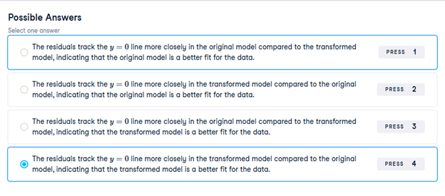
Here you can see diagnostic plots of residuals versus fitted values for two models on advertising conversion.
Original model (n_clicks versus n_impressions):
Transformed model (n_clicks ** 0.25 versus n_impressions ** 0.25):
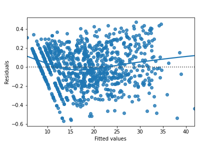
Look at the numbers on the y-axis scales and how well the trend lines follow the line. Which statement is true?
23) Q-Q plot of residuals
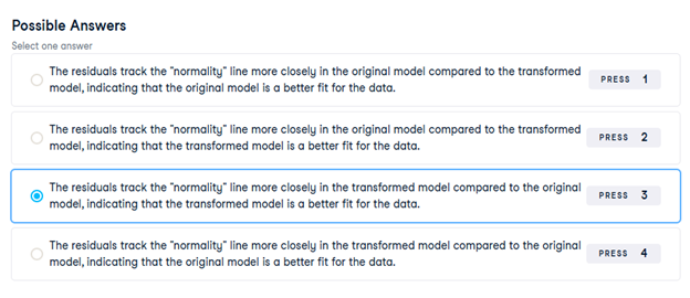
Here are normal Q-Q plots of the previous two models.
Original model (n_clicks versus n_impressions):
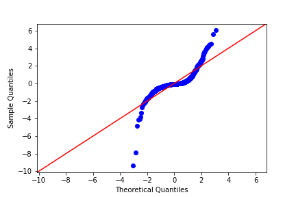
Transformed model (n_clicks ** 0.25 versus n_impressions ** 0.25):
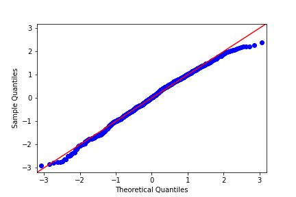
Look at how well the points track the “normality” line. Which statement is true?
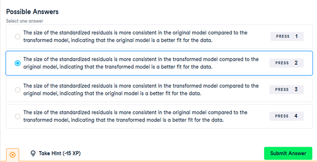
24) Scale-location
Here are normal scale-location plots of the previous two models. That is, they show the size of residuals versus fitted values.
Original model (n_clicks versus n_impressions):

Transformed model (n_clicks ** 0.25 versus n_impressions ** 0.25):

Look at the numbers on the y-axis and the slope of the trend line. Which statement is true?
25) Drawing diagnostic plots
It’s time for you to draw these diagnostic plots yourself using the Taiwan real estate dataset and the model of house prices versus number of convenience stores.
taiwan_real_estate is available as a pandas DataFrame and mdl_price_vs_conv is available.
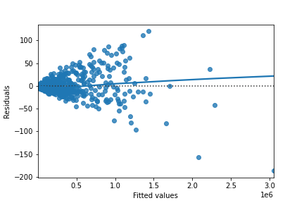
- Create the residuals versus fitted values plot. Add a lowess argument to visualize the trend of the residuals.
# Plot the residuals vs. fitted values
sns.residplot(x=”n_convenience”, y=”price_twd_msq”, data=taiwan_real_estate, lowess=True)
plt.xlabel(“Fitted values”)
plt.ylabel(“Residuals”)
# Show the plot
plt.show()
- Import qqplot() from statsmodels.api.
- Create the Q-Q plot of the residuals.
# Import qqplot
from statsmodels.api import qqplot
# Create the Q-Q plot of the residuals
qqplot(data=mdl_price_vs_conv.resid, fit=True, line=”45″)
# Show the plot
plt.show()
- Create the scale-location plot.
# Preprocessing steps
model_norm_residuals = mdl_price_vs_conv.get_influence().resid_studentized_internal
model_norm_residuals_abs_sqrt = np.sqrt(np.abs(model_norm_residuals))
# Create the scale-location plot
sns.regplot(x=mdl_price_vs_conv.fittedvalues, y=model_norm_residuals_abs_sqrt, ci=None, lowess=True)
plt.xlabel(“Fitted values”)
plt.ylabel(“Sqrt of abs val of stdized residuals”)
# Show the plot
plt.show()
26) Leverage
Leverage measures how unusual or extreme the explanatory variables are for each observation. Very roughly, high leverage means that the explanatory variable has values that are different from other points in the dataset. In the case of simple linear regression, where there is only one explanatory value, this typically means values with a very high or very low explanatory value.
Here, you’ll look at highly leveraged values in the model of house price versus the square root of distance from the nearest MRT station in the Taiwan real estate dataset.
Guess which observations you think will have a high leverage, then move the slider to find out.
Which statement is true?
Observations with a large distance to the nearest MRT station have the highest leverage, because most of the observations have a short distance, so long distances are more extreme.
27) Influence
Influence measures how much a model would change if each observation was left out of the model calculations, one at a time. That is, it measures how different the prediction line would look if you would run a linear regression on all data points except that point, compared to running a linear regression on the whole dataset.
The standard metric for influence is Cook’s distance, which calculates influence based on the residual size and the leverage of the point.
You can see the same model as last time: house price versus the square root of distance from the nearest MRT station in the Taiwan real estate dataset.
Guess which observations you think will have a high influence, then move the slider to find out.
Which statement is true?
Observations far away from the trend line have high influence, because they have large residuals and are far away from other observations.
28) Extracting leverage and influence
In the last few exercises, you explored which observations had the highest leverage and influence. Now you’ll extract those values from the model.
mdl_price_vs_dist and taiwan_real_estate are available.
- Get the summary frame from mdl_price_vs_dist and save as summary_info.
# Create summary_info
summary_info = mdl_price_vs_dist.get_influence().summary_frame()
- Add the hat_diag column of summary_info to taiwan_real_estate as the leverage column.
- Sort taiwan_real_estate by leverage in descending order and print the head.
# Create summary_info
summary_info = mdl_price_vs_dist.get_influence().summary_frame()
# Add the hat_diag column to taiwan_real_estate, name it leverage
taiwan_real_estate[“leverage”] = summary_info[“hat_diag”]
# Sort taiwan_real_estate by leverage in descending order and print the head
print(taiwan_real_estate.sort_values(by=”leverage”, ascending=False).head())
- Add the cooks_d column from summary_info to taiwan_real_estate as the cooks_dist column.
- Sort taiwan_real_estate by cooks_dist in descending order and print the head.
# Create summary_info
summary_info = mdl_price_vs_dist.get_influence().summary_frame()
# Add the hat_diag column to taiwan_real_estate, name it leverage
taiwan_real_estate[“leverage”] = summary_info[“hat_diag”]
# Add the cooks_d column to taiwan_real_estate, name it cooks_dist
taiwan_real_estate[“cooks_dist”] = summary_info[“cooks_d”]
# Sort taiwan_real_estate by cooks_dist in descending order and print the head.
print(taiwan_real_estate.sort_values(by=”cooks_dist”, ascending=False).head())
29) Exploring the explanatory variables
When the response variable is logical, all the points lie on the and
lines, making it difficult to see what is happening. In the video, until you saw the trend line, it wasn’t clear how the explanatory variable was distributed on each line. This can be solved with a histogram of the explanatory variable, grouped by the response.
You will use these histograms to get to know the financial services churn dataset seen in the video.
churn is available as a pandas DataFrame.
- In a sns.displot() call on the churn data, plot time_since_last_purchase as two histograms, split for each has_churned value.
# Create the histograms of time_since_last_purchase split by has_churned
sns.displot(data=churn, x=”time_since_last_purchase”, col=”has_churned”, bins=20, kde=False)
plt.show()
- Redraw the histograms using the time_since_first_purchase column, split for each has_churned value.
# Redraw the plot with time_since_first_purchase
sns.displot(data=churn, x=”time_since_first_purchase”, col=”has_churned”, bins=20, kde=False)
plt.show()
30) Visualizing linear and logistic models
As with linear regressions, regplot() will draw model predictions for a logistic regression without you having to worry about the modeling code yourself. To see how the predictions differ for linear and logistic regressions, try drawing both trend lines side by side. Spoiler: you should see a linear (straight line) trend from the linear model, and a logistic (S-shaped) trend from the logistic model.
churn is available.
- Using churn, plot has_churned versus time_since_first_purchase as a scatter plot with a red linear regression trend line (without a standard error ribbon).
# Draw a linear regression trend line and a scatter plot of time_since_first_purchase vs. has_churned
sns.regplot(x=”time_since_first_purchase”,
y=”has_churned”,
data=churn,
ci=None,
line_kws={“color”: “red”})
plt.show()
- Using churn, plot has_churned versus time_since_first_purchase as a scatter plot with a blue logistic regression trend line (without a standard error ribbon).
# Draw a linear regression trend line and a scatter plot of time_since_first_purchase vs. has_churned
sns.regplot(x=”time_since_first_purchase”,
y=”has_churned”,
data=churn,
ci=None,
line_kws={“color”: “red”})
# Draw a logistic regression trend line and a scatter plot of time_since_first_purchase vs. has_churned
sns.regplot(x=”time_since_first_purchase”,
y=”has_churned”,
data=churn,
ci=None,
logistic=True,
line_kws={“color”: “blue”})
plt.show()
31) Logistic regression with logit()
Logistic regression requires another function from statsmodels.formula.api: logit(). It takes the same arguments as ols(): a formula and data argument. You then use .fit() to fit the model to the data.
Here, you’ll model how the length of relationship with a customer affects churn.
churn is available.
- Import the logit() function from statsmodels.formula.api.
- Fit a logistic regression of has_churned versus time_since_first_purchase using the churn dataset. Assign to mdl_churn_vs_relationship.
- Print the parameters of the fitted model.
# Import logit
from statsmodels.formula.api import logit
# Fit a logistic regression of churn vs. length of relationship using the churn dataset
mdl_churn_vs_relationship = logit(“has_churned ~ time_since_first_purchase”, data=churn).fit()
# Print the parameters of the fitted model
print(mdl_churn_vs_relationship.params)
32) Probabilities
There are four main ways of expressing the prediction from a logistic regression model – we’ll look at each of them over the next four exercises. Firstly, since the response variable is either “yes” or “no”, you can make a prediction of the probability of a “yes”. Here, you’ll calculate and visualize these probabilities.
Two variables are available:
- mdl_churn_vs_relationship is the fitted logistic regression model of has_churned versus time_since_first_purchase.
- explanatory_data is a DataFrame of explanatory values.
- Create a DataFrame, prediction_data, by assigning a column has_churned to explanatory_data.
- In the has_churned column, store the predictions of the probability of churning: use the model, mdl_churn_vs_relationship, and the explanatory data, explanatory_data.
- Print the first five lines of the prediction DataFrame.
# Create prediction_data with predicted probabilities
prediction_data = explanatory_data.assign(
has_churned = mdl_churn_vs_relationship.predict(explanatory_data)
)
# Print the first five rows
print(prediction_data.head())
- Create a scatter plot with a logistic trend line of has_churned versus time_since_first_purchase.
- Overlay the plot with the points from prediction_data, colored red.
# Create prediction_data
prediction_data = explanatory_data.assign(
has_churned = mdl_churn_vs_relationship.predict(explanatory_data)
)
fig = plt.figure()
# Create a scatter plot with logistic trend line
sns.regplot(x=”time_since_first_purchase”,
y=”has_churned”,
data=churn,
ci=None,
logistic=True)
# Overlay with prediction_data, colored red
sns.scatterplot(x=”time_since_first_purchase”,
y=”has_churned”,
data=prediction_data,
color=”red”)
plt.show()
33) Most likely outcome
When explaining your results to a non-technical audience, you may wish to side-step talking about probabilities and simply explain the most likely outcome. That is, rather than saying there is a 60% chance of a customer churning, you say that the most likely outcome is that the customer will churn. The trade-off here is easier interpretation at the cost of nuance.
mdl_churn_vs_relationship, explanatory_data, and prediction_data are available from the previous exercise.
- Update prediction_data to add a column of the most likely churn outcome, most_likely_outcome.
- Print the first five lines of prediction_data.
# Update prediction data by adding most_likely_outcome
prediction_data[“most_likely_outcome”] = np.round(prediction_data[“has_churned”])
# Print the head
print(prediction_data.head())
- The code for creating a scatter plot with logistic trend line has been added from a previous exercise.
- Overlay the plot with prediction_data with red data points, with most_likely_outcome on the y-axis.
# Update prediction data by adding most_likely_outcome
prediction_data[“most_likely_outcome”] = np.round(prediction_data[“has_churned”])
fig = plt.figure()
# Create a scatter plot with logistic trend line (from previous exercise)
sns.regplot(x=”time_since_first_purchase”,
y=”has_churned”,
data=churn,
ci=None,
logistic=True)
# Overlay with prediction_data, colored red
sns.scatterplot(x=”time_since_first_purchase”,
y=”most_likely_outcome”,
data=prediction_data,
color=”red”)
plt.show()
34) Odds ratio
Odds ratios compare the probability of something happening with the probability of it not happening. This is sometimes easier to reason about than probabilities, particularly when you want to make decisions about choices. For example, if a customer has a 20% chance of churning, it may be more intuitive to say “the chance of them not churning is four times higher than the chance of them churning”.
mdl_churn_vs_relationship, explanatory_data, and prediction_data are available from the previous exercise.
- Update prediction_data to add a column, odds_ratio, of the odds ratios.
- Print the first five lines of prediction_data.
# Update prediction data with odds_ratio
prediction_data[“odds_ratio”] = prediction_data[“has_churned”] / (1 – prediction_data[“has_churned”])
# Print the head
print(prediction_data.head())
- Using prediction_data, draw a line plot of odds_ratio versus time_since_first_purchase.
- Some code for preparing the final plot has already been added.
# Update prediction data with odds_ratio
prediction_data[“odds_ratio”] = prediction_data[“has_churned”] / (1 – prediction_data[“has_churned”])
fig = plt.figure()
# Create a line plot of odds_ratio vs time_since_first_purchase
sns.lineplot(x=”time_since_first_purchase”, y=”odds_ratio”, data=prediction_data)
# Add a dotted horizontal line at odds_ratio = 1
plt.axhline(y=1, linestyle=”dotted”)
plt.show()
35) Log odds ratio
One downside to probabilities and odds ratios for logistic regression predictions is that the prediction lines for each are curved. This makes it harder to reason about what happens to the prediction when you make a change to the explanatory variable. The logarithm of the odds ratio (the “log odds ratio” or “logit”) does have a linear relationship between predicted response and explanatory variable. That means that as the explanatory variable changes, you don’t see dramatic changes in the response metric – only linear changes.
Since the actual values of log odds ratio are less intuitive than (linear) odds ratio, for visualization purposes it’s usually better to plot the odds ratio and apply a log transformation to the y-axis scale.
mdl_churn_vs_relationship, explanatory_data, and prediction_data are available from the previous exercise.
- Update prediction_data to add a log_odds_ratio column derived from odds_ratio.
- Print the first five lines of prediction_data.
# Update prediction data with log_odds_ratio
prediction_data[“log_odds_ratio”] = np.log(prediction_data[“odds_ratio”])
# Print the head
print(prediction_data.head())
- Update the code for the line plot to plot log_odds_ratio versus time_since_first_purchase.
# Update prediction data with log_odds_ratio
prediction_data[“log_odds_ratio”] = np.log(prediction_data[“odds_ratio”])
fig = plt.figure()
# Update the line plot: log_odds_ratio vs. time_since_first_purchase
sns.lineplot(x=”time_since_first_purchase”,
y=”log_odds_ratio”,
data=prediction_data)
# Add a dotted horizontal line at log_odds_ratio = 0
plt.axhline(y=0, linestyle=”dotted”)
plt.show()
36) Calculating the confusion matrix
A confusion matrix (occasionally called a confusion table) is the basis of all performance metrics for models with a categorical response (such as a logistic regression). It contains the counts of each actual response-predicted response pair. In this case, where there are two possible responses (churn or not churn), there are four overall outcomes.
- True positive: The customer churned and the model predicted they would.
- False positive: The customer didn’t churn, but the model predicted they would.
- True negative: The customer didn’t churn and the model predicted they wouldn’t.
- False negative: The customer churned, but the model predicted they wouldn’t.
churn and mdl_churn_vs_relationship are available.
- Get the actual responses by subsetting the has_churned column of the dataset. Assign to actual_response.
- Get the “most likely” predicted responses from the model. Assign to predicted_response.
- Create a DataFrame from actual_response and predicted_response. Assign to outcomes.
- Print outcomes as a table of counts, representing the confusion matrix. This has been done for you.
# Get the actual responses
actual_response = churn[“has_churned”]
# Get the predicted responses
predicted_response = np.round(mdl_churn_vs_relationship.predict(churn))
# Create outcomes as a DataFrame of both Series
outcomes = pd.DataFrame({“actual_response”: actual_response,
“predicted_response”: predicted_response})
# Print the outcomes
print(outcomes.value_counts(sort=False))
37) Drawing a mosaic plot of the confusion matrix
While calculating the performance matrix might be fun, it would become tedious if you needed multiple confusion matrices of different models. Luckily, the .pred_table() method can calculate the confusion matrix for you.
Additionally, you can use the output from the .pred_table() method to visualize the confusion matrix, using the mosaic() function.
churn and mdl_churn_vs_relationship are available.
- Import the mosaic() function from statsmodels.graphics.mosaicplot.
- Create conf_matrix using the .pred_table() method and print it.
- Draw a mosaic plot of the confusion matrix.
# Import mosaic from statsmodels.graphics.mosaicplot
from statsmodels.graphics.mosaicplot import mosaic
# Calculate the confusion matrix conf_matrix
conf_matrix = mdl_churn_vs_relationship.pred_table()
# Print it
print(conf_matrix)
# Draw a mosaic plot of conf_matrix
mosaic(conf_matrix)
plt.show()
38) Accuracy, sensitivity, specificity
Lots of performance metrics can be computed from a confusion matrix. For logistic regression, three of them in particular are important: accuracy, sensitivity, and specificity. Can you identify what each of those terms mean in the context of the churn model?
- Match the definition of the churn model performance metric to the name of that metric.

39) Measuring logistic model performance
As you know by now, several metrics exist for measuring the performance of a logistic regression model. In this last exercise, you’ll manually calculate accuracy, sensitivity, and specificity. Recall the following definitions:
Accuracy is the proportion of predictions that are correct.
Sensitivity is the proportion of true observations that are correctly predicted by the model as being true.
Specificity is the proportion of false observations that are correctly predicted by the model as being false.
churn, mdl_churn_vs_relationship, and conf_matrix are available.
- Extract the number of true positives (TP), true negatives (TN), false positives (FP), and false negatives (FN) from conf_matrix.
- Calculate the accuracy of the model.
- Calculate the sensitivity of the model.
- Calculate the specificity of the model.
# Extract TN, TP, FN and FP from conf_matrix
TN = conf_matrix[0, 0]
TP = conf_matrix[1, 1]
FN = conf_matrix[1, 0]
FP = conf_matrix[0, 1]
# Calculate and print the accuracy
accuracy = (TP + TN) / conf_matrix.sum()
print(“accuracy: “, accuracy)
# Calculate and print the sensitivity
sensitivity = TP / (TP + FN)
print(“sensitivity: “, sensitivity)
# Calculate and print the specificity
specificity = TN / (TN + FP)
print(“specificity: “, specificity)