
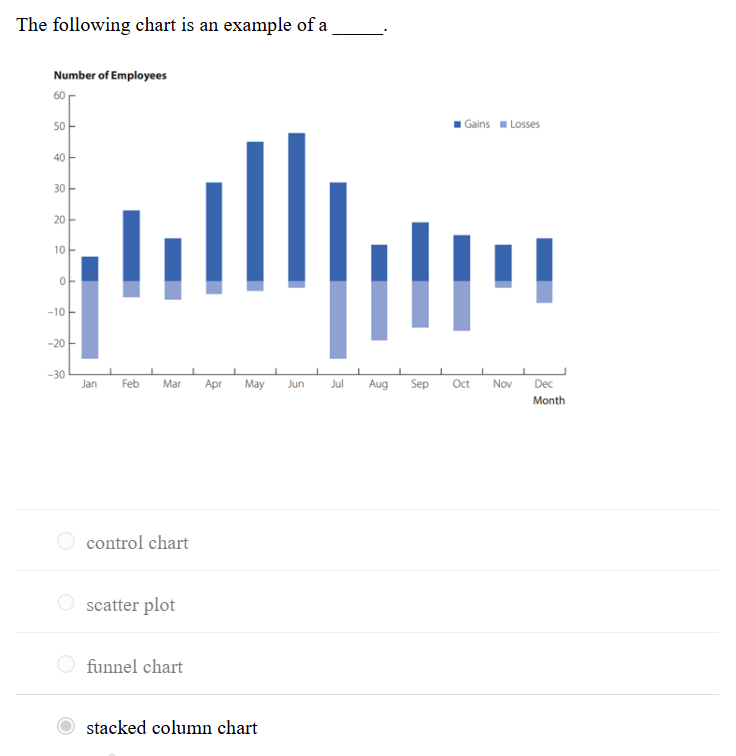
1.The following chart is an example of a _____.
A) stacked column chart
2.The scientific process of transforming data into insights for making better decisions is _____.
A) analytics
3.The ______ industry uses data visualization and Benford’s Law to detect fraud.
A) accounting
4.In accounting, data visualization is used to detect outliers that could be an indication of a data error or _____.
A) fraud
5.Because engineering relies heavily on mathematics and data, what is an important technique in every engineer’s tool kit?
A) Data visualization
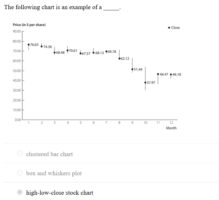
6.The following chart is an example of a _____.
A) high-low-close stock chart
7.Which of the following is an example of a categorical variable?
A. Whether a person has a traffic violation
8.Website analytics for understanding website traffic and sales is an example of how data visualization can be used to support more effective _____.
A. marketing
9. In Power BI Desktop, what is the purpose of the Navigator dialog box when importing data from an Excel file?
A. To select the worksheet to import
10. In Power BI Desktop, what does the comma button in the Formatting group of the Column tools tab do?
A. Adds a comma separator to the values
11. What is the file extension for saving a file in Power BI Desktop?
A. .pbix
12. Visual methods of displaying data are __________
A. charts
13. Should you use a bar chart or a pie chart to display categorical data?
A. A bar chart, since science has shown that we are better at assessing differences in length than angle and area.
14. In order to visualize hierarchical data along multiple dimensions, use a ____________.
A. treemap
15. Which chart type is most appropriate to summarize data about categories?
A. Bar chart
16. Correlation/relationship is _________.
A. how two variables are related to one another
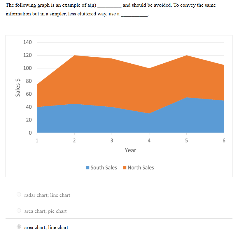
17.The following graph is an example of a(n) _________ and should be avoided. To convey the same information but in a simpler, less cluttered way, use a __________.
A. area chart; line chart
18.Composition is _________.
A. what makes up the whole of an entity under consideration
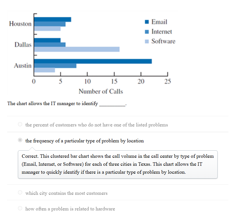
19.Bistra needs to compare the number of employees by job title for the last five years. Which of the following charts should she use?
A. Clustered column (bar) chart
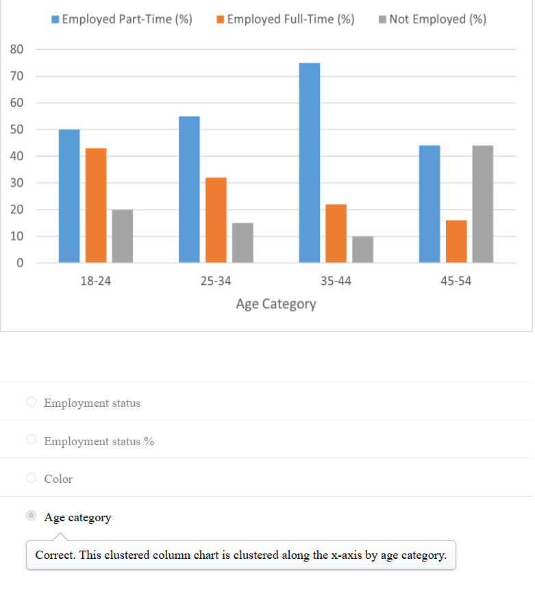
20.Approximately how much higher is the percentage of part-time employed 18- to 24-year-olds compared to full-time employed 35- to 44-year-olds?
A.
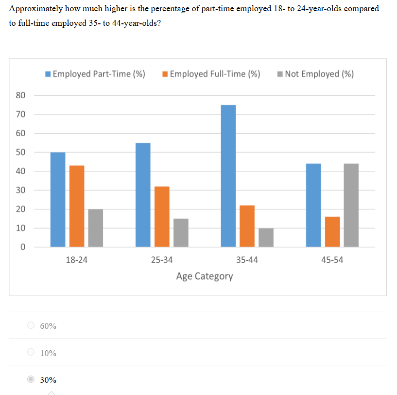
A. 30%
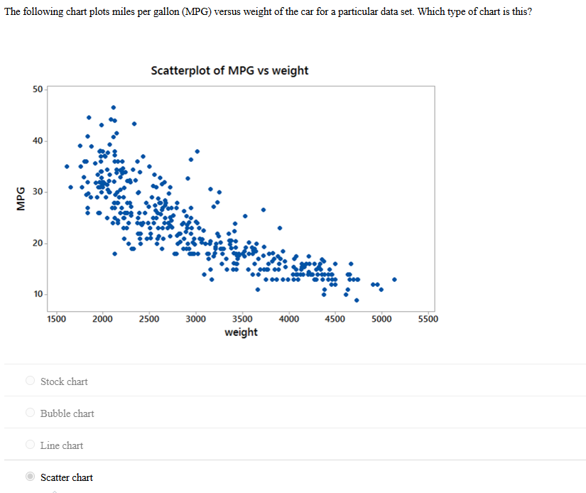
21.The following chart plots miles per gallon (MPG) versus weight of the car for a particular data set. Which type of chart is this?
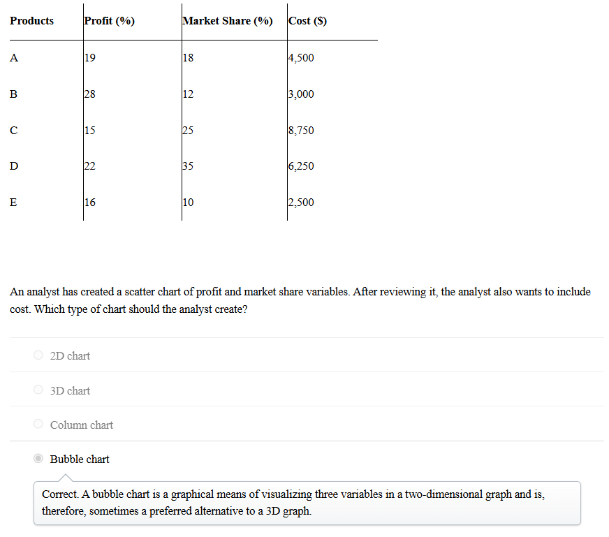
A.Scatter chart
22. What should you do if the variable you want to use for the X-axis or Y-axis of a scatter chart in Power BI is being summarized?
A. Convert it to “Don’t Summarize”
23.What is the first step in creating a chart in Power BI?
A. Connect Power BI to the data file
25.In Power BI, which option allows you to adjust the font size of the vertical axis labels?
A. Y-axis settings
26. A _____ variable takes on values that are numbers on the real number line?
A. quantitative
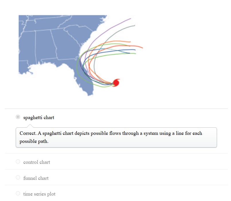
27. The image shown below is an example of a _____.
28. Prescriptive analytics are mathematical or logical models that __________.
A. suggest a decision or course of action
29. The class ranking of a college student is an example of a(n) ____ variable.
A. categorical
30. Which of the following arithmetic operations can be performed on categorical data?
A. None of these choices
31. Data for which numerical values are used to indicate magnitude, such as how many or how much, are referred to as:
A. Quantitative
32. With the increased use of analytics in business, human resources management (HRM) has become much more data-driven. Indeed, HRM is sometimes now referred to as _____.
A. people analytics
33. What is the purpose of the Σ symbol before a variable name in the Data pane in Power BI Desktop?
A. It indicates that Power BI Desktop has summed the variable across categories or time periods.
34. How can you change the data type of a variable in Power BI Desktop?
A. Select the variable in the Data pane, go to the Structure group, and change the data type.
35. In Power BI Desktop, what is the default view when you open the application?
A. Report view
36. This clustered bar chart represents the performance of a call center.?
A.
37. The following clustered column chart is clustered by which variable?
A.
38. An alternative for a stacked column chart when comparing more than two quantitative variables in each category is a __________.
A. clustered column chart
39. This Excel stacked bar chart displays the demographics of a business analysis class. Approximately how many students are in the class?
A. 150.
40. Composition is _________.
A. what makes up the whole of an entity under consideration
41. Jordan needs to display data over time. Which of the following charts should he use?
A. Line chart
42. In the line chart creation process, which chart editing option suggests continuity between the connection points and makes it easier for the reader to see and interpret changes that have occurred over time?
A. Scatter with Straight Lines and Markers
43. Three months after the launch of five new products in the market, a consumer electronics company arrived at the following results.
A.
44. Should you use a bar chart or a pie chart to display categorical data?
A. A bar chart, since science has shown that we are better at assessing differences in length than angle and area.
45. In order to visualize hierarchical data along multiple dimensions, use a ____________.
A. treemap
46. What is the first step in creating a chart in Power BI?
A. Connect Power BI to the data file
47. In Power BI, what does toggling the “On” button to “Off” for the Legend option do?
A. Hides the legend
48. In Power BI, which option allows you to adjust the range of the vertical axis in a chart?
A. Range
49. In Power BI, where can you find the option to select the desired chart type?
A. Visualizations pane