1. The following table provides monthly revenue values for Tedstar, Inc., a company that sells valves to large industrial firms. The monthly revenue data have been graphed using a line chart in the following figure.
| Month | Jan | Feb | Mar | Apr | May | Jun | Jul | Aug | Sep | Oct | Nov | Dec |
|---|---|---|---|---|---|---|---|---|---|---|---|---|
| Revenue ($) | 145,869 | 123,576 | 143,298 | 178,505 | 186,850 | 192,850 | 134,500 | 145,286 | 154,285 | 148,523 | 139,600 | 148,235 |

(a)
What characteristics of this line chart make it more difficult than necessary to interpret?
The chart contains unnecessary gridlines.
The axis labels are not needed.
All the data points are not graphed.
The y-axis label values are spaced much too close together.
The shading of the chart does not add value.
A)

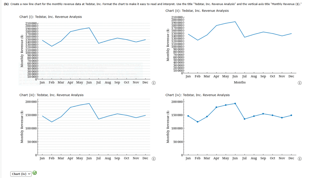
(b)
Create a new line chart for the monthly revenue data at Tedstar, Inc. Format the chart to make it easy to read and interpret. Use the title “Tedstar, Inc. Revenue Analysis” and the vertical-axis title “Monthly Revenue ($).”


2.Brandience Marketing LLC provides marketing analytics consulting for clients. For one of its clients, Brandience has been asked to perform a market segmentation study for a business client that provides auditing services to manufacturing customers. The client believes there are two variables of importance that should be used to group similar customers into clusters: Years of Service with the Client and Total Assets. Brandience plans to use a clustering algorithm to group similar customers into different clusters, but before applying the algorithm, Brandience creates a simple scatter chart to plot each customer based on their Years of Service with the Client and Total Assets. The scatter chart created by Brandience follows.

Modify the chart by using an additional Gestalt principle to make it more obvious to the audience which clients are in each cluster. Which additional Gestalt principle did you use?

3.Red Sky Delivery performs “last-mile” delivery services for online retailers, such as Amazon. Red Sky employs delivery drivers who perform the “last-mile” delivery service by delivering packages to individual residence and business locations. Red Sky measures several delivery driver performance metrics, including number of delivery stops completed per eight-hour shift. The table below provides data on nine Red Sky delivery drivers and the average number of packages delivered per shift over the previous 30 days.
| Delivery Driver | Average Number of Delivery Stops Completed (per shift) |
|---|---|
| Amy Urbaczewski | 92.87 |
| Sally Melouk | 110.78 |
| Brenda Barnes | 114.20 |
| Jonathan Payne | 132.50 |
| Bruce Wheeler | 148.20 |
| Cam Madsen | 87.51 |
| Sheila Stevens | 139.82 |
| Grant Inhara | 154.23 |
| Finn Helton | 109.11 |
Create a column chart to display the information in the table above. Format the column chart to best display the data. Use a chart title of “Comparing Red Sky Delivery Drivers” and a vertical-axis title of “Average number of deliveries per shift.” Get rid of any unnecessary grid lines and add data labels that show the average number of delivery stops completed for each driver. Sort the columns in descending order to make it easier for the audience to see which drivers have the highest and lowest average number of delivery stops per shift.
Investigation by Red Sky indicates that all of these delivery drivers except Amy Urbaczewski have similar delivery routes. Amy typically delivers in more rural areas, while all other drivers support more urban routes. Red Sky wants to draw attention to the fact that Amy’s routes are different than the others. Modify the sorted column chart by changing the color of the column associated with Amy Urbaczewski to indicate that this column is different from the others.


Identify the correct chart.

4.A sales manager is trying to determine appropriate sales performance bonuses for her team this year. The following table contains the data relevant to determining the bonuses, but it is not easy to read and interpret.
| Salesperson | Total Sales ($) | Average Performance Bonus Previous Years ($) | Customer Accounts | Years with Company |
|---|---|---|---|---|
| Smith, Michael | 325000.78 | 12499.3452 | 124 | 14 |
| Yu, Joe | 13678.21 | 239.9434 | 9 | 7 |
| Reeves, Bill | 452359.19 | 21987.2462 | 175 | 21 |
| Hamilton, Joshua | 87423.91 | 7642.9011 | 28 | 3 |
| Harper, Derek | 87654.21 | 1250.1393 | 21 | 4 |
| Quinn, Dorothy | 234091.39 | 14567.9833 | 48 | 9 |
| Graves, Lorrie | 379401.94 | 27981.4432 | 121 | 12 |
| Sun, Yi | 31733.59 | 672.9111 | 7 | 1 |
| Thompson, Nicole | 127845.22 | 13322.9713 | 17 | 3 |
Reformat the table to improve readability and help the sales manager make her decisions about bonuses. (Hint: It will also help the sales manager if the table is ordered from top-to-bottom by Total Sales.)
| Salesperson | Total Sales ($) | Average Performance Bonus Previous Years ($) | Customer Accounts | Years with Company |
|---|---|---|---|---|
| Reeves, Bill | 452,359.19 | 21,987.2462 | 175 | 21 |
| Graves, Lorrie | 379,401.94 | 27,981.4432 | 121 | 12 |
| Smith, Michael | 325,000.78 | 12,499.3452 | 124 | 14 |
| Quinn, Dorothy | 234,091.39 | 14,567.9833 | 48 | 9 |
| Thompson, Nicole | 127,845.22 | 13,322.9713 | 17 | 3 |
| Harper, Derek | 87,654.21 | 1,250.1393 | 21 | 4 |
| Hamilton, Joshua | 87,423.91 | 7,642.9011 | 28 | 3 |
| Sun, Yi | 31,733.59 | 672.9111 | 7 | 1 |
| Yu, Joe | 13,678.21 | 239.9434 | 9 | 7 |
| Salesperson | Total Sales ($) | Average Performance Bonus Previous Years ($) | Customer Accounts | Years with Company |
|---|---|---|---|---|
| Reeves, Bill | 452,359 | 21,987 | 175 | 21 |
| Graves, Lorrie | 379,402 | 27,981 | 121 | 12 |
| Smith, Michael | 325,001 | 12,499 | 124 | 14 |
| Quinn, Dorothy | 234,091 | 14,568 | 48 | 9 |
| Thompson, Nicole | 127,845 | 13,323 | 17 | 3 |
| Harper, Derek | 87,654 | 1,250 | 21 | 4 |
| Hamilton, Joshua | 87,424 | 7,643 | 28 | 3 |
| Sun, Yi | 31,734 | 673 | 7 | 1 |
| Yu, Joe | 13,678 | 240 | 9 | 7 |
| Salesperson | Total Sales ($) | Average Performance Bonus Previous Years ($) | Customer Accounts | Years with Company |
|---|---|---|---|---|
| Reeves, Bill | 452,359.19 | 21,987.2462 | 175.00 | 21.00 |
| Graves, Lorrie | 379,401.94 | 27,981.4432 | 121.00 | 12.00 |
| Smith, Michael | 325,000.78 | 12,499.3452 | 124.00 | 14.00 |
| Quinn, Dorothy | 234,091.39 | 14,567.9833 | 48.00 | 9.00 |
| Thompson, Nicole | 127,845.22 | 13,322.9713 | 17.00 | 3.00 |
| Harper, Derek | 87,654.21 | 1,250.1393 | 21.00 | 4.00 |
| Hamilton, Joshua | 87,423.91 | 7,642.9011 | 28.00 | 3.00 |
| Sun, Yi | 31,733.59 | 672.9111 | 7.00 | 1.00 |
| Yu, Joe | 13,678.21 | 239.9434 | 9.00 | 7.00 |
| Salesperson | Total Sales ($) | Average Performance Bonus Previous Years ($) | Customer Accounts | Years with Company |
|---|---|---|---|---|
| Reeves, Bill | 452,359 | 21,987 | 175.00 | 21.00 |
| Graves, Lorrie | 379,402 | 27,981 | 121.00 | 12.00 |
| Smith, Michael | 325,001 | 12,499 | 124.00 | 14.00 |
| Quinn, Dorothy | 234,091 | 14,568 | 48.00 | 9.00 |
| Thompson, Nicole | 127,845 | 13,323 | 17.00 | 3.00 |
| Harper, Derek | 87,654 | 1,250 | 21.00 | 4.00 |
| Hamilton, Joshua | 87,424 | 7,643 | 28.00 | 3.00 |
| Sun, Yi | 31,734 | 673 | 7.00 | 1.00 |
| Yu, Joe | 13,678 | 240 | 9.00 | 7.00 |

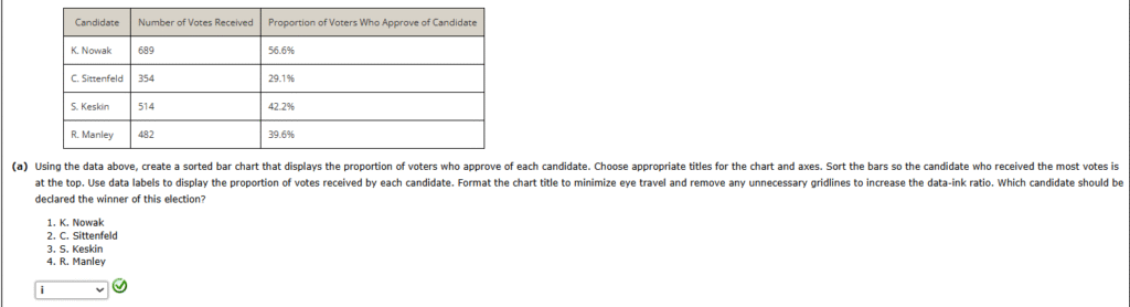
5.Approval voting is a type of voting system in which voters can vote for any number of eligible candidates. A vote for a candidate in this type of system indicates that the voter “approves” of that candidate for the position the candidate is seeking. In the final tally of the election results, the total number of approval votes for each candidate is calculated. The candidate who receives the most approval votes is declared the winner. The figure below displays the results from an approval voting election in which there were four eligible candidates: S. Keskin, R. Manley, K. Nowak, and C. Sittenfeld. A total of 1218 voters participated in this election. The table below shows the number of votes received by each candidate as well as the proportion of voters who approved of each candidate.
| Candidate | Number of Votes Received | Proportion of Voters Who Approve of Candidate |
|---|---|---|
| S. Keskin | 354 | 29.1% |
| R. Manley | 689 | 56.6% |
| K. Nowak | 514 | 42.2% |
| C. Sittenfeld | 482 | 39.6% |
(a)
Using the data above, create a sorted bar chart that displays the proportion of voters who approve of each candidate. Choose appropriate titles for the chart and axes. Sort the bars so the candidate who received the most votes is at the top. Use data labels to display the proportion of votes received by each candidate. Format the chart title to minimize eye travel and remove any unnecessary gridlines to increase the data-ink ratio. Which candidate should be declared the winner of this election?
C. Sittenfeld
S. Keskin
R. Manley
K. Nowak

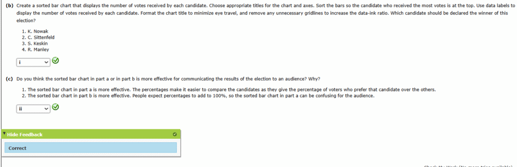
(b)
Create a sorted bar chart that displays the number of votes received by each candidate. Choose appropriate titles for the chart and axes. Sort the bars so the candidate who received the most votes is at the top. Use data labels to display the number of votes received by each candidate. Format the chart title to minimize eye travel, and remove any unnecessary gridlines to increase the data-ink ratio. Which candidate should be declared the winner of this election?
- S. Keskin
- R. Manley
- K. Nowak
- C. Sittenfeld

(c)
Do you think the sorted bar chart in part a or in part b is more effective for communicating the results of the election to an audience? Why?
- The sorted bar chart in part b is more effective. People expect percentages to add to 100%, so the sorted bar chart in part a can be confusing for the audience.
- The sorted bar chart in part a is more effective. The percentages make it easier to compare the candidates as they give the percentage of voters who prefer that candidate over the others.

6.Sackenheim Compressors, Inc. manufactures air compressors for industrial use. The company is performing an analysis of its direct and indirect costs related to manufacturing a particular type of air compressor. It has gathered cost data for the previous 20 weeks, and it would like to identify any trends in the data. A scatter chart created using the data follows.

Which Gestalt principle should be used here to make it easier for the audience to identify trends in the data? Create an improved version of this chart by applying the Gestalt principle that makes any trends in the data more obvious to the audience.

7.In this problem, we revisit the pie chart from an earlier problem. Platt Consulting Services is interested in comparing the number of customer accounts managed by its managing consultants. In particular, the company needs to compare the number of accounts managed by Bernie Smith, Stanley Lucas, and Gracie Rogers because these three accountants started with the company at about the same time and have similar skill sets. The following chart is a default chart produced in Microsoft Excel.

Consider the following data from Platt Consulting Services.
| Manger | Number of Accounts Managed |
|---|---|
| Bernie Smith | 16 |
| Caroline Hyde | 3 |
| Gracie Rogers | 14 |
| Hurley Reyes | 8 |
| Kendall Espinosa | 21 |
| Margaret Walnut | 4 |
| Michael Withrow | 6 |
| Norma Lane | 2 |
| Stanley Lucas | 13 |
Use the data in the table above to create a new data visualization that uses a different type of chart and demonstrates the proper use of preattentive attributes to allow for easier comparison of the number of accounts managed by each consultant.


8. In this problem, we revisit the pie chart from an earlier problem. Platt Consulting Services is interested in comparing the number of customer accounts managed by its managing consultants. In particular, the company needs to compare the number of accounts managed by Bernie Smith, Stanley Lucas, and Gracie Rogers because these three accountants started with the company at about the same time and have similar skill sets. The following chart is a default chart produced in Microsoft Excel.
Consider the following data from Platt Consulting Services.
| Manger | Number of Accounts Managed |
|---|---|
| Bernie Smith | 16 |
| Caroline Hyde | 3 |
| Gracie Rogers | 14 |
| Hurley Reyes | 8 |
| Kendall Espinosa | 21 |
| Margaret Walnut | 4 |
| Michael Withrow | 6 |
| Norma Lane | 2 |
| Stanley Lucas | 13 |
Use the data in the table above to create a new data visualization that uses a different type of chart and demonstrates the proper use of preattentive attributes to allow for easier comparison of the number of accounts managed by each consultant.
A. Chart(iv)
9. Red Sky Delivery performs “last-mile” delivery services for online retailers, such as Amazon. Red Sky employs delivery drivers who perform the “last-mile” delivery service by delivering packages to individual residence and business locations. Red Sky measures several delivery driver performance metrics, including number of delivery stops completed per eight-hour shift. The table below provides data on nine Red Sky delivery drivers and the average number of packages delivered per shift over the previous 30 days.
| Delivery Driver | Average Number of Delivery Stops Completed (per shift) |
|---|---|
| Amy Urbaczewski | 92.87 |
| Sally Melouk | 110.78 |
| Brenda Barnes | 114.20 |
| Jonathan Payne | 132.50 |
| Bruce Wheeler | 148.20 |
| Cam Madsen | 87.51 |
| Sheila Stevens | 139.82 |
| Grant Inhara | 154.23 |
| Finn Helton | 109.11 |
Create a column chart to display the information in the table above. Format the column chart to best display the data. Use a chart title of “Comparing Red Sky Delivery Drivers” and a vertical-axis title of “Average number of deliveries per shift.” Get rid of any unnecessary grid lines and add data labels that show the average number of delivery stops completed for each driver. Sort the columns in descending order to make it easier for the audience to see which drivers have the highest and lowest average number of delivery stops per shift.
Investigation by Red Sky indicates that all of these delivery drivers except Amy Urbaczewski have similar delivery routes. Amy typically delivers in more rural areas, while all other drivers support more urban routes. Red Sky wants to draw attention to the fact that Amy’s routes are different than the others. Modify the sorted column chart by changing the color of the column associated with Amy Urbaczewski to indicate that this column is different from the others.
A. Chart(iv)
10. The following table provides monthly revenue values for Tedstar, Inc., a company that sells valves to large industrial firms. The monthly revenue data have been graphed using a line chart in the following figure.
11. Approval voting is a type of voting system in which voters can vote for any number of eligible candidates. A vote for a candidate in this type of system indicates that the voter “approves” of that candidate for the position the candidate is seeking. In the final tally of the election results, the total number of approval votes for each candidate is calculated. The candidate who receives the most approval votes is declared the winner. The figure below displays the results from an approval voting election in which there were four eligible candidates: K. Nowak, C. Sittenfeld, S. Keskin, and R. Manley. A total of 1218 voters participated in this election. The table below shows the number of votes received by each candidate as well as the proportion of voters who approved of each candidate.