
1. In doing an analysis of the economics of baseball in your state, you collect data on annual home game attendance and number of wins from 2000 to 2019 for the state’s two baseball teams, the Komodos and the Condors. To communicate the nature of the relationship between annual home game attendance and number of wins for the two teams over that period, you produce the following scatter chart in Excel.

The chart shows a mildly positive relationship between annual home game attendance and number of wins for each team. The chart also shows the Condors have routinely won more games than the Komodos but have generally had lower attendance. However, you see a way to improve this chart by using the predominant color of each team’s uniform instead of the Excel default colors for the points that represent the two teams.
You obtain the following images of the two team’s home jerseys from their respective websites and paste them into the file attendwinschart that also contains the data and your original chart.

Use PowerPoint and the Eyedropper tool to determine the predominant color of each jersey. Images of the two jerseys are included in the file attendwinschart and can be cut and pasted into PowerPoint. Revise the scatter chart in the file attendwinschart so the color of each set of points corresponds to the color of the corresponding t-shirt.


A. Chart(iii)
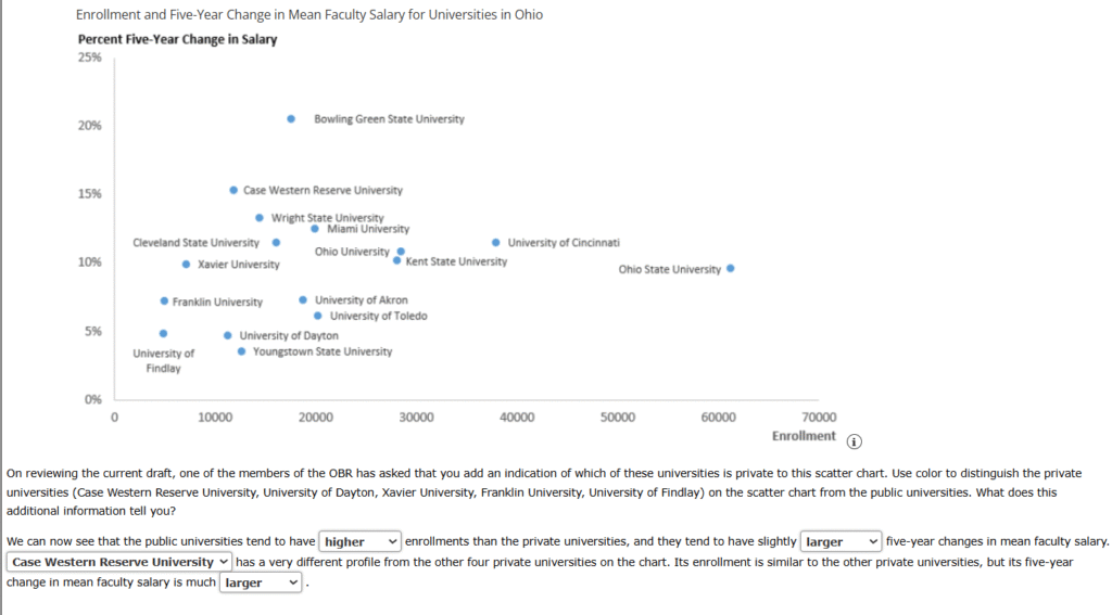
2. The Ohio Board of Regents (OBR) is preparing its five-year report on the state of higher education in Ohio. The current draft of the report includes a scatter chart of enrollment and the percentage five-year change in average faculty salary for the 16 largest four-year institutions in the state. The scatter chart that is included in the current draft of the report follows and is provided in the file ohhigheredchart.
3. CrystalClear, Inc. manufactures low-resolution 15-inch screens for inexpensive laptop computers at plants in five states (California, Nebraska, North Carolina, North Dakota, and Texas). The number of units produced by each plant is provided in the following table.
| Plant Location | Units Produced |
|---|---|
| Texas | 54,210 |
| North Dakota | 61,002 |
| California | 75,143 |
| Nebraska | 79,210 |
| North Carolina | 82,157 |
CrystalClear, Inc. management suspects that its larger plants are producing the greatest number of units. The square footage for each plant is provided in the following table.
| Plant Location | Sq Ft |
|---|---|
| Texas | 48,000 |
| North Dakota | 52,000 |
| California | 66,000 |
| Nebraska | 62,000 |
| North Carolina | 71,000 |
Provide a scatter chart of the plant data to provide insight into the nature of the relationship between units produced and size of the plant for the five plants and highlight the Nebraska plant.
A. Chart(i)
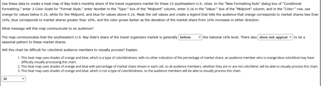
4. Bay Side Manufacturing produces small leather goods such as wallets, travel organizers, toiletry kits, briefcases, and folios. The company has a 16% share in the U.S. travel organizers market, but management is concerned that its market share in the southeastern United States lags behind its national share. Bay Side’s monthly share of the travel organizers market for the past year in 15 major cities in the southeastern United States is provided in the file bayside. A portion of the data is shown in the following table.
| Market Share | ||||||||||
|---|---|---|---|---|---|---|---|---|---|---|
| Jan | Feb | Mar | Apr | Nov | Dec | |||||
| Atlanta | 0.142 | 0.145 | 0.137 | 0.152 | … | 0.132 | 0.152 | |||
| Baltimore | 0.172 | 0.199 | 0.177 | 0.189 | … | 0.181 | 0.185 | |||
| Baton Rouge | 0.133 | 0.084 | 0.137 | 0.123 | … | 0.144 | 0.097 | |||
| Birmingham | 0.087 | 0.105 | 0.105 | 0.096 | … | 0.118 | 0.121 | |||
| Charlotte | 0.088 | 0.112 | 0.094 | 0.100 | … | 0.069 | 0.077 | |||
| Jacksonville | 0.188 | 0.188 | 0.190 | 0.173 | … | 0.197 | 0.185 | |||
| Louisville | 0.217 | 0.214 | 0.164 | 0.190 | … | 0.189 | 0.192 | |||
| Memphis | 0.107 | 0.115 | 0.132 | 0.111 | … | 0.125 | 0.115 | |||
| Miami | 0.162 | 0.158 | 0.158 | 0.157 | … | 0.180 | 0.169 | |||
| Nashville | 0.053 | 0.054 | 0.074 | 0.081 | … | 0.083 | 0.099 | |||
| New Orleans | 0.129 | 0.161 | 0.159 | 0.189 | … | 0.194 | 0.155 | |||
| Raleigh | 0.156 | 0.188 | 0.162 | 0.150 | … | 0.190 | 0.191 | |||
| Richmond | 0.178 | 0.156 | 0.183 | 0.157 | … | 0.158 | 0.145 | |||
| Tampa | 0.119 | 0.115 | 0.108 | 0.145 | … | 0.144 | 0.110 | |||
| Virginia Beach | 0.172 | 0.174 | 0.129 | 0.166 | … | 0.164 | 0.191 | |||
| Washington, DC | 0.232 | 0.241 | 0.204 | 0.191 | … | 0.207 | 0.243 | |||
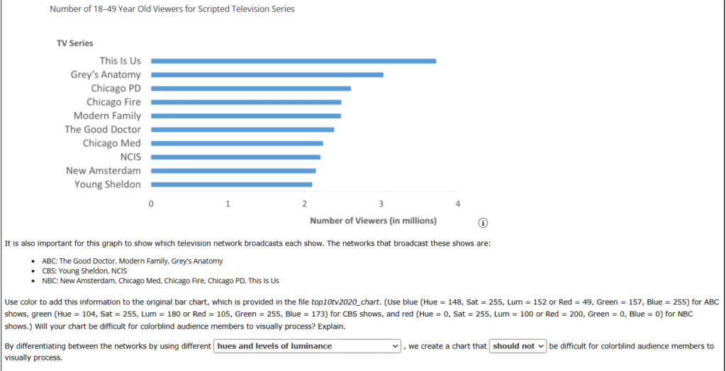
5. The 18–49 age group is an extremely lucrative demographic for television networks. Advertisers pay a premium to reach consumers in this age group with their advertising. The following bar chart shows the number of viewers in millions that the top 10 scripted series averaged during the 2019–2020 television season.
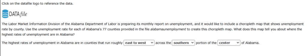
6. The Labor Market Information Division of the Alabama Department of Labor is preparing its monthly report on unemployment, and it would like to include a choropleth map that shows unemployment rate by county. Use the unemployment rate for each of Alabama’s 77 counties provided in the file alabamaunemployment to create this choropleth map. What does this map tell you about where the highest rates of unemployment are in Alabama?
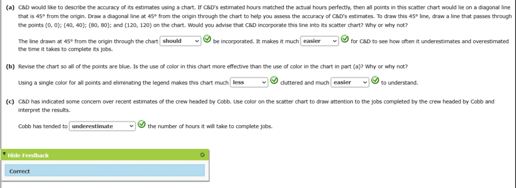
7. Charlene & Daughters (C&D) employes 20 crews of interior house painters that work throughout the northwest United States. The leader of each crew is responsible for visiting potential job sites and developing an estimate of the number of hours it will take to complete a job based on a C&D formula that considers the square footage of the surfaces to be painted, the amount and type of trim, and whether ceilings are to be painted. The crew leader also has the latitude to make subjective adjustments based on other factors that are not considered by the formula.
| Repair Person | Estimated Hours | Actual Hours |
|---|---|---|
| Briggs | 25.8 | 29.4 |
| Briggs | 62.5 | 66.3 |
| Briggs | 75.6 | 50.9 |
| Briggs | 75.7 | 77.0 |
| Briggs | 61.9 | 74.8 |
| Briggs | 6.1 | 5.8 |
| Briggs | 38.2 | 36.3 |
| Briggs | 52.2 | 55.3 |
| Briggs | 63.1 | 69.3 |
| Briggs | 66.9 | 77.5 |
| Cobb | 37.1 | 32.6 |
| Cobb | 45.0 | 46.6 |
| ⋮ | ⋮ | ⋮ |
| Taubee | 6.8 | 6 |
| Taubee | 54.1 | 62.5 |
| Vincent | 25.7 | 20.3 |
| Vincent | 80.9 | 93.6 |
| Vincent | 20.8 | 20.6 |
| Vincent | 24.8 | 25.7 |
| Vincent | 74.4 | 84.7 |
| Vincent | 18.3 | 18.3 |
| Vincent | 74.6 | 81.2 |
| Vincent | 58.7 | 52.9 |
| Vincent | 37.5 | 41.1 |
| Vincent | 68.7 | 56.0 |
C&D has also used these data to produce a scatter chart, and it has used color to differentiate between the crews on this chart. The chart, which follows, is also included in the file canddchart. Note that the legend identifies each crew by the name of its crew leader.

8. Boise Regional Medical Center (BRMC) is completing its annual report for the Idaho Board of Trustees. One section of this report is devoted to an analysis of the composition of the BRMC nursing staff. The current draft of this report includes the following bar chart that shows the percentage of the nursing staff by classification.
| Nurse Classification | Percentage |
|---|---|
| Telemetry Nurse | 4 |
| Perioperative Nurse | 5 |
| Post−Anesthesia Care Nurse | 5 |
| Medical−Surgical Nurse | 6 |
| Intensive Care Unit Nurse | 9 |
| Emergency Room Nurse | 12 |
| Nurse Practitioner | 15 |
| Licensed Practical Nurse | 19 |
| Registered Nurse | 25 |

In its review of the draft report, management has noted that some audience members may consider the color of the bars in this chart to be inappropriate for BRMC because red is often associated with anxiety. Management has requested that the chart be revised using a color that is more calming. Refer to the table below to identify traits frequently associated with various colors.
| Color | Meanings and Assocations |
|---|---|
| Red | Anxiety, Arousing, Daring, Dominant, Energy, Excitement, Health, Life, Love, Passion, Power, Protection, Spirited, Stimulating, Strength, Up-To-Date |
| Orange | Abundance, Arousing, Comfort, Daring, Excitement, Extraversion, Fun, Happiness, Lively, Security, Sensuality, Spirited, Warmth |
| Yellow | Arousing, Cheerful, Confidence, Creativity, Excitement, Extraversion, Friendliness, Happiness, Optimism, Self-Esteem, Sincerity, Smiley, Spirited |
| Green | Calm, Comfort, Equilibrium, Harmony, Health, Hope, Nature, Outdoorsy, Peace, Prosperity, Relaxation, Security, Serenity, Soothing, Tender |
| Blue | Calm, Comfort, Competence, Coolness, Dignified Duty, Efficiency, lntelligence, Logic, Peace, Reflection, Relaxation, Reliability, Security, Serenity, Soothing, Successful, Tender, Tranquility, Trust |
| Purple | Authenticity, Charming, Dignified, Exclusive, Luxury, Quality, Regal, Sensuality, Sophistication, Spiritual, Stately, Upper Class |
| Pink | Charming, Cheerful, Feminine, Gentle, Nurturing, Sincerity, Soft, Sophistication, Tranquility, Warmth |
| Brown | Nature, Outdoorsy, Reliability, Ruggedness, Security, Support, Tough |
| Black | Dignified, Efficiency, Elegance, Emotional Safety, Glamour, Power, Richness, Ruggedness, Security, Sophistication, Stately, Substance, Tough, Upper Class |
| White | Calm, Clarity, Cleanness, Down-to-Earth, Happiness, Heavens, Honest, Hygience, Innocence, Peace, Purity, Serenity, Sincerity, Soothing, Tender |
What range of hue would you use to revise this chart using a color for the bars that is generally considered to be comforting and calming? Refer to the table below to identify the hue you will use.
| Color | Hue |
|---|---|
| Red | 0 |
| Yellow | 40 |
| Green | 80 |
| Cyan | 120 |
| Blue | 160 |
| Magenta | 200 |
A. 40 to 160