
Module 1 Quiz: Chapters 1 & 2
1. You have already installed or loaded your R package and want to view its content on the R Console. Can you simply type the package name and run it?
False
2.

3. What is the command used to upgrade a package that is already installed?
update.packages(ask = FALSE)update.packages()4. What is the correct command to install packages?
install.packages(“package_name”)
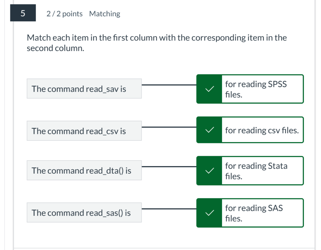
5. Match each item in the first column with the corresponding item in the second column.
6. In R, there are multiple ways to load a package. Choose the ones that you think are correct from the following options:
require(package_name)
library(package_name)
7. Fill in the Blank

8. You can only load data from a CSV file.
False
9. How to load an installed package?
library(package_name)
10 . Match each item in the first column with the corresponding item in the second column.

Module 2 Quiz: Chapters 3 & 4
1. The coord_flip() function is used to flip the x and y axes in a bar graph.
TrueFalse
2. In ggplot2, how can you add a title to the y-axis of a bar graph?
labs(y = “Title”)
3. The argument position = "dodge" in geom_bar() is used to place bars next to each other instead of stacking them.
True
4. Line graphs are useful for visualizing data changes over time.
True
5. Which ggplot2 function is used to create line graphs?
geom_line()
6. Which function is used to create a basic bar graph in R?
barplot()
7. To create a smoothed line in a line graph, you can use geom_smooth(method = "loess").
True
8. To display counts on top of bars in a bar graph, you can use geom_text(aes(label = ...), vjust = -0.5).
True
9. The geom_line() function in ggplot2 can only plot a single line.
False
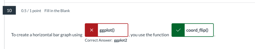
10. To create a horizontal bar graph using :ggplot2, you use the function:coord_flip().
11. The scale_color_manual() function is used to manually set the colors for different lines.
True
12. To plot multiple lines in a single graph, you should map the color aesthetic to a variable. This is done by:
geom_line(aes(color = …))
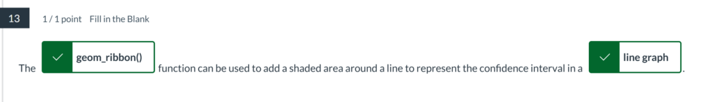
13. The Correct answer:geom_ribbon() function can be used to add a shaded area around a line to represent the confidence interval in a Correct answer:line graph.
14. Which of the following functions can be used to add labels to points on a line graph?
geom_label()
15. The barplot() function in base R can only create horizontal bar graphs.
False
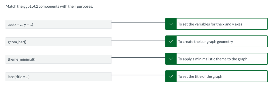
16. Match the ggplot2 components with their purposes:
17. How can you add color to the bars in a bar graph using ggplot2?
geom_bar(aes(fill = …))
18. Which of the following arguments can be used to change the width of bars in geom_bar()?
width
19. Stacked bar graphs can be created by using the `geom_bar()` function with the default `position` argument

20. Match the ggplot2 functions with their purposes for line graphs:
Module 3 Quiz: Chapters 5 & 6
1. What is the purpose of using geom_jitter() in a scatter plot?
To prevent overplotting by adding a small amount of random variation to the data
2. In ggplot2, which function can be used to create a bubble chart?
geom_point(aes(size = …))
3. Which function is used to create a histogram in ggplot2?
geom_histogram()
4. In a box plot, what do the whiskers represent?
The range of the data excluding outliers
5. Which function can be used to create a scatter plot matrix in ggplot2?
ggpairs()
6. Which aesthetic is used to map a variable to different shapes in a scatter plot?
aes(shape = …)
7. To change the size of the points in a scatter plot, which aesthetic should be used?
aes(size = …)
8. Which ggplot2 function is used to create scatter plots?
geom_point()
9. Which function can be used to map different colors to different groups in a scatter plot?
aes(color = …)
10. What does a box in a box plot represent?
The interquartile range (IQR)
11. Which argument in geom_point() can be used to set the transparency of the points?
alpha
12. To create a violin plot, which ggplot2 function should be used?
geom_violin()
13. What is the primary purpose of a density plot?
To show the distribution of a continuous variable
14. How can you add a regression line to a scatter plot in ggplot2?
geom_smooth(method = “lm”)
15. How can you adjust the number of bins in a histogram?
geom_histogram(binwidth = …)
16. Which function is used to create a density plot in ggplot2?
geom_density()
17. How can you remove the legend from a scatter plot in ggplot2?
theme(legend.position = “none”)
18. What argument in geom_boxplot() can be used to show individual data points?
geom_jitter()
19. Which function is used to create a box plot in ggplot2?
geom_boxplot()
20. How can you create a faceted plot to compare distributions across different groups in ggplot2?
facet_wrap()
Module 3 Quiz: Chapters 7 & 8
scale_x_discrete() is used to handle continuous data on the x-axis.
False
You cannot control the size of text in geom_text().
False
The expand argument in scale_y_continuous() is used to add padding around the data.
True
It is not possible to add a custom annotation layer in ggplot2.
False
coord_cartesian() can be used to zoom in on a specific area of the plot without removing data points.
True
The labs() function can be used to add labels to the x and y axes as well as the title of the plot.
True
It is not possible to change the text orientation of axis labels in ggplot2.
False
ggtitle() is used to add a title to a ggplot.
True
The coord_flip() function rotates the entire plot, swapping the x and y axes.
True
The breaks argument in scale_x_continuous() is used to control the points at which grid lines appear.
True
The vjust and hjust arguments are used to adjust the vertical and horizontal justification of text in geom_text().
True
scale_y_log10() can be used to transform the y-axis to a logarithmic scale.
True
The annotate() function can be used to add shapes like rectangles and lines to a plot.
True
theme() can be used to modify the appearance of the axis text and ticks.
True
geom_label() automatically adds a rectangle around the text.
True
scale_x_date() is used for plotting time series data on the x-axis.
True
The annotate() function can only be used to add text annotations to a plot.
False
The scale_x_continuous() function is used to modify the x-axis of a plot with continuous data
True
The annotate() function cannot be used to add mathematical notation to a plot.
False
geom_text() and geom_label() can both be used to add text annotations to a plot.
True
Module 3 Quiz: Chapters 9 & 10
theme_gray() is the default theme applied to ggplot2 plots.
True
The legend.position argument in theme() can be used to place the legend inside the plotting area.
True
Legends in ggplot2 can only be placed at the top or bottom of the plot.
False
The guides() function is used to control the appearance of legends in ggplot2.
True
The theme_bw() function creates a plot with a black and white color scheme.
True
You cannot change the order of items in a legend.
False
It is not possible to change the font size of plot titles using theme().
False
guide_legend() and guide_colorbar() are two types of guides available for customizing legends in ggplot2.
True
It is possible to remove a legend from a ggplot by setting legend.position = "none".
True
You can use theme() to change the background color of the legend box.
True
theme_minimal() provides a clean theme with no background annotations.
True
The labs() function can be used to set the title of the legend.
True
The override.aes argument in guide_legend() can be used to modify the appearance of legend items without changing the plot itself.
True
theme_light() is designed to be used with plots that have light backgrounds and dark grid lines.
True
The legend.key argument in theme() is used to control the appearance of the boxes around legend keys.
True
The theme() function can be used to remove both major and minor grid lines from a plot.
True
You cannot use the theme() function to customize the legend position in a ggplot.
False
theme_void() removes all background, axis, and grid elements from a plot.
True
The theme() function cannot be used to change the background color of a plot.
False
The theme() function in ggplot2 is used to modify non-data elements of a plot.
True
Module 6 Quiz: Chapters 11 & 12
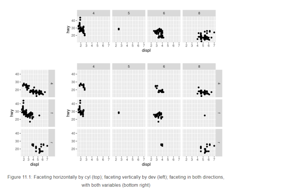
The facet_grid() function is used to create the top plot in this image.
Faceting can be done in both horizontal and vertical directions simultaneously.
The facet_wrap() function arranges panels in a grid layout to display data for different categories.
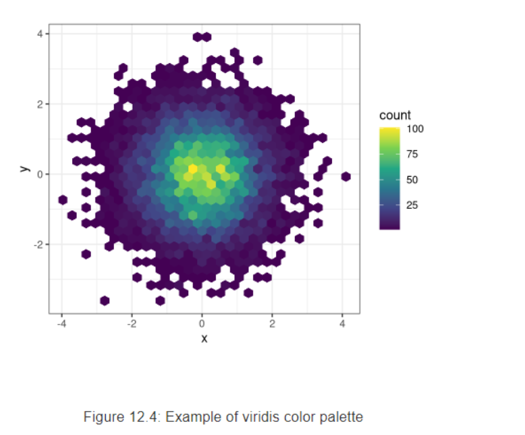
The color scale on the right side of the plot indicates the density of data points.
The plot shown here uses a gradient color scale to represent different count values.
The plot uses hexagonal bins to aggregate data points.
Module 6 Quiz: Chapters 11 & 12
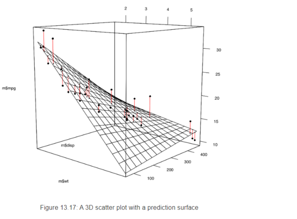
The black points in the plot represent the actual data points.
The vertical lines in the plot indicate the deviation of the actual data points from the prediction surface.
The plot includes a prediction surface that helps to visualize the trend in the data.
The 3D scatter plot in the image shows the relationship between three variables: m$mpg, m$disp, and m$wt.
The plot uses black dots to represent the data points.
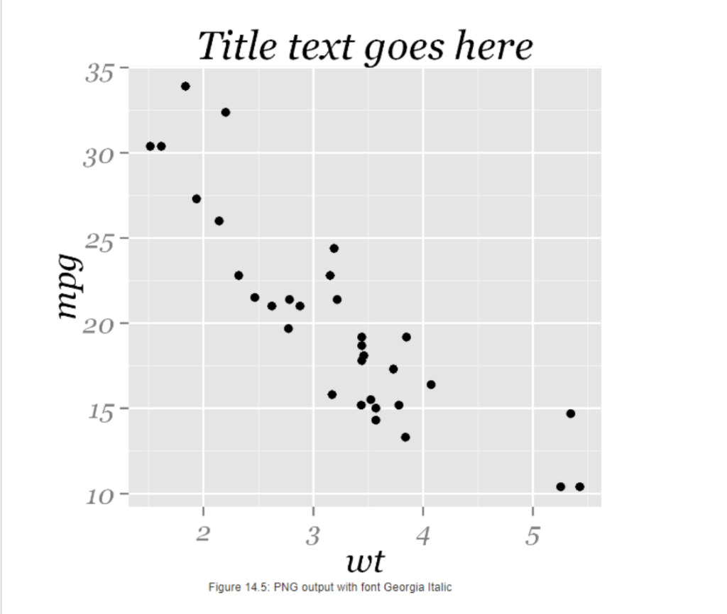
The y-axis is labeled mpg.
The x-axis is labeled wt.
The scatter plot in the image shows the relationship between two variables: wt and mpg.