1.Required information
To complete this exercise, you will need to download and install Tableau on your computer. Tableau provides free instructor and student licenses as well as free videos and support for utilizing and learning the software. Once you are up and running with Tableau, watch the three “Getting Started” Tableau videos. All of Tableau’s short training videos can be found here.
[The following information applies to the questions displayed below.]
Woltz Page Company (WPC) is a manufacturer that uses a job-order costing system with a plantwide predetermined overhead rate based on direct-labor hours. Its average direct labor wage rate is $24 per hour. The company has asked you to conduct a job profitability study beginning with a thorough critique of its existing cost system. To keep the scope of your project manageable, you have chosen to base your critique on a subset of 10 jobs from the many jobs completed by the company during the year.
Download the Excel file, which you will use to create the Tableau visualizations that will accompany your critique.
Upload the Excel file into Tableau by doing the following:
- Open the Tableau Desktop application.
- On the left-hand side, under the “Connect” header and the “To a file” sub-header, click on “Microsoft Excel.”
- Choose the Excel file and click “Open.”
- Since the only worksheet in the Excel File is “Woltz Page Co” it will default as a selection with no further import steps needed
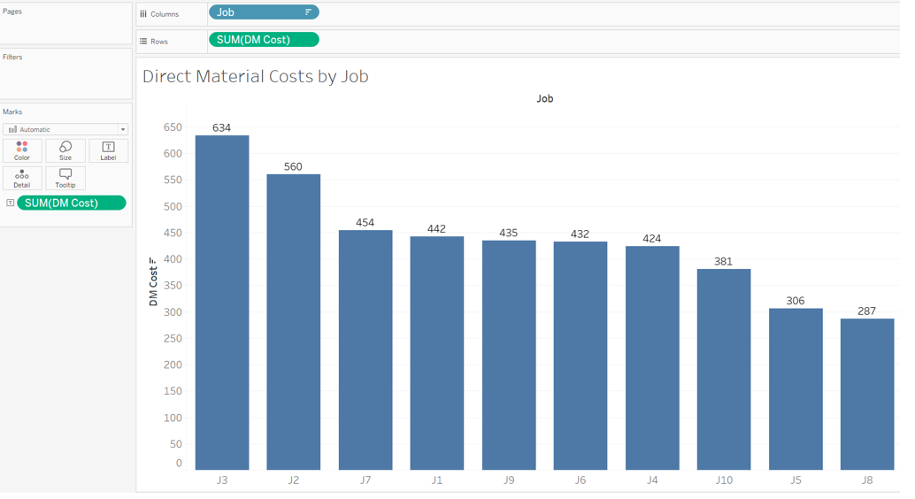
Create a bar chart in Tableau that shows the total Direct Material Costs (DM Costs) for each of the ten jobs:
- Double click on “Sheet 1” at the bottom of your workbook and rename it “Direct Material Costs by Job”
- On the left-hand side under “Dimensions” (sometimes labeled as Tables), click on “Job” and drag it to the “Columns” area above the blank sheet.
- On the left-hand side under “Measures”, click on “DM Cost” and drag it to the “Rows” area.
- The calculation will default to Sum, which is what we want in this instance.
- This will create a vertical bar chart which is what we want in this instance.
- Label each job with its respective direct materials cost by clicking on “DM Cost” under “Measures” and dragging and dropping it onto the “Label” Marks card.○ If the labels appear horizontal, then proceed to the next step. If they do not appear horizontal, then click on the “Label” Marks card (
 ) and under “Label Appearance”, click on the drop down for “Alignment” and choose (
 ) under direction.
 - Sort the direct materials cost from highest to lowest by clicking on the descending sort button in the middle of the menu bar at the top of the screen (
 )
) - Your visualization should appear as follows:
Required:
1b. Of the 10 jobs:Which one had the lowest direct materials cost?What is the total amount?
1a. Of the 10 jobs:Which one had the highest direct materials cost?What is the total amount?

2.Required information
To complete this exercise, you will need to download and install Tableau on your computer. Tableau provides free instructor and student licenses as well as free videos and support for utilizing and learning the software. Once you are up and running with Tableau, watch the three “Getting Started” Tableau videos. All of Tableau’s short training videos can be found here.
[The following information applies to the questions displayed below.]
Woltz Page Company (WPC) is a manufacturer that uses a job-order costing system with a plantwide predetermined overhead rate based on direct-labor hours. Its average direct labor wage rate is $24 per hour. The company has asked you to conduct a job profitability study beginning with a thorough critique of its existing cost system. To keep the scope of your project manageable, you have chosen to base your critique on a subset of 10 jobs from the many jobs completed by the company during the year.
Download the Excel file, which you will use to create the Tableau visualizations that will accompany your critique.
Upload the Excel file into Tableau by doing the following:
- Open the Tableau Desktop application.
- On the left-hand side, under the “Connect” header and the “To a file” sub-header, click on “Microsoft Excel.”
- Choose the Excel file and click “Open.”
- Since the only worksheet in the Excel File is “Woltz Page Co” it will default as a selection with no further import steps needed
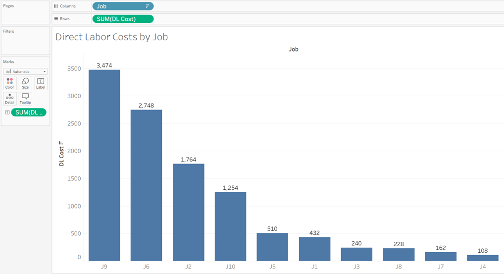
Create a bar chart in Tableau that shows the total Direct Labor Costs (DL Costs) for each of the ten jobs.
- Click on the “New Worksheet” button at the bottom of your Workbook.

- Double-click on the newly created “Sheet 2” at the bottom and rename it “Direct Labor Costs by Job”
- On the left-hand side under “Dimensions” (sometimes labeled as Tables) click on “Job” and drag it to the “Columns” area above the blank sheet.
- On the left-hand side under “Measures”, click on “DL Cost” and drag it to the “Rows” area.
- The calculation will default to Sum, which is what we want in this instance.
- This will create a vertical bar chart which is what we want in this instance.
- Label each job with its respective direct labor cost by clicking on “DL Cost” under “Measures” and dragging and dropping it onto the “Label” Marks card.○ If the labels appear horizontal, then proceed to the next step. If they do not appear horizontal, then click on the “Label” Marks card () and under “Label Appearance”, click on the drop down for “Alignment” and choose () under direction.
- Sort the direct labor costs from highest to lowest by clicking on the descending sort button in the middle of the menu bar at the top of the screen ()
- Your visualization should appear as follows:
Required:
2b. Of the 10 jobs:Which one had the lowest direct labor cost?What is the total amount?
2a. Of the 10 jobs:Which one had the highest direct labor cost?What is the total amount?

3.Required information
To complete this exercise, you will need to download and install Tableau on your computer. Tableau provides free instructor and student licenses as well as free videos and support for utilizing and learning the software. Once you are up and running with Tableau, watch the three “Getting Started” Tableau videos. All of Tableau’s short training videos can be found here.
[The following information applies to the questions displayed below.]
Woltz Page Company (WPC) is a manufacturer that uses a job-order costing system with a plantwide predetermined overhead rate based on direct-labor hours. Its average direct labor wage rate is $24 per hour. The company has asked you to conduct a job profitability study beginning with a thorough critique of its existing cost system. To keep the scope of your project manageable, you have chosen to base your critique on a subset of 10 jobs from the many jobs completed by the company during the year.
Download the Excel file, which you will use to create the Tableau visualizations that will accompany your critique.
Upload the Excel file into Tableau by doing the following:
- Open the Tableau Desktop application.
- On the left-hand side, under the “Connect” header and the “To a file” sub-header, click on “Microsoft Excel.”
- Choose the Excel file and click “Open.”
- Since the only worksheet in the Excel File is “Woltz Page Co” it will default as a selection with no further import steps needed
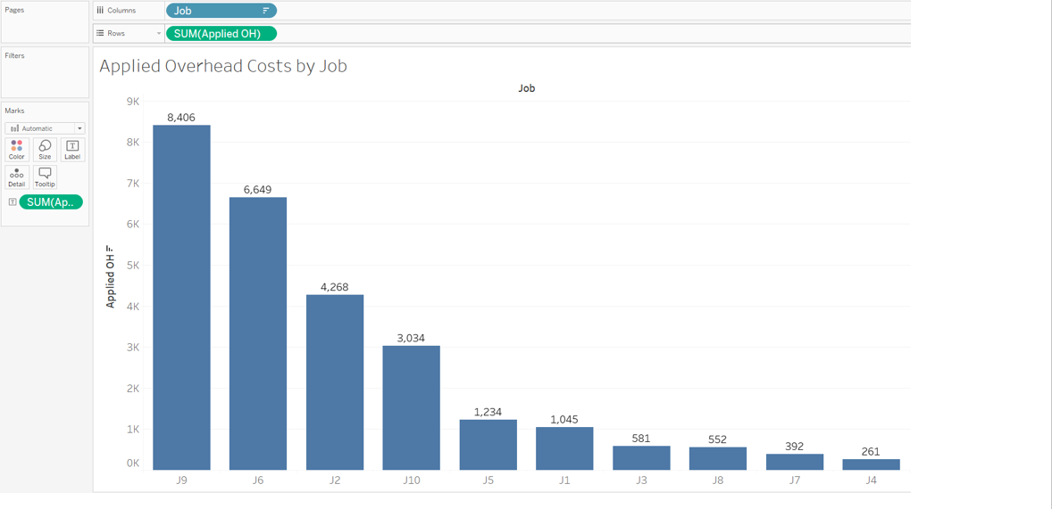
Create a bar chart in Tableau that shows the total Applied Overhead Costs (Applied OH) for each of the ten jobs.
- Click on the “New Worksheet” button at the bottom of your Workbook.
- Double-click on the newly created “Sheet 3” at the bottom and rename it “Applied Overhead Costs by Job”
- On the left-hand side under “Dimensions” (sometimes labeled as Tables) click on “Job” and drag it to the “Columns” area above the blank sheet.
- On the left-hand side under “Measures”, click on “Applied OH” and drag it to the “Rows” area.
- The calculation will default to Sum, which is what we want in this instance.
- This will create a vertical bar chart which is what we want in this instance.
- Label each job with its respective applied overhead cost by clicking on “Applied OH” under “Measures” and dragging and dropping it onto the “Label” Marks card.○ If the labels appear horizontal, then proceed to the next step. If they do not appear horizontal, then click on the “Label” Marks card () and under “Label Appearance”, click on the drop down for “Alignment” and choose () under direction.
- Sort the applied overhead costs from highest to lowest by clicking on the descending sort button in the middle of the menu bar at the top of the screen ()
- Your visualization should appear as follows:
Required:
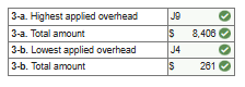
3b. Of the 10 jobs:Which one had the lowest applied overhead?What is the total amount?
3a. Of the 10 jobs:Which one had the highest applied overhead?What is the total amount?
4.Required information
To complete this exercise, you will need to download and install Tableau on your computer. Tableau provides free instructor and student licenses as well as free videos and support for utilizing and learning the software. Once you are up and running with Tableau, watch the three “Getting Started” Tableau videos. All of Tableau’s short training videos can be found here.
[The following information applies to the questions displayed below.]
Woltz Page Company (WPC) is a manufacturer that uses a job-order costing system with a plantwide predetermined overhead rate based on direct-labor hours. Its average direct labor wage rate is $24 per hour. The company has asked you to conduct a job profitability study beginning with a thorough critique of its existing cost system. To keep the scope of your project manageable, you have chosen to base your critique on a subset of 10 jobs from the many jobs completed by the company during the year.
Download the Excel file, which you will use to create the Tableau visualizations that will accompany your critique.
Upload the Excel file into Tableau by doing the following:
- Open the Tableau Desktop application.
- On the left-hand side, under the “Connect” header and the “To a file” sub-header, click on “Microsoft Excel.”
- Choose the Excel file and click “Open.”
- Since the only worksheet in the Excel File is “Woltz Page Co” it will default as a selection with no further import steps needed
Create two new formulas that calculate each job’s total cost and its gross margin. After the formulas are created, generate a bar chart that shows each job’s gross margin beginning with the job that has the highest gross margin and descending to the job with the lowest gross margin.
- Click on the “New Worksheet” button at the bottom of your Workbook.
- Double-click on the newly created “Sheet 4” at the bottom and rename it “Gross Margin by Job”
- Similar to other data analysis/visualization tools, you can create calculations using your quantitative values. To create a calculated field for a new measure that captures all of the costs related to a job do the following:
- Click on the “Analysis” drop-down at the top of the screen
- Choose “Create Calculated Field”
- A “Calculation” window will appear
- Change the title of the measure from “Calculation1” to “Total Costs”
- To calculate total costs, we need to add together the sum of all direct material costs, direct labor costs, and applied overhead costs. We can do this by typing in the formula for sum and then the measure name (or we can drag and drop the measure name into the window) followed by the + sign and then repeating for each of the costs. The formula will appear as follows:
- SUM([DM Cost])+SUM([DL Cost])+SUM([Applied OH])
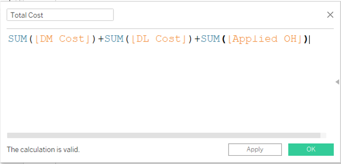
- Click “OK” to close the window and save the calculation. This new calculation (“Total Cost”) will show up as a new “Measure”
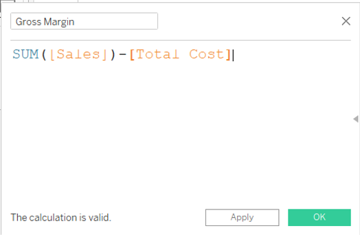
- Next create a calculation for “Gross Margin”
- Click on the “Analysis” drop-down at the top of the screen
- Choose “Create Calculated Field”
- A “Calculation” window will appear
- Change the title of the measure from “Calculation1” to “Gross Margin”
- To calculate gross margin, we need to subtract the total costs (a measure we just created) from the sum of sales. The formula will appear as follows:
- SUM([Sales])-[Total Cost]
- On the left-hand side under “Dimensions” (sometimes labeled as Tables) click on “Job” and drag it to the “Columns” area above the blank sheet.
- On the left-hand side under “Measures”, click on “Gross Margin” and drag it to the “Rows” area.
- The calculation will default to Sum, which is what we want in this instance.
- This will create a vertical bar chart which is what we want in this instance.
- Label each job with its respective gross margin by clicking on “Gross Margin” under “Measures” and dragging and dropping it onto the “Label” Marks card.○ If the labels appear horizontal, then proceed to the next step. If they do not appear horizontal, then click on the “Label” Marks card () and under “Label Appearance”, click on the drop down for “Alignment” and choose () under direction.
- To make it clear which jobs have a positive vs. a negative gross margin, make the jobs with a positive gross margin green and the jobs with a negative gross margin red by doing the following:
- Click on “Gross Margin” under “Measures” and drag and drop it onto the “Colors” Marks card (
 ).
). - Next click on the “Colors” Marks card and select “Edit Colors”
- Check the box next to “Stepped Color” and modify the steps to 2
- Click on the left color square and change it to a red color and then click on the right color square and change it to a green color (another good option that avoids concerns related to color blindness would be to use orange for negative and blue for positive)
- Finally click the “<<Advanced” button then check the box next to “Center” and ensure it says 0
- Click on “Gross Margin” under “Measures” and drag and drop it onto the “Colors” Marks card (
- To improve viewing, locate the “Standard” dropdown option in the menu bar at the top of the screen. Click on that dropdown and choose “Entire View.”
- Sort the gross margins from highest to lowest by clicking on the descending sort button in the middle of the menu bar at the top of the screen ()
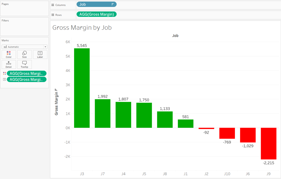
- Your visualization should appear as follows:
Required:
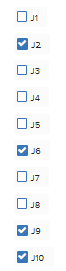
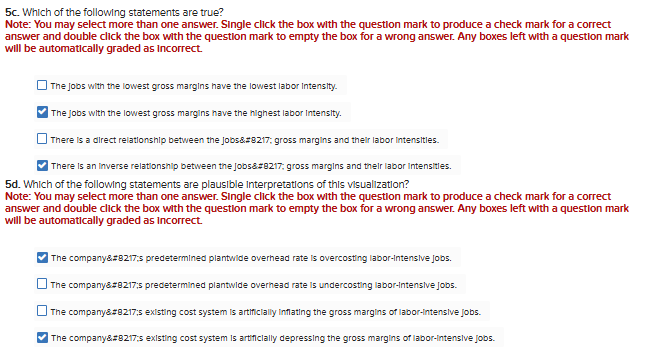
4a. Of the 10 jobs:Which one(s) had a negative gross margin?Note: You may select more than one answer. Single click the box with the question mark to produce a check mark for a correct answer and double click the box with the question mark to empty the box for a wrong answer. Any boxes left with a question mark will be automatically graded as incorrect.
4b. Of the 10 jobs:
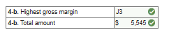
Which one had the highest gross margin?
What is the total amount?
4c. Of the 10 jobs:
Which one had the 2nd highest gross margin?
What is the total amount?

5.Required information
To complete this exercise, you will need to download and install Tableau on your computer. Tableau provides free instructor and student licenses as well as free videos and support for utilizing and learning the software. Once you are up and running with Tableau, watch the three “Getting Started” Tableau videos. All of Tableau’s short training videos can be found here.
[The following information applies to the questions displayed below.]
Woltz Page Company (WPC) is a manufacturer that uses a job-order costing system with a plantwide predetermined overhead rate based on direct-labor hours. Its average direct labor wage rate is $24 per hour. The company has asked you to conduct a job profitability study beginning with a thorough critique of its existing cost system. To keep the scope of your project manageable, you have chosen to base your critique on a subset of 10 jobs from the many jobs completed by the company during the year.
Download the Excel file, which you will use to create the Tableau visualizations that will accompany your critique.
Upload the Excel file into Tableau by doing the following:
- Open the Tableau Desktop application.
- On the left-hand side, under the “Connect” header and the “To a file” sub-header, click on “Microsoft Excel.”
- Choose the Excel file and click “Open.”
- Since the only worksheet in the Excel File is “Woltz Page Co” it will default as a selection with no further import steps needed
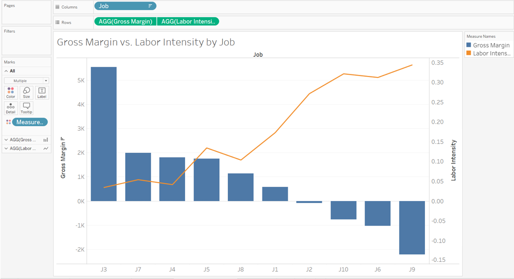
Create a new formula that calculates each job’s labor intensity. (i.e., its direct labor cost divided by its sales). After you create the formula, generate a circle views chart (scatterplot) showing each job’s gross margin (depicted as a bar chart) and its labor intensity (depicted as a line chart).
- Click on the “New Worksheet” button at the bottom of your Workbook.
- Double-click on the newly created “Sheet 5” at the bottom and rename it “Gross Margin v. Labor Intensity by Job”
- To calculate each job’s labor intensity do the following:
- Click on the “Analysis” drop-down at the top of the screen
- Choose “Create Calculated Field”
- A “Calculation” window will appear
- Change the title of the measure from “Calculation1” to “Labor Intensity”
- To calculate labor intensity, we need to divide the sum of direct labor costs by the sum of sales. The formula will appear as follows:
- SUM([DL Cost])/SUM([Sales])
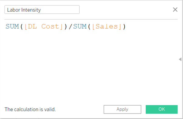
- Click “OK” to close the window and save the calculation. This new calculation (“Labor Intensity”) will show up as a new “Measure”
- On the left-hand side under “Dimensions” click on and drag “Jobs” into columns
- On the left-hand side under “Measures” (sometimes labeled as Tables) click on “Gross Margin” and drag it to the “Rows” area above the blank sheet.
- On the left-hand side under “Measures” (sometimes labeled as Tables) click on “Labor Intensity” and drag it to the “Rows” area beside “Gross Margin”
- Sort the bar chart from highest to lowest amount by clicking on the descending sort button in the middle of the menu bar at the top of the screen ()
- Once “Labor Intensity” is in rows, click on the “Agg(Labor Intensity)” pill dropdown and choose “Dual Axis”
- Now under the “Marks” card section you should see three sub-headers “All”, “AGG(Gross Margin)”, and “AGG(Labor Intensity)”
- Click on the “AGG(Gross Margin)” sub header and select the drop down that says automatic, and modify the selection to “Bar”
- Click on the “AGG(Labor Intensity)” sub header and select the drop down that says automatic, and modify the selection to “Line”◾ While still on the “AGG(Labor Intensity)” sub header, click on the “Color” marks card and choose “Edit Colors” and choose orange to improve line’s visibility
- To improve viewing, locate the “Standard” dropdown option in the menu bar at the top of the screen. Click on that dropdown and choose “Entire View.”
- Your visualization should appear as follows:
Required:
5a. Of the 10 jobs:Which one has the highest labor intensity?

5b. Of the 10 jobs:
Which one has the lowest labor intensity?

6.Required information
To complete this exercise, you will need to download and install Tableau on your computer. Tableau provides free instructor and student licenses as well as free videos and support for utilizing and learning the software. Once you are up and running with Tableau, watch the three “Getting Started” Tableau videos. All of Tableau’s short training videos can be found here.
[The following information applies to the questions displayed below.]
Woltz Page Company (WPC) is a manufacturer that uses a job-order costing system with a plantwide predetermined overhead rate based on direct-labor hours. Its average direct labor wage rate is $24 per hour. The company has asked you to conduct a job profitability study beginning with a thorough critique of its existing cost system. To keep the scope of your project manageable, you have chosen to base your critique on a subset of 10 jobs from the many jobs completed by the company during the year.
Download the Excel file, which you will use to create the Tableau visualizations that will accompany your critique.
Upload the Excel file into Tableau by doing the following:
- Open the Tableau Desktop application.
- On the left-hand side, under the “Connect” header and the “To a file” sub-header, click on “Microsoft Excel.”
- Choose the Excel file and click “Open.”
- Since the only worksheet in the Excel File is “Woltz Page Co” it will default as a selection with no further import steps needed
Create a side-by-side bar chart in Tableau that shows three bars (direct materials cost, direct labor cost, and applied overhead cost) for each job.
- Click on the “New Worksheet” button at the bottom of your Workbook.
- Double-click on the newly created “Sheet 6” at the bottom and rename it “Job Cost Summary”
- On the left-hand side under “Measures” (sometimes labeled as Tables) double click on “DM Costs”
- On the left-hand side under “Measures” (sometimes labeled as Tables) double click on “DL Costs”
- On the left-hand side under “Measures” (sometimes labeled as Tables) double click on “Applied OH”
- On the left-hand side under “Dimensions” double click on “Jobs”
- The resulting visualization will be nine circle views. We want to modify this to a side-by-side bar chart.○ In the upper right-hand corner of the screen, click on “Show Me,” then select the “side-by-side bars” option in the 3rd row down in the far-right column
- To improve viewing, locate the “Standard” dropdown option in the menu bar at the top of the screen. Click on that dropdown and choose “Entire View.”
- To insert numerical values at the top of each bar in your chart, click the Text button (
 ) in the menu bar at the top of the screen.
 - Your visualization should appear as follows:
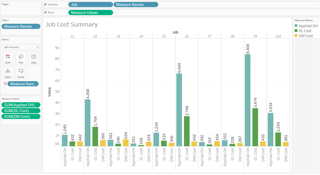
Required:
Note: You may select more than one answer. Single click the box with the question mark to produce a check mark for a correct answer and double click the box with the question mark to empty the box for a wrong answer. Any boxes left with a question mark will be automatically graded as incorrect.

7.Required information
To complete this exercise, you will need to download and install Tableau on your computer. Tableau provides free instructor and student licenses as well as free videos and support for utilizing and learning the software. Once you are up and running with Tableau, watch the three “Getting Started” Tableau videos. All of Tableau’s short training videos can be found here.
[The following information applies to the questions displayed below.]
Abernathy Company’s accounting department has finished preparing the master budget for this year. The chief financial officer (CFO) would like your assistance in creating data visualizations that she can use to better explain the master budget to the company’s senior management team.
More specifically, the CFO would like you to prepare some data visualizations that depict trends in sales, net income, cash collections, current assets, and operating cash flows.
Download the Excel file, which you will use to create your Tableau visualizations.
Upload the Excel file into Tableau by doing the following:
- Open the Tableau Desktop application.
- On the left-hand side, under the “Connect” header and the “To a file” sub-header, click on “Microsoft Excel.”
- Choose the Excel file and click “Open.”
- Since the only worksheet in the Excel File is “Abernathy Company” it will default as a selection with no further import steps needed
Create a line chart that provides a monthly sales trend analysis:
- Double click on “new sheet” at the bottom of the workbook and change the name of the newly created “Sheet 1” to “Monthly Sales Trend”
- On the left-hand side under “Dimensions” (sometimes labeled as Tables), double-click on “Month ended”
- On the left-hand side under “Measures”, double click on “Sales”
- In the upper right-hand corner, click on “Show Me” and choose the “Lines (continuous)” option in the 1st column fifth row down.
- Note this will default to just showing the year. We want to see a monthly trend; therefore, in the “Columns” area you will see a green pill that says “YEAR(Month ended)”, click on the [+] in that pill◾ This will modify the pill from years to quarters, click the [+] once more to go to “MONTHS”
- Format the title of the x-axis by right-clicking on the x-axis and clicking “Edit axis”
- At the bottom of the window that appears within the “Axis Titles” section replace “Month of Month Ended” with “Month”
- Uncheck the box “Automatic” that is beside “Subtitles”
- Your visualization should appear as follows:
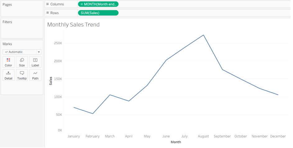
Required:
Note: Note that for all questions below you may select more than one answer. Single click the box with the question mark to produce a check mark for a correct answer and double click the box with the question mark to empty the box for a wrong answer. Any boxes left with a question mark will be automatically graded as incorrect.

8.Required information
To complete this exercise, you will need to download and install Tableau on your computer. Tableau provides free instructor and student licenses as well as free videos and support for utilizing and learning the software. Once you are up and running with Tableau, watch the three “Getting Started” Tableau videos. All of Tableau’s short training videos can be found here.
[The following information applies to the questions displayed below.]
Abernathy Company’s accounting department has finished preparing the master budget for this year. The chief financial officer (CFO) would like your assistance in creating data visualizations that she can use to better explain the master budget to the company’s senior management team.
More specifically, the CFO would like you to prepare some data visualizations that depict trends in sales, net income, cash collections, current assets, and operating cash flows.
Download the Excel file, which you will use to create your Tableau visualizations.
Upload the Excel file into Tableau by doing the following:
- Open the Tableau Desktop application.
- On the left-hand side, under the “Connect” header and the “To a file” sub-header, click on “Microsoft Excel.”
- Choose the Excel file and click “Open.”
- Since the only worksheet in the Excel File is “Abernathy Company” it will default as a selection with no further import steps needed
Create a line chart that includes the monthly sales trend analysis from part 1 plus another trend line depicting the monthly cash collections from customers:
- Tableau enables us to duplicate sheets when we are trying to create a similar visualization. Right-click on the sheet name at the bottom “Monthly Sales Trend” and choose “Duplicate”
- You will now see you have a new sheet titled “Monthly Sales Trend (2)” which is an exact copy of the first sheet
- Double click on this new sheet and rename it “Monthly Sales vs. Cash Collections”
- On the left-hand side under “Measures”, double click on “Total cash collections”○ This will create two line charts that, in the next step, we will modify to one chart containing two lines
- In the upper right-hand corner, click on “Show Me” and choose “Dual lines” in the far-right column fifth row down.
- Then right click on the right Y-axis and choose “Synchronize Axis”
- Your visualization should appear as follows:
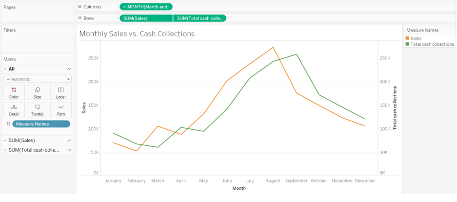
Required:
Note: Note that for all questions below you may select more than one answer. Single click the box with the question mark to produce a check mark for a correct answer and double click the box with the question mark to empty the box for a wrong answer. Any boxes left with a question mark will be automatically graded as incorrect.

9.Required information
To complete this exercise, you will need to download and install Tableau on your computer. Tableau provides free instructor and student licenses as well as free videos and support for utilizing and learning the software. Once you are up and running with Tableau, watch the three “Getting Started” Tableau videos. All of Tableau’s short training videos can be found here.
[The following information applies to the questions displayed below.]
Abernathy Company’s accounting department has finished preparing the master budget for this year. The chief financial officer (CFO) would like your assistance in creating data visualizations that she can use to better explain the master budget to the company’s senior management team.
More specifically, the CFO would like you to prepare some data visualizations that depict trends in sales, net income, cash collections, current assets, and operating cash flows.
Download the Excel file, which you will use to create your Tableau visualizations.
Upload the Excel file into Tableau by doing the following:
- Open the Tableau Desktop application.
- On the left-hand side, under the “Connect” header and the “To a file” sub-header, click on “Microsoft Excel.”
- Choose the Excel file and click “Open.”
- Since the only worksheet in the Excel File is “Abernathy Company” it will default as a selection with no further import steps needed
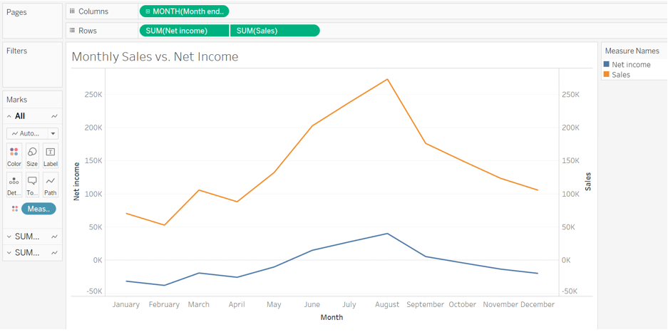
Create a line chart that includes the monthly sales trend analysis from part 1 plus another trend line depicting the monthly net income:
- Tableau enables us to duplicate sheets when we are trying to create a similar visualization. Right-click on the sheet name at the bottom “Monthly Sales Trend” (from Part 1) and choose “Duplicate”
- You will now see you have a new sheet titled “Monthly Sales Trend (2)” which is an exact copy of the first sheet
- Double click on this new sheet and rename it “Monthly Sales vs. Net Income”
- On the left-hand side under “Measures”, double click on “Net Income”○ This will create two line charts that, in the next step, we will modify to one chart containing two lines
- In the upper right-hand corner, click on “Show Me” and choose “Dual lines” in the far-right column fifth row down.
- Then right click on the right Y-axis and choose “Synchronize Axis”
- Your visualization should appear as follows:
Required:
Note: Note that for all questions below you may select more than one answer. Single click the box with the question mark to produce a check mark for a correct answer and double click the box with the question mark to empty the box for a wrong answer. Any boxes left with a question mark will be automatically graded as incorrect.

10.Required information
To complete this exercise, you will need to download and install Tableau on your computer. Tableau provides free instructor and student licenses as well as free videos and support for utilizing and learning the software. Once you are up and running with Tableau, watch the three “Getting Started” Tableau videos. All of Tableau’s short training videos can be found here.
[The following information applies to the questions displayed below.]
Abernathy Company’s accounting department has finished preparing the master budget for this year. The chief financial officer (CFO) would like your assistance in creating data visualizations that she can use to better explain the master budget to the company’s senior management team.
More specifically, the CFO would like you to prepare some data visualizations that depict trends in sales, net income, cash collections, current assets, and operating cash flows.
Download the Excel file, which you will use to create your Tableau visualizations.
Upload the Excel file into Tableau by doing the following:
- Open the Tableau Desktop application.
- On the left-hand side, under the “Connect” header and the “To a file” sub-header, click on “Microsoft Excel.”
- Choose the Excel file and click “Open.”
- Since the only worksheet in the Excel File is “Abernathy Company” it will default as a selection with no further import steps needed
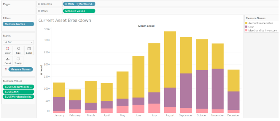
Create a bar chart that depicts each month’s ending total current assets. Each bar within the chart will sub-divide into three parts—the portion of the overall balance that resides in cash, accounts receivable, and inventory:
- Click on “new sheet” at the bottom of the workbook and change the name of the newly created “Current Asset Breakdown”
- On the left-hand side under “Dimensions” (sometimes labeled as Tables), double-click on “Month ended”
- On the left-hand side under “Dimensions” (sometimes labeled as Tables), click on “Measure Names” and drag and drop it onto the “Colors” Marks card (
 ).○ Now the blue pill that says “Measure Names” appears below the “Marks” card. Click on the drop down of that pill and choose “filter”
 - Uncheck every box except for the following:
- Accounts receivable
- Cash
- Merchandise Inventory
- Click “OK”
- On the left-hand side under “Measures”, click on “Measure Values” and drag and drop it onto “Rows”
- Note the visualization will default to showing only the year. We want to see a monthly trend, therefore in the “Columns” area you will see a blue pill that says “YEAR(Month ended)”, click on the [+] in that pill○This will modify the pill from years to quarters, click the [+] once more to go to “MONTHS”
- In the Columns area click on the dropdown for “YEAR(Month Ended)” and choose “Remove”
- In the Columns area click on the dropdown for “QUARTER(Month Ended)” and choose “Remove”
- Under the “Marks” card, there is a dropdown that currently says “Automatic”, click on that dropdown and choose “Bar”
- To improve viewing, locate the “Standard” dropdown option in the menu bar at the top of the screen. Click on that dropdown and choose “Entire View.”
- Format the title of the y-axis by right-clicking on the y-axis and clicking “Edit axis”○ At the bottom of the window that appears within the “Axis Titles” section replace “Value” with “Amount”
- Your visualization should appear as follows:
Required:
Note: Note that for all questions below you may select more than one answer. Single click the box with the question mark to produce a check mark for a correct answer and double click the box with the question mark to empty the box for a wrong answer. Any boxes left with a question mark will be automatically graded as incorrect.

11.Required information
To complete this exercise, you will need to download and install Tableau on your computer. Tableau provides free instructor and student licenses as well as free videos and support for utilizing and learning the software. Once you are up and running with Tableau, watch the three “Getting Started” Tableau videos. All of Tableau’s short training videos can be found here.
[The following information applies to the questions displayed below.]
Abernathy Company’s accounting department has finished preparing the master budget for this year. The chief financial officer (CFO) would like your assistance in creating data visualizations that she can use to better explain the master budget to the company’s senior management team.
More specifically, the CFO would like you to prepare some data visualizations that depict trends in sales, net income, cash collections, current assets, and operating cash flows.
Download the Excel file, which you will use to create your Tableau visualizations.
Upload the Excel file into Tableau by doing the following:
- Open the Tableau Desktop application.
- On the left-hand side, under the “Connect” header and the “To a file” sub-header, click on “Microsoft Excel.”
- Choose the Excel file and click “Open.”
- Since the only worksheet in the Excel File is “Abernathy Company” it will default as a selection with no further import steps needed
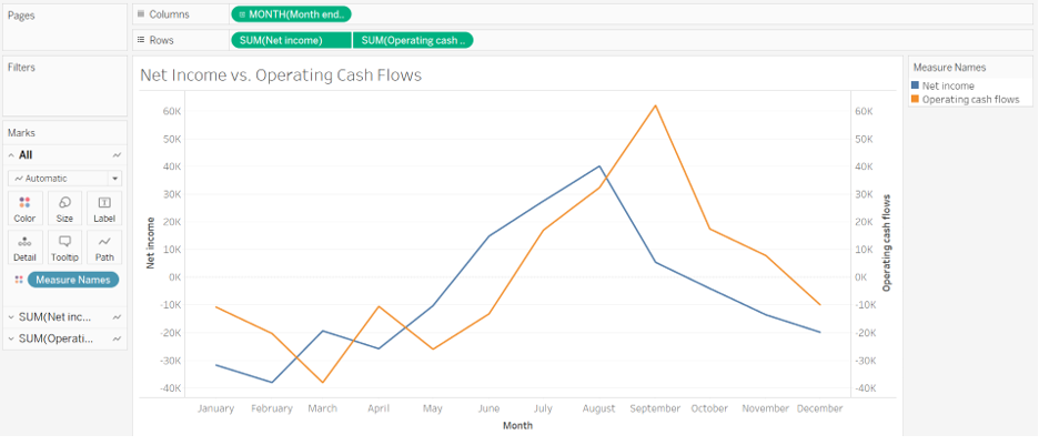
Create a line chart that includes a total of two lines. The first line will depict monthly trends in operating cash flows and the second line will depict net income:
- Double click on “new sheet” at the bottom of the workbook and change the name of the newly created to “Net Income vs. Operating Cash Flows”
- On the left-hand side under “Dimensions” (sometimes labeled as Tables), double-click on “Month ended”
- On the left-hand side under “Measures”, double click on “Net income”
- On the left-hand side under “Measures”, double click on “Operating Cash Flows”
- In the upper right-hand corner, click on “Show Me” and choose “Dual lines” in the far-right column fifth row down.○ Note this will default to showing only the year. We want to see a monthly trend, therefore in the “Columns” area you will see a green pill that says “YEAR(Month ended)”, click on the [+] in that pill◾ This will modify the pill from years to quarters, click the [+] once more to go to “MONTHS”
- Right click on the right Y-axis and choose “Synchronize Axis”
- Format the title of the x-axis by right-clicking on the x-axis and clicking “Edit axis”
- At the bottom of the window that appears within the “Axis Titles” section replace “Month of Month Ended” with “Month”
- Uncheck the box “Automatic” that is beside “Subtitles”
- Your visualization should appear as follows:
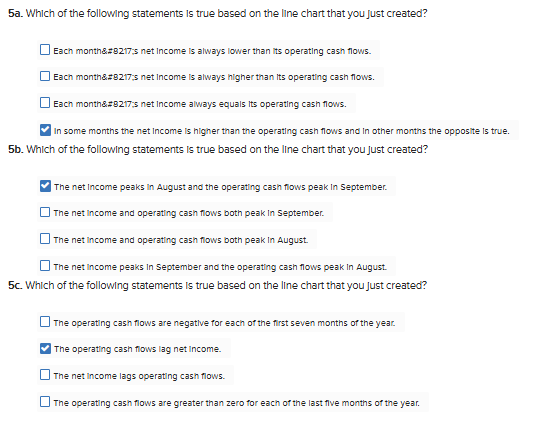
Required:
Note: Note that for all questions below you may select more than one answer. Single click the box with the question mark to produce a check mark for a correct answer and double click the box with the question mark to empty the box for a wrong answer. Any boxes left with a question mark will be automatically graded as incorrect.
12.Required information
To complete this exercise, you will need to download and install Tableau on your computer. Tableau provides free instructor and student licenses as well as free videos and support for utilizing and learning the software. Once you are up and running with Tableau, watch the three “Getting Started” Tableau videos. All of Tableau’s short training videos can be found here.
[The following information applies to the questions displayed below.]
Bullseye Company is benchmarking its quarterly financial performance against two of its competitors—PriceCo and Wall-Co. You have been asked to create some data visualizations that summarize the benchmarking data.
Download the Excel file, which you will use to create your Tableau visualizations.
Upload the Excel file into Tableau by doing the following:
- Open the Tableau Desktop application.
- On the left-hand side, under the “Connect” header and the “To a file” sub-header, click on “Microsoft Excel.”
- Choose the Excel file and click “Open.”
- Since the only worksheet in the Excel File is “Ratio Analysis” it will default as a selection with no further import steps needed
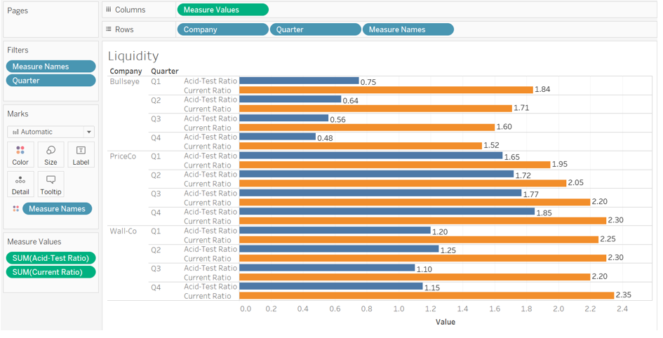
With respect to liquidity analysis, create a clustered bar chart that compares the current ratio and acid-test (quick) ratio for all three companies:
- Click on “new sheet” at the bottom of the workbook and change the name of the newly created “Sheet 1” to “Liquidity”.
- On the left-hand side under “Dimensions” (sometimes labeled as Tables), double-click on “Company”.
- On the left-hand side under “Dimensions” (sometimes labeled as Tables), double-click on “Quarter”.
- On the left-hand side under “Measures”, double click on the measure of “Acid-Test Ratio”.
- On the left-hand side under “Measures”, double click on the measure of “Current Ratio”
- In the upper right-hand corner, click on “Show Me” and choose the “side-by-side bars” option in the third column third row down.
- Within the visualization, click on the attribute “Quarterly Average” and choose “Exclude”
- Click on the Label button (
 ) at the top of the screen” to show the n values.○ After doing this, click on the “Label” Marks card and click the box for “Allow labels to overlap other marks”
 - In the green pill “Measure Values” in the “Rows” area, click on the drop down and choose format.○ In the “Pane” tab, under the “Default” section, click on the “Numbers” drop down and choose “Numbers (Custom)” and change the decimals to 2.
- Right click on the header titled “Company” and choose the option “Hide Field Labels for Columns”.
- Above the “Columns” area, click on the button to swap rows with columns (
 ).
). - To improve viewing, locate the “Standard” dropdown option in the menu bar at the top of the screen. Click on that dropdown and choose “Entire View.”
- Your visualization should appear as follows:
Required:
Note: Note that for all questions below you may select more than one answer. Single click the box with the question mark to produce a check mark for a correct answer and double click the box with the question mark to empty the box for a wrong answer. Any boxes left with a question mark will be automatically graded as incorrect.

13.Required information
To complete this exercise, you will need to download and install Tableau on your computer. Tableau provides free instructor and student licenses as well as free videos and support for utilizing and learning the software. Once you are up and running with Tableau, watch the three “Getting Started” Tableau videos. All of Tableau’s short training videos can be found here.
[The following information applies to the questions displayed below.]
Bullseye Company is benchmarking its quarterly financial performance against two of its competitors—PriceCo and Wall-Co. You have been asked to create some data visualizations that summarize the benchmarking data.
Download the Excel file, which you will use to create your Tableau visualizations.
Upload the Excel file into Tableau by doing the following:
- Open the Tableau Desktop application.
- On the left-hand side, under the “Connect” header and the “To a file” sub-header, click on “Microsoft Excel.”
- Choose the Excel file and click “Open.”
- Since the only worksheet in the Excel File is “Ratio Analysis” it will default as a selection with no further import steps needed
With respect to asset management, create a horizontal bar chart that compares the average sale period for all three companies:
- Click on “new sheet” at the bottom of the workbook and change the name of the newly created “Sheet 1” to “Asset Management”.
- On the left-hand side under “Measures”, click on the measure of “Average Sale Period” and drag and drop it into “Columns”
- On the left-hand side under “Dimensions” (sometimes labeled as Tables), click on “Company” and drag and drop it into “Rows”.
- On the left-hand side under “Dimensions” (sometimes labeled as Tables), click on “Quarter” and drag and drop it into “Rows”.
- Within the visualization, click on the attribute “Quarterly Average” and choose “Exclude”
- On the left-hand side under “Dimensions” (sometimes labeled as Tables), click on “Company” and drag and drop it onto the “Colors” Marks card (
 ).○ This will allow the companies to stand out better
 - Click on the Label button () at the top of the screen” to show the n values.
- Right click on the header titled “Company” and choose the option “Hide Field Labels for Rows”.
- To improve viewing, locate the “Standard” dropdown option in the menu bar at the top of the screen. Click on that dropdown and choose “Entire View.”
- Your visualization should appear as follows:
Required:
Note: Note that for all questions below you may select more than one answer. Single click the box with the question mark to produce a check mark for a correct answer and double click the box with the question mark to empty the box for a wrong answer. Any boxes left with a question mark will be automatically graded as incorrect.
14.Required information
To complete this exercise, you will need to download and install Tableau on your computer. Tableau provides free instructor and student licenses as well as free videos and support for utilizing and learning the software. Once you are up and running with Tableau, watch the three “Getting Started” Tableau videos. All of Tableau’s short training videos can be found here.
[The following information applies to the questions displayed below.]
Bullseye Company is benchmarking its quarterly financial performance against two of its competitors—PriceCo and Wall-Co. You have been asked to create some data visualizations that summarize the benchmarking data.
Download the Excel file, which you will use to create your Tableau visualizations.
Upload the Excel file into Tableau by doing the following:
- Open the Tableau Desktop application.
- On the left-hand side, under the “Connect” header and the “To a file” sub-header, click on “Microsoft Excel.”
- Choose the Excel file and click “Open.”
- Since the only worksheet in the Excel File is “Ratio Analysis” it will default as a selection with no further import steps needed
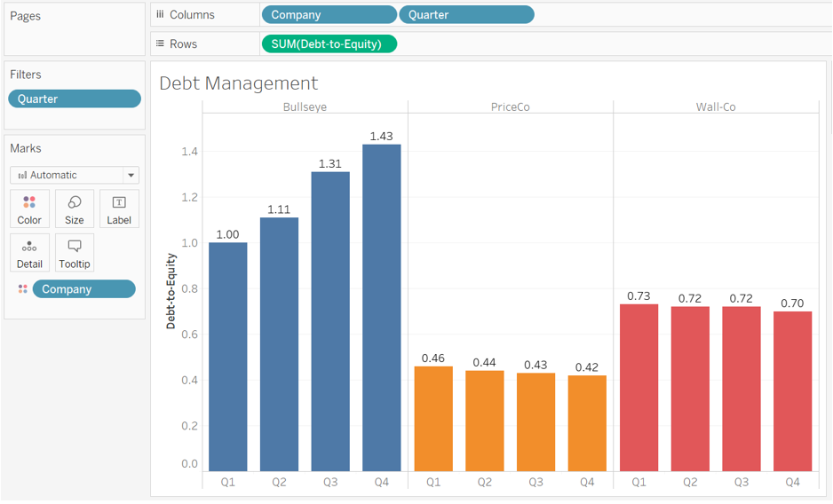
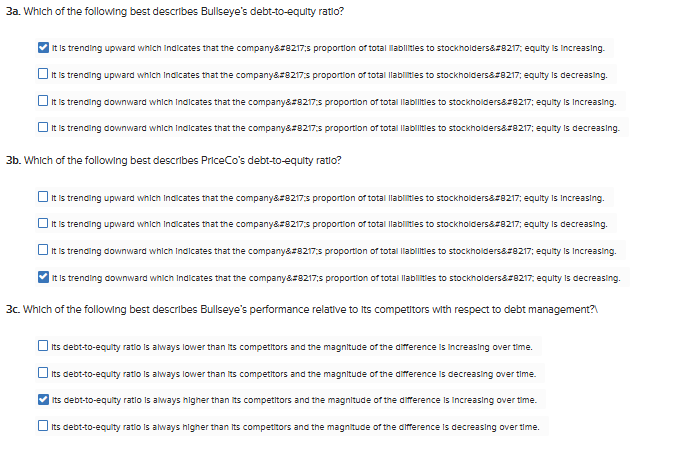
With respect to debt management, create a vertical bar chart that shows the debt-to-equity ratio for all three companies:
- Click on “new sheet” at the bottom of the workbook and change the name of the newly created “Sheet” to “Debt Management”.
- On the left-hand side under “Measures”, click on the measure of “Debt-to-Equity” and drag and drop it into “Rows”
- On the left-hand side under “Dimensions” (sometimes labeled as Tables), click on “Company” and drag and drop it into “Columns”.
- On the left-hand side under “Dimensions” (sometimes labeled as Tables), click on “Quarterly” and drag and drop it into “Columns”.
- Within the visualization, click on the attribute “Quarterly Average” and choose “Exclude”
- On the left-hand side under “Dimensions” (sometimes labeled as Tables), click on “Company” and drag and drop it onto the “Colors” Marks card ().○ This will allow the companies to stand out better
- Click on the Label button () at the top of the screen” to show the values.
- In the green pill “Sum(Debt-to-Equity)” in the “Rows” area, click on the drop down and choose format.○ In the “Pane” tab, under the “Default” section, click on the “Numbers” drop down and choose “Numbers (Custom)” and change the decimals to 2.
- Right click on the header titled “Company” and choose the option “Hide Field Labels for Columns”.
- To improve viewing, locate the “Standard” dropdown option in the menu bar at the top of the screen. Click on that dropdown and choose “Entire View.”
- Your visualization should appear as follows:
Required:
Note: Note that for all questions below you may select more than one answer. Single click the box with the question mark to produce a check mark for a correct answer and double click the box with the question mark to empty the box for a wrong answer. Any boxes left with a question mark will be automatically graded as incorrect.
15.Required information
To complete this exercise, you will need to download and install Tableau on your computer. Tableau provides free instructor and student licenses as well as free videos and support for utilizing and learning the software. Once you are up and running with Tableau, watch the three “Getting Started” Tableau videos. All of Tableau’s short training videos can be found here.
[The following information applies to the questions displayed below.]
Bullseye Company is benchmarking its quarterly financial performance against two of its competitors—PriceCo and Wall-Co. You have been asked to create some data visualizations that summarize the benchmarking data.
Download the Excel file, which you will use to create your Tableau visualizations.
Upload the Excel file into Tableau by doing the following:
- Open the Tableau Desktop application.
- On the left-hand side, under the “Connect” header and the “To a file” sub-header, click on “Microsoft Excel.”
- Choose the Excel file and click “Open.”
- Since the only worksheet in the Excel File is “Ratio Analysis” it will default as a selection with no further import steps needed
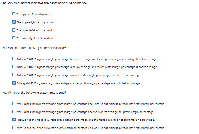
Regarding profitability analysis, create a scatterplot showing the relationship between each company’s average gross margin percentage and average net profit margin percentage:
- Click on “new sheet” at the bottom of the workbook and change the name of the newly created “Sheet” to “Profitability Analysis”.
- On the left-hand side under “Measures”, double click on the measure of “Gross Margin %”
- On the left-hand side under “Measures”, double click on the measure of “Net Profit Margin %”
- In the “Analysis” menu option, uncheck the box next to “Aggregate Measures”
- On the left-hand side under “Dimensions” (sometimes labeled as Tables), click on “Quarter” and drag and drop it onto the “Filters” section○ Uncheck all of the quarters and only keep “Quarterly Average” selected
- On the left-hand side under “Dimensions” (sometimes labeled as Tables), click on “Company” and drag and drop it onto the “Colors” Marks card ().○ This will allow the companies to stand out better
- On the left-hand side under “Dimensions” (sometimes labeled as Tables), click on “Company” and drag and drop it onto the “Label” Marks card ().
- Click on the “Analytics” tab then double click on “Average Line” under the “Summarize” sub header
- Right-click on the y-axis and choose “Format”
- On the “Axis” tab go the “Scale” sub header and choose “Percentage”
- Change the decimals to 1
- On the “Axis” tab go the “Scale” sub header and choose “Percentage”
- Right-click on the x-axis and choose “Format”
- On the “Axis” tab go the “Scale” sub header and choose “Percentage”
- Change the decimals to 1
- On the “Axis” tab go the “Scale” sub header and choose “Percentage”
- To improve viewing, locate the “Standard” dropdown option in the menu bar at the top of the screen. Click on that dropdown and choose “Entire View.”
- Your visualization should appear as follows:
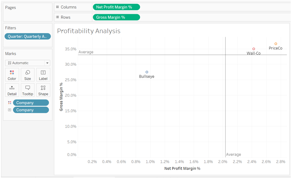
Required:
Note: Note that for all questions below you may select more than one answer. Single click the box with the question mark to produce a check mark for a correct answer and double click the box with the question mark to empty the box for a wrong answer. Any boxes left with a question mark will be automatically graded as incorrect.
16.Required information
To complete this exercise, you will need to download and install Tableau on your computer. Tableau provides free instructor and student licenses as well as free videos and support for utilizing and learning the software. Once you are up and running with Tableau, watch the three “Getting Started” Tableau videos. All of Tableau’s short training videos can be found here.
[The following information applies to the questions displayed below.]
Bullseye Company is benchmarking its quarterly financial performance against two of its competitors—PriceCo and Wall-Co. You have been asked to create some data visualizations that summarize the benchmarking data.
Download the Excel file, which you will use to create your Tableau visualizations.
Upload the Excel file into Tableau by doing the following:
- Open the Tableau Desktop application.
- On the left-hand side, under the “Connect” header and the “To a file” sub-header, click on “Microsoft Excel.”
- Choose the Excel file and click “Open.”
- Since the only worksheet in the Excel File is “Ratio Analysis” it will default as a selection with no further import steps needed
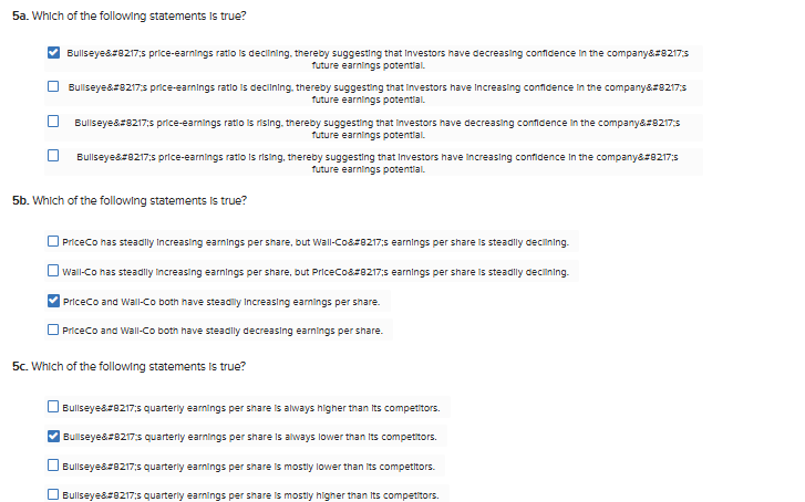
With respect to market performance, create a combo chart that shows the earnings per share and the price-earnings ratio for all three companies:
- Click on “new sheet” at the bottom of the workbook and change the name of the newly created “Sheet” to “Market Performance”.
- On the left-hand side under “Dimensions” (sometimes labeled as Tables), click on “Company” and drag and drop it into “Columns”.
- On the left-hand side under “Dimensions” (sometimes labeled as Tables), click on “Quarter” and drag and drop it into “Columns”.
- On the left-hand side under “Measures”, click on the measure of “Earnings Per Share” and drag and drop it into “Rows”
- On the left-hand side under “Measures”, click on the measure of “Price-Earnings Ratio” and drag and drop it into “Rows”
- In the green pill in the “Rows” area that says “Sum(Price-Earnings Ratio)”, click on the drop down and choose “Dual Axis”
- Within the visualization, click on the attribute “Quarterly Average” and choose “Exclude”
- In the “Marks” card area, do the following:
- Click on the section just for “Sum(Price-Earnings Ratio)”
- Change the drop down from “Automatic” to “Gantt Bar”
- Click in the “Colors” Marks card, and choose “Effects” border, and choose the black color.
- On the left-hand side under “Measures”, click on “Price-Earnings Ratio” and drag and drop it onto the “Label” Marks card ().
- Click on the resulting green pill below and choose format
- In the “Pane” tab, under the “Default” section, click on the “Numbers” drop down and choose “Numbers (Custom)” and change the decimals to 2.
- Click on the resulting green pill below and choose format
- Click on the section just for “Sum(Earnings Per Share)”
- Change the drop down from “Automatic” to “Bar”
- On the left-hand side under “Measures”, click on “Earnings Per Share” and drag and drop it onto the “Label” Marks card ().
- Click on the resulting green pill below and choose format
- In the “Pane” tab, under the “Default” section, click on the “Numbers” drop down and choose “Currency (Standard).
- Click on the resulting green pill below and choose format
- Click on the section just for “Sum(Price-Earnings Ratio)”
- Right click the y-axis and choose “Edit axis”
- In the “Range” area, choose “Fixed” and change the upper limit to “2.75”
- This will give the visualization a clearer view
- Right click on the header titled “Company” and choose the option “Hide Field Labels for Columns”.
- To improve viewing, locate the “Standard” dropdown option in the menu bar at the top of the screen. Click on that dropdown and choose “Entire View.”
- Your visualization should appear as follows:
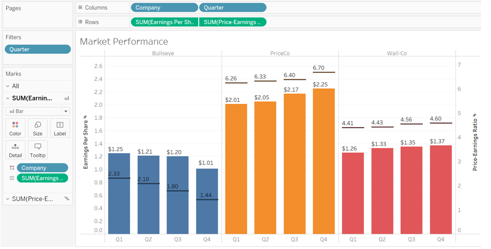
Required:
Note: Note that for all questions below you may select more than one answer. Single click the box with the question mark to produce a check mark for a correct answer and double click the box with the question mark to empty the box for a wrong answer. Any boxes left with a question mark will be automatically graded as incorrect.