
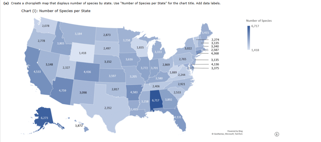
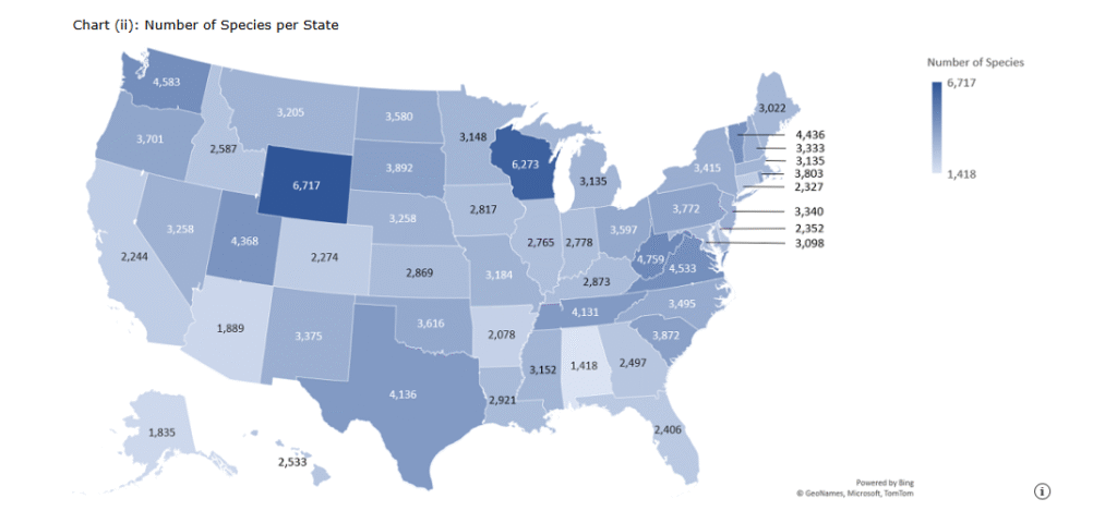
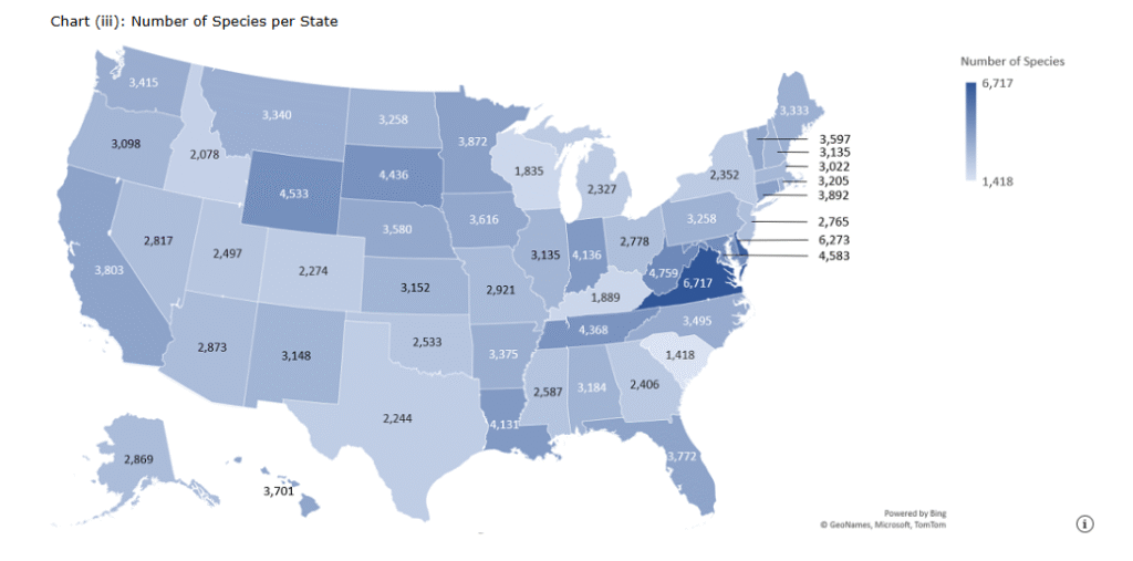
1.Ecologists often measure the biodiversity of a region by the number of distinct species that exist in the region. Nature reserves are lands specifically designated by the government to help maintain biodiversity. Care must be taken when setting up a network of nature reserves so the maximum number of species can exist in the network. Geography matters as well, as putting reserves too close together might subject the entire network to risks, such as devastation from wildfires. The initial step in this type of planning usually involves mapping the number of species that exist in each region. The file species contains the number of unique species that exist in each of the 50 states in the United States.

2. The U.S. Census Bureau tracks shifts in population by each state and region in the United States. The net migration rate is an indicator of the movement of people from one area to another. A positive net migration rate means more people moved into the area than moved away, and a negative net migration rate means more people left the area than moved to the area. Mathematically, the net migration rate N is defined as follows.

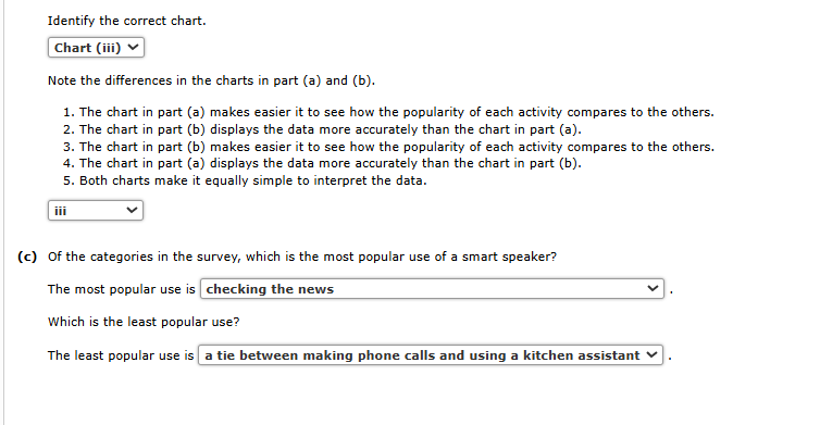
3. A consulting firm conducted a survey of owners of smart speakers to better understand how they use these devices. The table below displays the percentage of the respondents who use their smart speaker for each of 11 activities.
| Use Category | Percentage of Respondents |
|---|---|
| Checking sports | 27% |
| Checking the news | 74% |
| Checking weather/traffic | 49% |
| Controlling lighting | 26% |
| Finding local information | 30% |
| Fun stuff (jokes, etc.) | 36% |
| Listening to music | 40% |
| Looking up facts | 39% |
| Making phone calls | 24% |
| Setting reminders/alarms | 35% |
| Using a kitchen assistant | 24% |
(a)
Construct a bar chart that shows the percentage of respondents by category. Use “How People Use Their Smart Speakers” for the chart title. Edit the chart to make it easier to interpret. Add data labels.
Identify the correct chart.
–Select–Chart (i)Chart (ii)Chart (iii)Chart (iv)Item 1
(b)
Sort the data so percentages are ordered from smallest to largest.
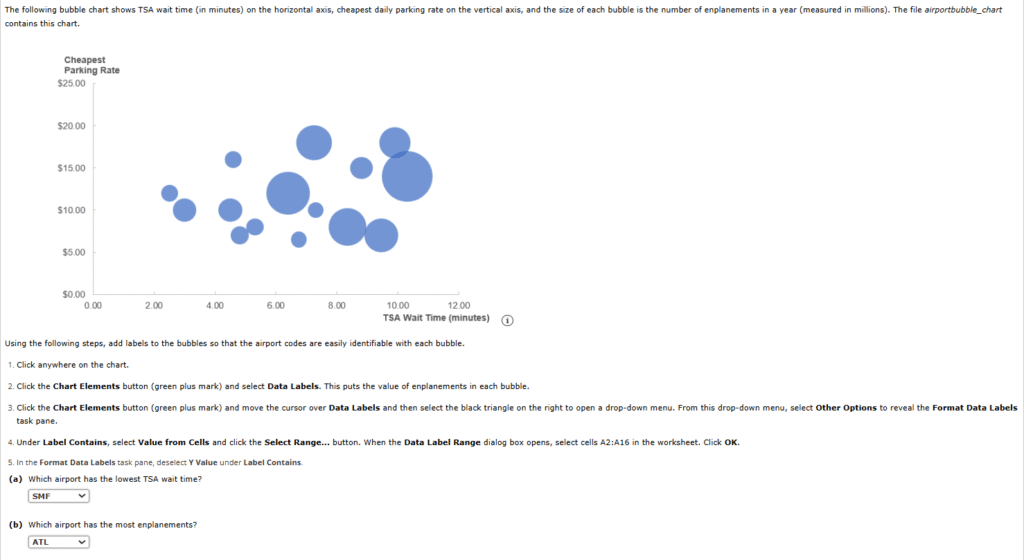
4. The following bubble chart shows TSA wait time (in minutes) on the horizontal axis, cheapest daily parking rate on the vertical axis, and the size of each bubble is the number of enplanements in a year (measured in millions). The file airportbubble_chart contains this chart.
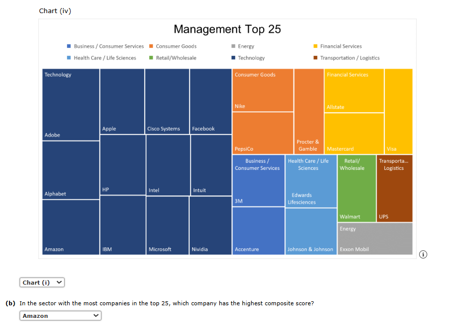
5. The Drucker Institute ranks corporations for managerial effectiveness based on a composite score derived from the following five factors: customer satisfaction, employee engagement and development, innovation, financial strength, and social responsibility. The file ManagementTop25 contains the top 25 companies in the Institute’s ranking based on the composite score (source: The Wall Street Journal). For each company, the industry sector, the company name, and the composite score are given.
(a)
Create a treemap chart using these data with the Sector being the category, Company being the subcategory, and the composite score being the quantitative variable. Use “Management Top 25” for the chart title. Hint: Be sure to first sort the data by sector.


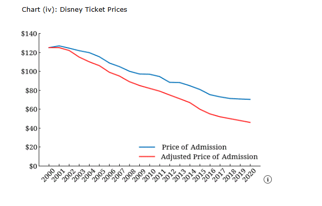
6. Suppose that previously, we displayed the price of a general admission ticket to Walt Disney World for the years 2000–2020. However, these prices did not factor in inflation over these years. The file disneypricesadjusted gives the general admission price and the general admission price adjusted for inflation for the years 2000–2020.
(a)
Create a line chart that shows the price of admission and the adjusted price of admission for the years 2000–2020.


Identify the correct chart.

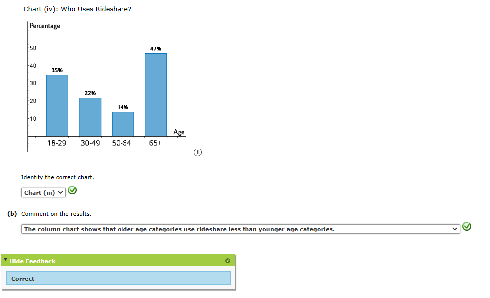
7. A poll showed that 30% of all Americans regularly use a ride-sharing service such as Lyft or Uber. The table below contains the survey results by age category.
| Age | Percentage who use Rideshare |
|---|---|
| 18–29 | 47% |
| 30–49 | 35% |
| 50–64 | 22% |
| 65+ | 14% |
(a)
Construct a column chart that shows the percentage of respondents who use a ride share by age category. Use “Who Uses Rideshare?” as the chart title and “Age” as the horizontal axis title. Edit the chart to make it easier to interpret. Add data labels.
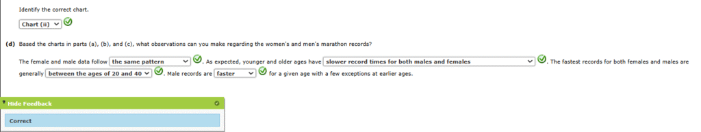
8. The file marathonrecords contains marathon world records for ages 6 to 90 for women and men (records for ages 9 and 10 were incomplete).
(a)
Create a scatter chart with age on the horizontal axis and the women’s marathon record on the vertical axis. Use “Female Marathon Records (in minutes)” as the vertical axis title and “Age” as the horizontal axis title. Edit the chart to improve interpretation.


Identify the correct chart.
–Select–Chart (i)Chart (ii)Chart (iii)Chart (iv)Item 1
(b)
Create a scatter chart with age on the horizontal axis and the men’s marathon records on the vertical axis. Use “Male Marathon Records (in minutes)” as the vertical axis title and “Age” as the horizontal axis title. Edit the chart to improve interpretation.


Identify the correct chart.
–Select–Chart (i)Chart (ii)Chart (iii)Chart (iv)Item 2
(c)
Create a scatter chart that plots both the women’s records versus age and the men’s record versus age. Select Scatter with Straight Lines. Use “Marathon Records (in minutes)” as the vertical axis title and “Age” as the horizontal axis title. Edit the chart to improve interpretation.


9. The following charts show the relationships between tuition and year founded and graduation rate and year founded. The two charts are similar.


Consider the data in the file colleges. The file contains the following data on the sample of 103 private colleges: year founded, tuition and fees (not including room and board) for the year these data were collected, and the percentage of undergraduates who obtained their degree within six years (source: The World Almanac).
(a)
Create a scatter chart to explore the relationship between tuition and percent who graduate. Use “Graduation Rate versus Tuition” as the chart title, “Tuition” as the horizontal axis title, and “Graduation Rate” as the vertical axis title.
Chart (i): Graduation Rate versus Tuition

Chart (ii): Graduation Rate versus Tuition

Chart (iii): Graduation Rate versus Tuition

Chart (iv): Graduation Rate versus Tuition

