
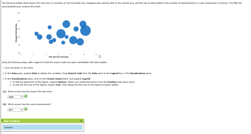
1. The following bubble chart shows TSA wait time (in minutes) on the horizontal axis, cheapest daily parking rate on the vertical axis, and the size of each bubble is the number of enplanements in a year (measured in millions). The PBIX file airportbubblevisual contains this chart.
2. Consider the data in the file colleges. The file contains the following data on the sample of 103 private colleges: year founded, tuition and fees (not including room and board) for the year these data were collected, and the percentage of undergraduates who obtained their degree within six years (source: The World Almanac).
The following charts show the relationships between tuition and year founded, and graduation rate and year founded. The two charts are similar.


(a)
Create a scatter chart to explore the relationship between tuition and percent who graduate. Use “Graduation Rate versus Tuition” as the chart title, “Tuition” as the horizontal axis title, and “Graduation Rate (%)” as the vertical axis title.


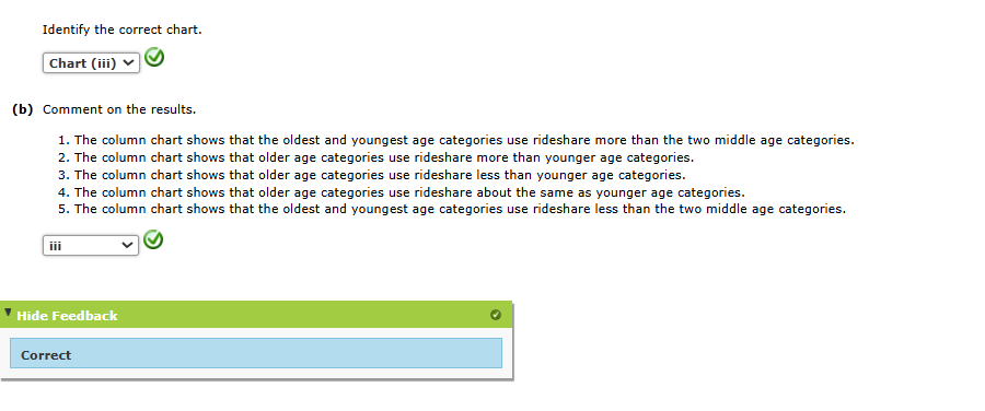
3. A poll showed that 30% of all Americans regularly use a ride-sharing service such as Lyft or Uber. The table below and the file rideshare2 contain the survey results by age category.
| Age | Percentage who use Rideshare |
|---|---|
| 18–29 | 49% |
| 30–49 | 33% |
| 50–64 | 20% |
| 65+ | 16% |
(a)
Construct a column chart that shows the percentage of respondents who use a rideshare by age category. Use “Who Uses Rideshare?” as the chart title and “Age (years)” as the horizontal axis title. Edit the chart to make it easier to interpret. Add data labels.


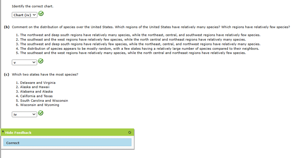
4. Ecologists often measure the biodiversity of a region by the number of distinct species that exist in the region. Nature reserves are lands specifically designated by the government to help maintain biodiversity. Care must be taken when setting up a network of nature reserves so that the maximum number of species can exist in the network. Geography matters as well, as putting reserves too close together might subject the entire network to risks, such as devastation from wildfires. The initial step in this type of planning usually involves mapping the number of species that exist in each region. The file species contains the number of unique species that exist in each of the 50 states in the United States.
(a)
Create a choropleth map that displays number of species by state. Use “Number of Species per State” for the chart title. Lighter colors should represent fewer species and darker colors should represent more species.


5. Suppose that previously, we displayed the price of a general admission ticket to Walt Disney World for the years 2000–2020. However, these prices did not factor in inflation over these years. The file disneypricesadjusted gives the general admission price and the general admission price adjusted for inflation for the years 2000–2020.
(a)
Create a line chart that shows the price of admission and the adjusted price of admission for the years 2000–2020.


