
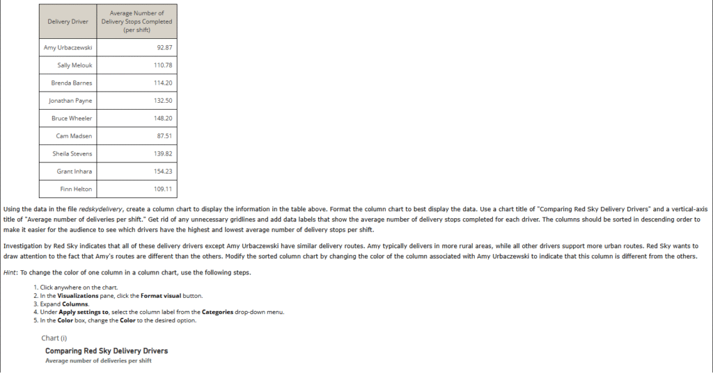
1. Red Sky Delivery performs “last-mile” delivery services for online retailers such as Amazon. Red Sky employs delivery drivers who perform the “last-mile” of delivery service by delivering packages to individual residence and business locations. Red Sky measures several delivery driver performance metrics, including number of delivery stops completed per eight-hour shift. The table below provides data on nine Red Sky delivery drivers and their average number of packages delivered per shift over the previous 30 days.


A. Chart(iv)
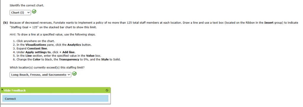
2. Funstate Carnivals operates four large amusement parks, each of which is located in California. Funstate would like to examine the staffing across these four amusement parks. It is most interested in comparing the total number of staff employed at each park, but it is also interested in comparing the gender breakdown of the staffing at each park. The table below shows the total number of staff employed at each park, broken out by self-identified gender.
| Total Number of Staff | ||
|---|---|---|
| Location | Male | Female |
| Fresno | 72 | 84 |
| Sacramento | 89 | 61 |
| Long Beach | 65 | 84 |
| Oakland | 48 | 51 |
(a)
Using the data in the file funstate, create a stacked bar chart to display these data. Different colors should be used for “Male” and “Female.” Use the chart title “Funstate Carnivals Staffing Analysis,” choose appropriate axes titles, and include a chart legend to identify male versus female staff in the bar chart. Format the chart to minimize eye travel and remove any unnecessary gridlines to increase the data-ink ratio.
Funstate would like to show the exact numbers of male and female staff at each location on the chart. Add data labels to the stacked bar chart to display the number of male and number of female staff at each location. Format the data labels so they are easy for the audience to read.


3. Hoxworth Blood Center, located in Cincinnati, Ohio, is a leader in transfusion medicine. Founded in 1938, it is the second oldest blood bank in the United States. Hoxworth operates at seven locations in the Greater Cincinnati area where it collects blood from donors. Hoxworth is performing a comparison of the amount of blood donors serviced by each of its locations during the month of October. Suppose that Hoxworth has a stated goal of each location servicing an average of 50 blood donors per day each month. The column chart that follows compares the average number of blood donors at each Hoxworth location.

However, this chart is cluttered, and the data-ink ratio is low. Starting with the chart in the PBIX file hoxworthvisual, declutter the chart and improve the data-ink ratio to produce an improved column chart.
Hint: To draw a line at a specified value, use the following steps.
- Click anywhere on the chart.
- In the Visualizations pane, click the Analytics button.
- Expand Constant line.
- Under Apply settings to, click + Add line.
- In the Line section, enter the specified value in the Value box.
- Change the Color to black, the Transparency to 0%, and the Style to Solid.


A. Chart(iv)