
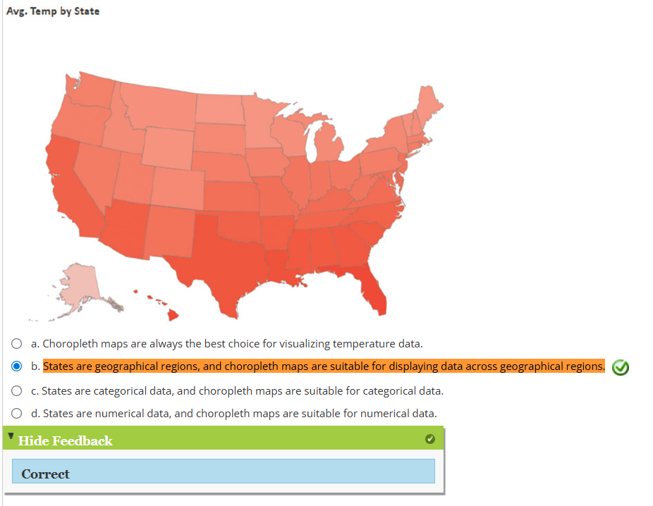
1. In the below Power BI example using sequential color, why is a choropleth map an appropriate choice for visualizing average annual temperature by state?
2. Why was the color scheme changed from blue to red in the below Power BI example using sequential color?

3. What type of color scheme is commonly used in a stacked column or bar chart to differentiate between categories within each column or bar?
A) Categorical color
4. In the United States, which color is most often used to indicate coolness?
A) Blue
5. What type of color scheme is used to emphasize values above and below a central point?
A) Diverging color
6. What does a darker shade indicate in a choropleth map?
A) Higher intensity
7. Why might using blue in a choropleth map of average temperature by state be misinterpreted?
A) Blue is associated with coolness, so it could imply that states with higher average temperatures are cooler.