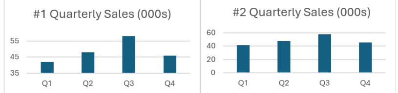

1. These graphs are built using the same quarterly sales data. Which is the more informative graph?
A: #2 because the vertical axis is adjusted to closer match actual sales, thereby more accurately displaying the relative quarterly sales.
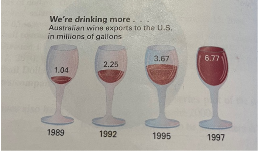
2. This is a visualization of Australian wine exports to the United States and is similar to a chart that was once published in a magazine article about the wine industry. What is/are the problems with this chart?
A: All of the above.
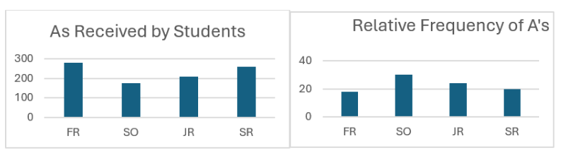
3. These graphs are based on the same data. Which is the more informative graph?
A: Relative Frequency of A’s’ because it is the percentage of A’s in each class.
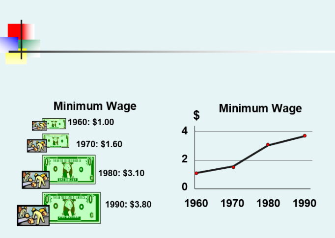
4. The above chart/graph shows the increase in the Minimum Wage from 1960 to 1990. Which is the more informative graph?
A: The graph on the right because it is a proper time-series plot based on actual data.
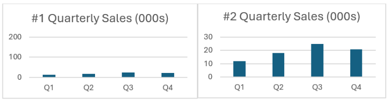
5. These graphs are built using the same quarterly sales data. Which is the more informative graph?
A: #2 because the vertical axis is based on 0.